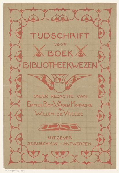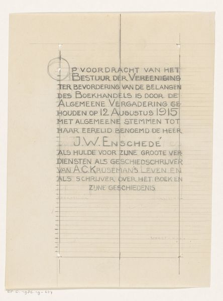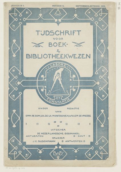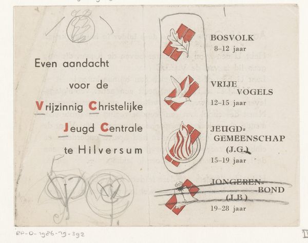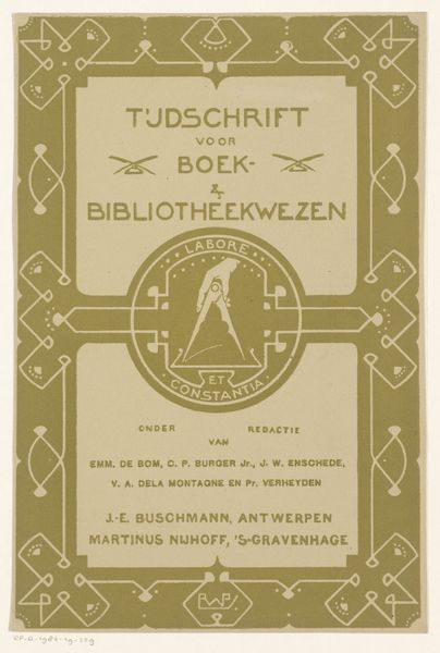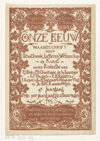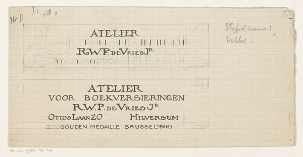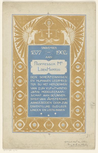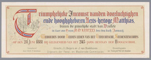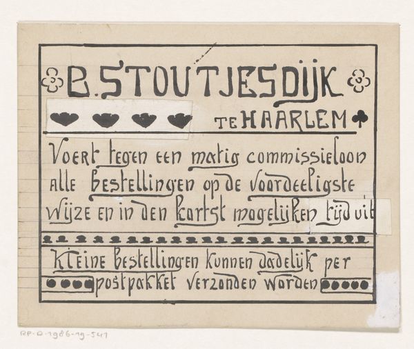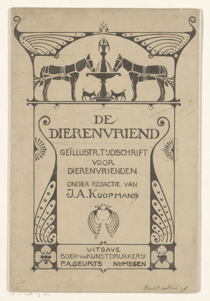
Omslagontwerp voor: Tijdschrift voor boek- en bibliotheekwezen, 1903 1903
0:00
0:00
drawing, graphic-art, paper, typography, ink, poster
#
drawing
#
graphic-art
#
art-nouveau
#
paper
#
typography
#
ink
#
geometric
#
ink colored
#
sketchbook drawing
#
poster
Dimensions: height 279 mm, width 189 mm
Copyright: Rijks Museum: Open Domain
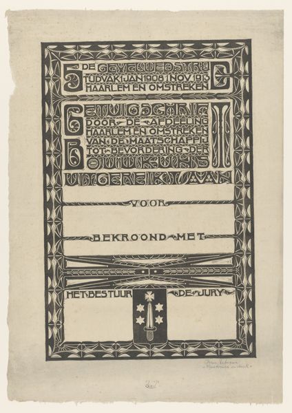
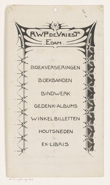
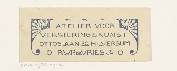
Reinier Willem Petrus de Vries made this cover design for a book and library science journal in 1903. Look how the pale blue ink carefully follows the grid of the paper, as if the design is emerging slowly through a process of careful transcription. I’m drawn to how the blue lines vary in thickness, giving depth to what could otherwise be a very flat surface. There’s a really satisfying tension here between the mechanical grid and the organic feel of the hand-drawn elements. My eye keeps coming back to the little floral motifs. The way they are each slightly different, with petals that aren’t quite symmetrical, speaks to the artist's hand and eye. You can see a connection to earlier Arts and Crafts designers like William Morris, yet De Vries is also pushing towards something cleaner and more modern. For me, this piece is a reminder that even in the most structured forms, there’s always room for the personal touch, the little wobble that makes it human.
Comments
No comments
Be the first to comment and join the conversation on the ultimate creative platform.
