drawing, paper, watercolor
#
drawing
#
dutch-golden-age
#
landscape
#
paper
#
watercolor
#
coloured pencil
#
cityscape
Dimensions: height 184 mm, width 286 mm, height 532 mm, width 320 mm
Copyright: Rijks Museum: Open Domain
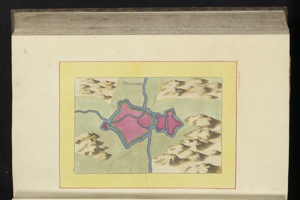
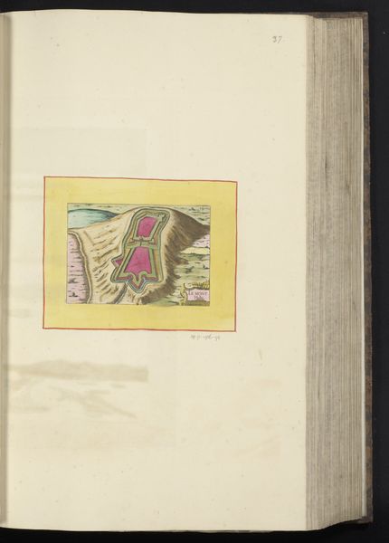
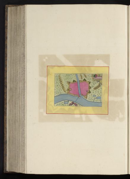
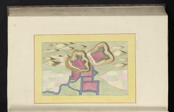
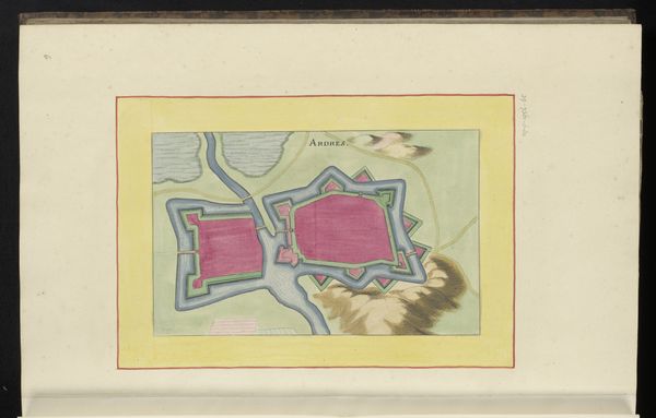
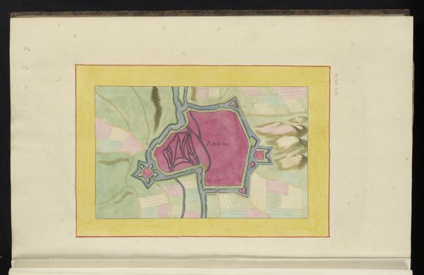
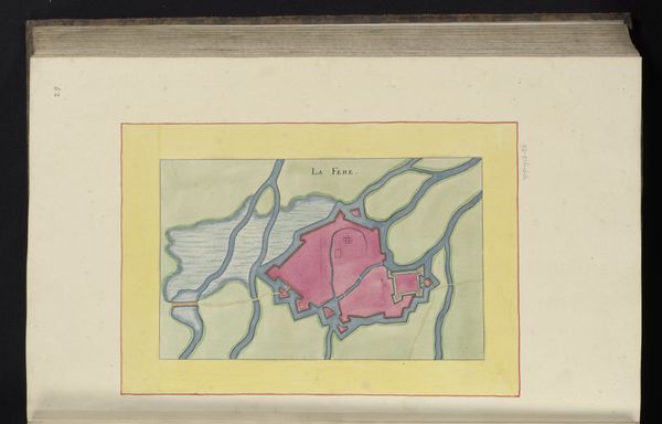
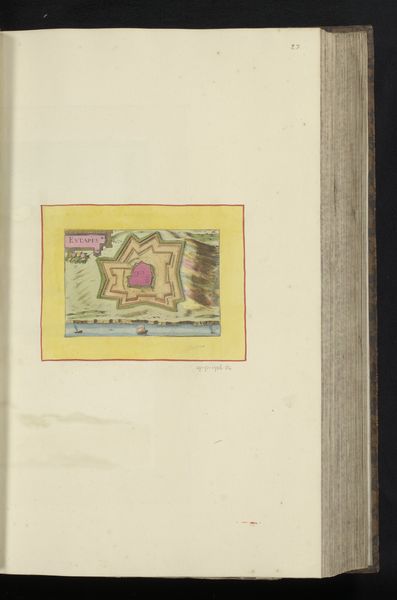
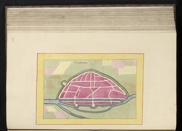
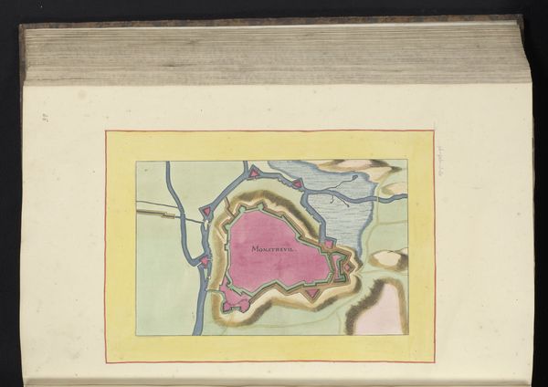
Curator: Here we have an anonymous 17th-century Dutch Golden Age drawing titled "Vestingplattegrond van Saint-Quentin", created in 1656. The artist utilized watercolor and coloured pencil on paper to depict this cityscape. Editor: Well, immediately, I'm struck by this fascinatingly artificial pink. It’s not quite the blushing, inviting rose, but more of a calculated, architectural…carnation. Makes me wonder if this city was always seen as something deliberately constructed, even ornamental, rather than lived-in. Curator: It's interesting you note the color choice. Viewing it through the lens of formalism, the stark pink hue is quite distinct from the muted tones surrounding it. Note how the geometric forms create a visual hierarchy, emphasizing the city’s planned layout and defensive structure, as well as its separation from the surroundings. Editor: Exactly! I get this distinct feeling of calculated power, looking down, almost godlike. The orderly arrangement – each line so crisp. This wasn't about feeling your way through a city, but knowing its measure, its vulnerability, the weakness in its shell. The soft landscape palette against those sharp geometries also serves as quite a stark contrast. Curator: The contrast certainly enhances the sense of the city as a fortified space. Observe how the surrounding landscape elements—rendered with a looser, more painterly hand—define the boundaries and spatial context, emphasizing the strategic importance of its position relative to water and land routes. Editor: But even the river becomes this neat blue brushstroke. Are we looking at a city, or the idea of a city? Did the artist intend to express urban life and history? Were they, instead, creating a manual for generals? All that considered, I can't help but admire how art translates military interests into visually delightful pieces, where order and symmetry triumph. Curator: Precisely! I feel the value is in the formal construction itself—the delicate watercolor washes, the carefully considered balance of tones—convey a sense of structured knowledge and spatial control characteristic of that period. Editor: In this context, knowledge feels like a strategic advantage; beautiful but also deeply functional. Thank you, formalism, for helping me get here. Curator: Indeed, a fruitful exploration, underscoring how the convergence of art and science in Dutch Golden Age cartography yields enduringly compelling compositions.
Comments
No comments
Be the first to comment and join the conversation on the ultimate creative platform.
More like this