drawing, coloured-pencil, print, paper
#
drawing
#
coloured-pencil
# print
#
landscape
#
paper
#
coloured pencil
#
genre-painting
Dimensions: height 212 mm, width 272 mm, height 532 mm, width 320 mm
Copyright: Rijks Museum: Open Domain
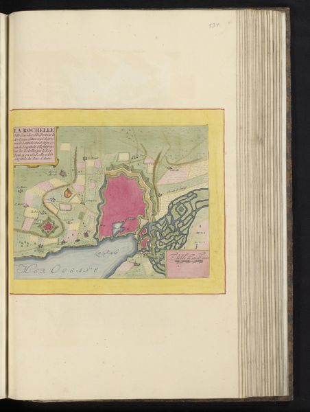
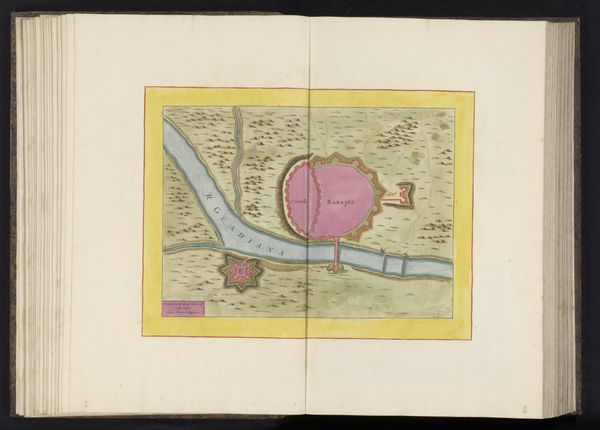
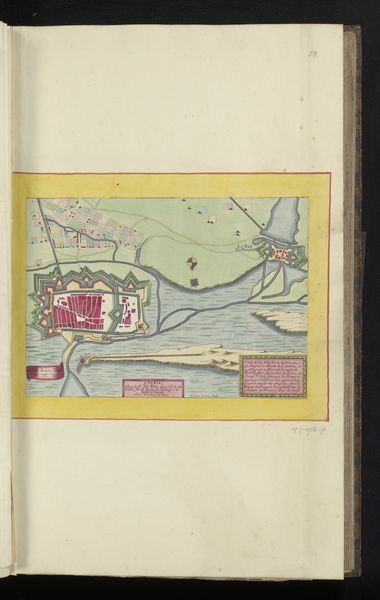
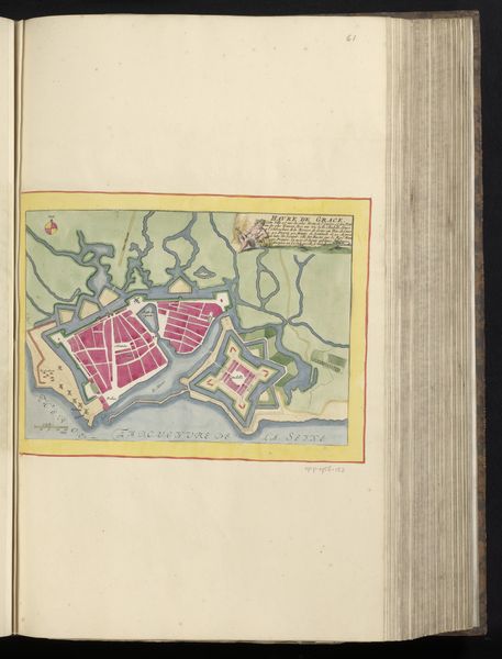
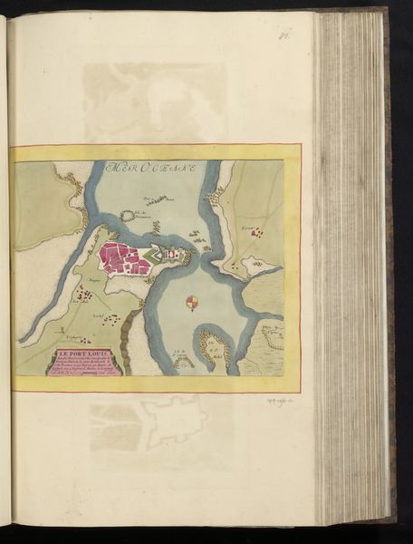
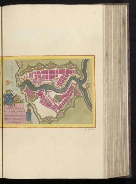
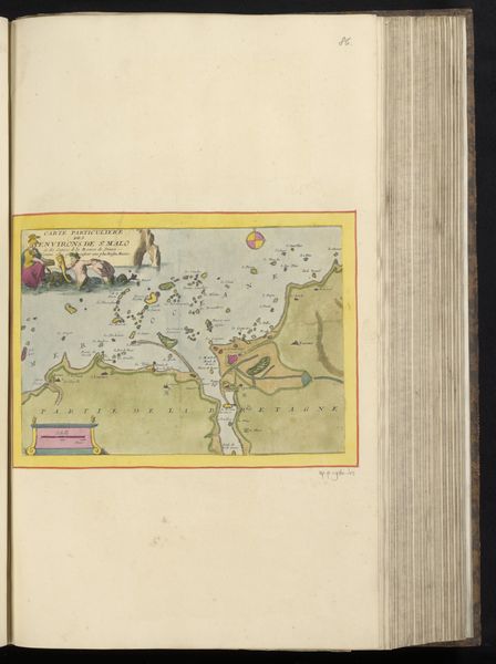
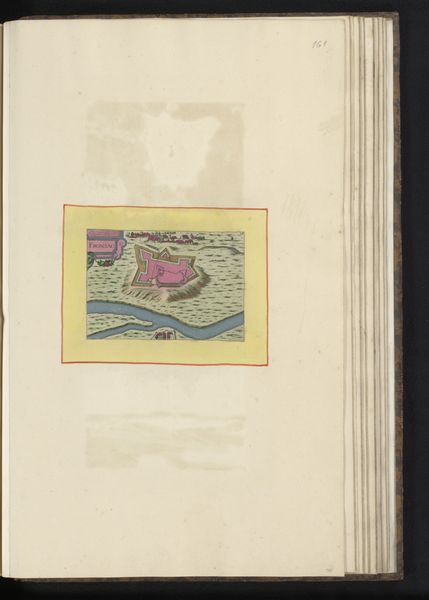
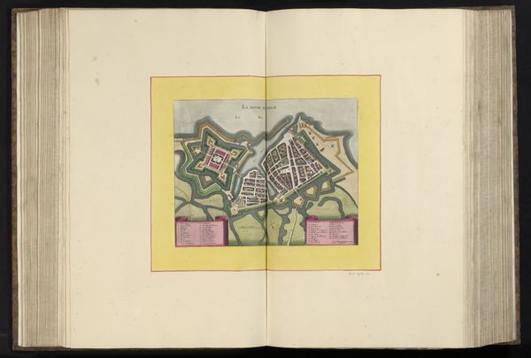
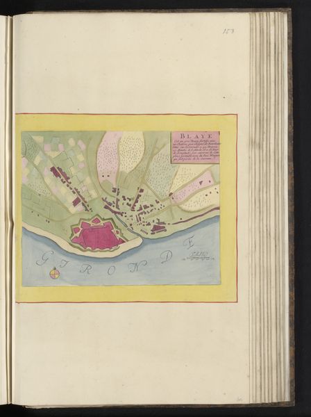
Curator: What first strikes me is the striking combination of precision and vibrant, almost playful, color. Editor: I see that! "Vestingplattegrond van Bayonne," created around 1690-1700 by an anonymous artist, employs coloured pencil and print on paper to depict a detailed plan of the fortified city. What I love is how the rigid lines of the fortifications contrast with that soft wash of pink. Curator: Pink is hardly what one expects when you think "fortifications". Is this artist trying to soften something, mask its aggressive intention? And what does pink symbolise here in the context of military defense? Editor: Think about it: even maps have symbolic purposes. They present the landscape not necessarily as it "is" but as how the commissioner or patron wishes it to be perceived. Perhaps that rose pigment makes it clear how it could flourish within those parameters. The city is shown surrounded by star-shaped fortresses, their geometric forms designed to resist attack, a cultural motif across Europe at that time. But more broadly, cities symbolize the ambition of man. Curator: So, rather than blunt aggression, the pink hues might evoke something more subtle – a desire for the city to radiate prosperity, stability? An era that is a contrast to what was intended? That tension between intent and aspiration seems crucial to our reading. What about its scale and positioning? It almost feels like a pressed flower within the old book. Editor: Precisely. This rendering invites us to look not at grand strategy but local lives—its streets and gardens promising civic order. The level of detail implies that the artist lived in the city. They may be working for the defense! They can tell what details are more prominent than others, from the artist's experience. We become time travelers gazing back at Bayonne with this intimate understanding of defense. It's funny when we apply meaning to details or artistic direction...but it also adds an interesting spin on historical art. Curator: So, we are not merely seeing a map then but a cultural artefact ripe with embedded ideologies. Almost makes one think the intention to protect a space can mean many things when filtered through creative impression. Editor: Exactly. Art invites that constant act of reconsidering our assumptions; seeing beyond surface is always a valuable process.
Comments
No comments
Be the first to comment and join the conversation on the ultimate creative platform.
More like this