drawing, paper, ink
#
drawing
#
script typography
#
hand-lettering
#
baroque
#
old engraving style
#
hand drawn type
#
hand lettering
#
paper
#
word art
#
ink
#
hand-drawn typeface
#
geometric
#
thick font
#
golden font
#
calligraphy
#
small lettering
Dimensions: height 203 mm, width 297 mm
Copyright: Rijks Museum: Open Domain
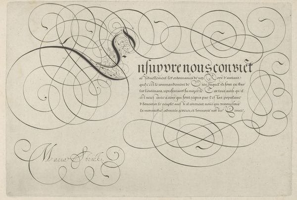
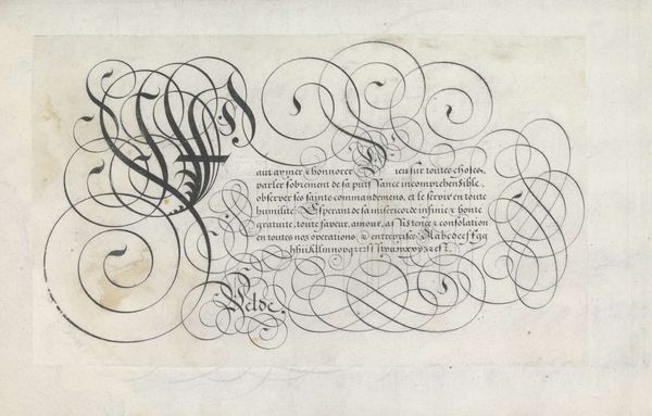
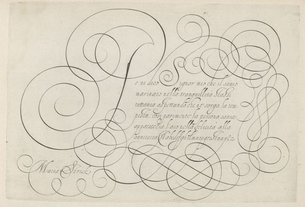
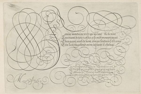
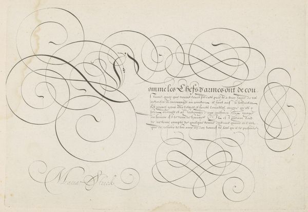
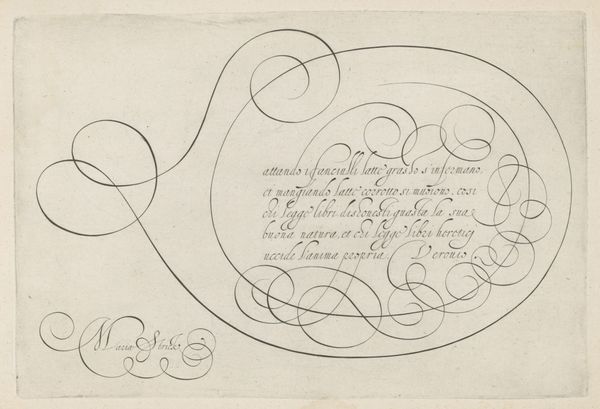
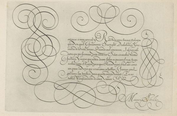
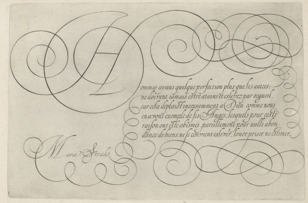
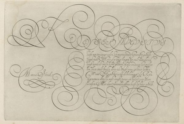
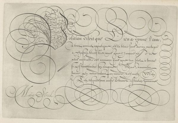
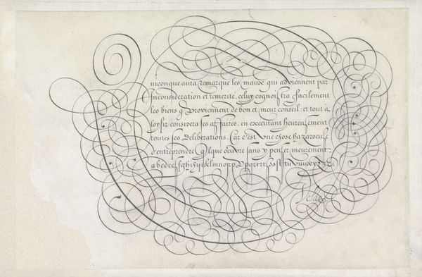
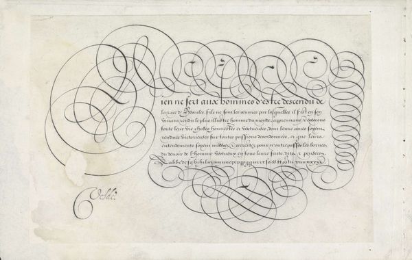
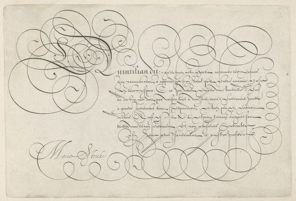
Curator: Ah, yes, here we have Hans Strick's "Schrijfvoorbeeld met kapitaal A," created around 1618. It’s currently held at the Rijksmuseum. Strick used ink on paper for this drawing, showcasing incredible hand-lettering. What strikes you first? Editor: Utter precision! My immediate thought is about the steady hand and focused breath required. Imagine the skill embedded in each swirl and stroke. It's all about the making here; what sort of quill did he use, and how much would ink and paper like this have cost in 1618? Was this commissioned or just for practice, a show of skill? Curator: Those are excellent questions. The calligraphy is absolutely captivating, isn't it? The baroque style just oozes from every carefully rendered curve, especially in that extravagant capital A that dominates the page. I almost get lost in it, picturing the artist completely absorbed in the act of creation, channeling his emotions into this beautiful piece of word art. It's more than just text; it's a portal to another state of mind, almost like meditation. Editor: Absolutely, it’s about more than legibility. But beyond the spiritual or artistic intention, let's think about the raw materials. Paper-making at the time was labor-intensive; so was preparing ink. This piece reflects economic realities. Even something as simple as practicing handwriting required resources others wouldn’t have had, doesn't it? This "Schrijfvoorbeeld," in its elegant lines, points to a specific point of privilege. Curator: I suppose that's why it whispers to me about history, society, too, because Strick gives that “A” such presence with interwoven swirls. It reminds me a bit of illuminated manuscripts and ancient scrolls where every word and letter was art, so imbued with reverence, right? Editor: And those associations with religion and law... the letter commands the page because that’s what letters were expected to do. They conferred legitimacy; they dictated and organized social relations and trade! To think of this "drawing" purely aesthetically ignores its root function in structuring reality through script, ink, and paper. Curator: Well said. I suppose both the ethereal inspiration and material realities interweave, don’t they? Editor: Precisely. Curator: And the dialogue helps unlock a richer experience. Thanks. Editor: Likewise.
Comments
No comments
Be the first to comment and join the conversation on the ultimate creative platform.
More like this