drawing, paper, ink
#
word art style
#
drawing
#
script typography
#
hand-lettering
#
lettering
#
hand drawn type
#
hand lettering
#
paper
#
11_renaissance
#
word art
#
ink
#
hand-drawn typeface
#
fading type
#
geometric
#
line
#
decorative-art
#
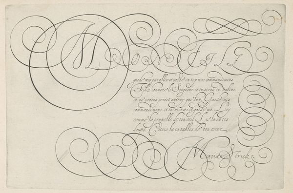
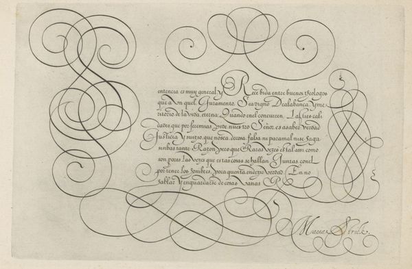
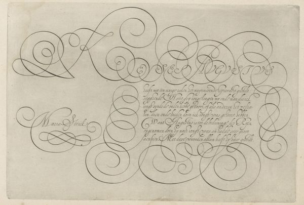
calligraphy
#
small lettering
Dimensions: height 202 mm, width 297 mm
Copyright: Rijks Museum: Open Domain
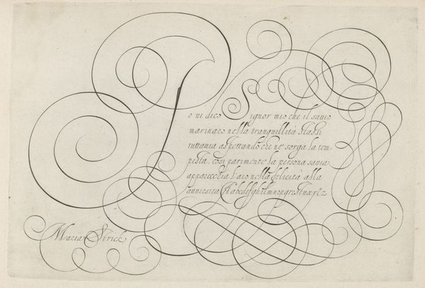
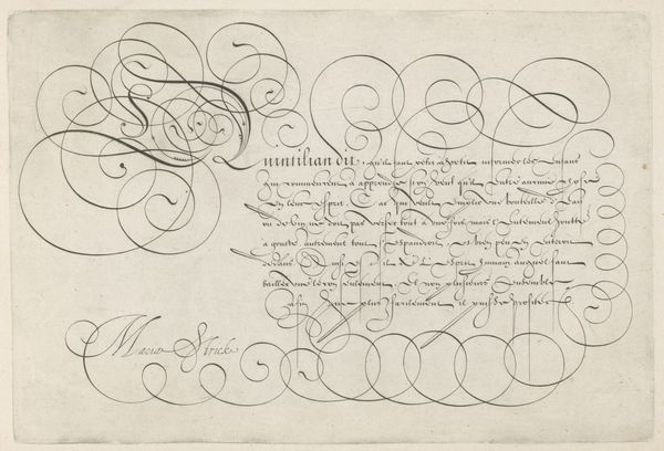
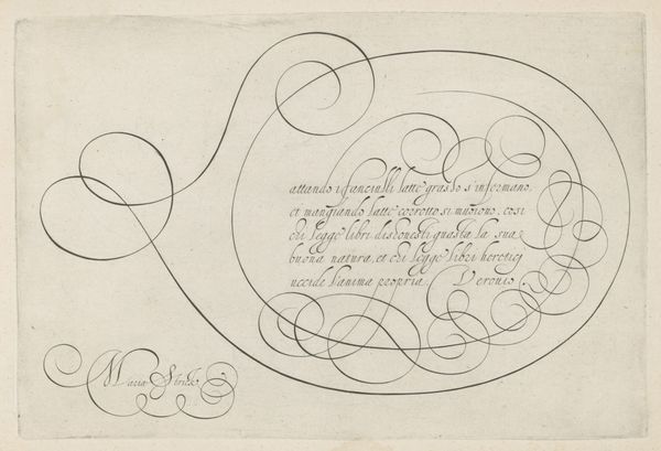
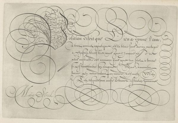
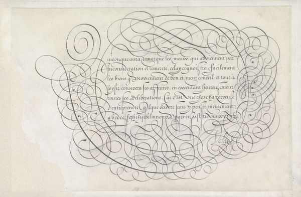
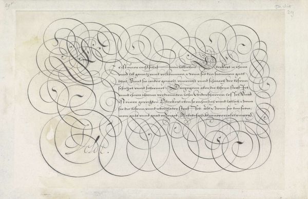
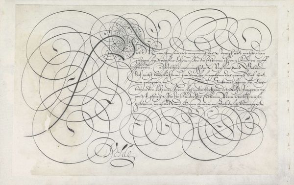
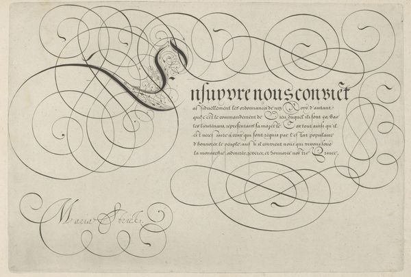
This is "Schrijfvoorbeeld met kapitaal C," made by Hans Strick sometime in the late 16th century. The work presents an example of calligraphy, showcasing elaborate swirls and elegant letterforms in ink on paper. During Strick’s lifetime, the Dutch Republic was in its infancy, a society in the throes of defining its cultural identity through language and art. Calligraphy held a place of importance, valued not just for its function but also as an art form. Note how the flourishes and the composition’s layout create a visual rhythm. The curves around the text almost seem to dance. Identity is subtly woven into this piece. While it's a demonstration of skill, it also reflects Strick’s cultural milieu and his aspirations as an artist working in a time of social and artistic change. How does this work strike you? Is it purely decorative, or does it evoke deeper reflections on language, skill, and cultural identity?
Comments
No comments
Be the first to comment and join the conversation on the ultimate creative platform.
More like this