drawing, ink
#
drawing
#
script typography
#
hand-lettering
#
old engraving style
#
hand drawn type
#
hand lettering
#
form
#
11_renaissance
#
personal sketchbook
#
ink
#
hand-drawn typeface
#
fading type
#
geometric
#
thick font
#
line
#
calligraphy
#
small lettering
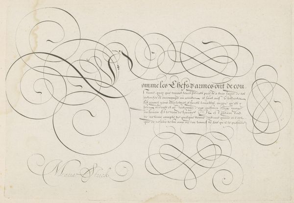
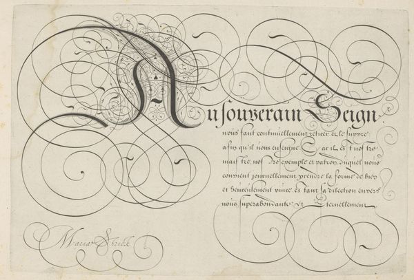
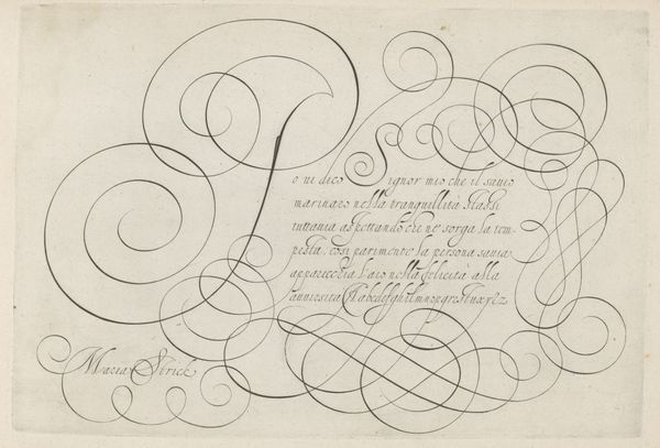
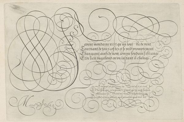
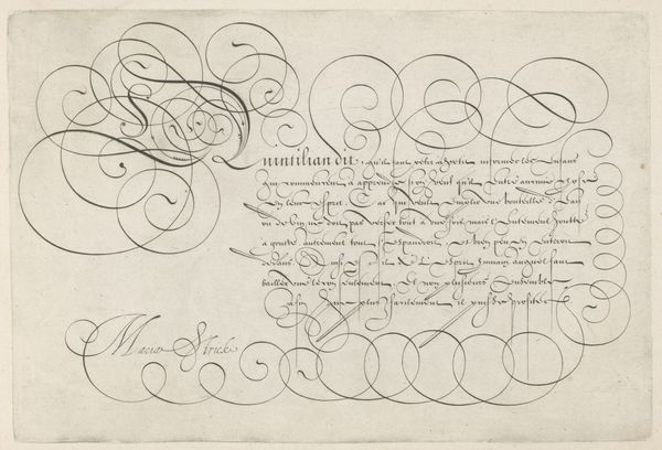
Dimensions: height 201 mm, width 294 mm
Copyright: Rijks Museum: Open Domain
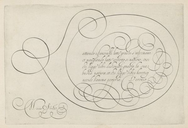
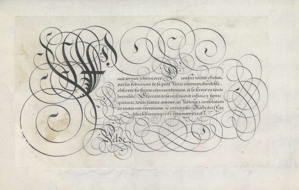
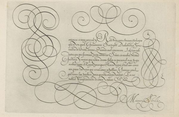
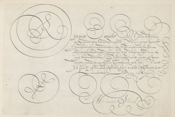
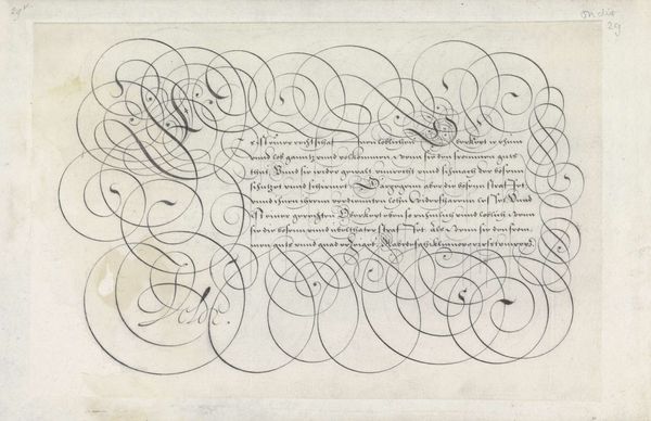
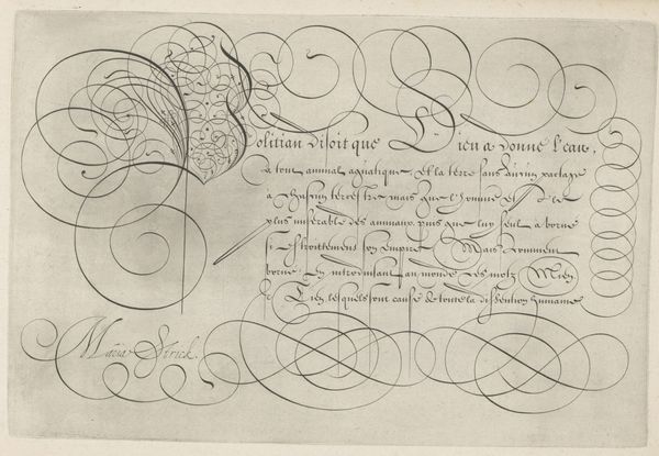
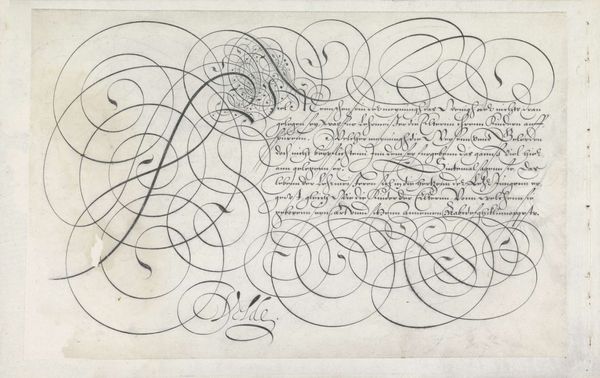
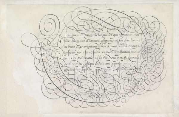
This is a 16th-century calligraphic print titled 'Schrijfvoorbeeld met kapitaal E' by Hans Strick. The first impression is of elegant lines swirling across the page, almost obscuring the text. The composition contrasts the bold, ornamental flourishes of the letter 'E' with the precise, smaller script of the text it introduces. Strick masterfully uses line to create a sense of depth and movement. The curves and loops seem to dance across the surface, inviting the eye to follow their path. The text itself, rendered in a more formal hand, provides a structural counterpoint to the free-flowing ornamentation. The strategic placement of textual elements serves to frame the composition, drawing attention to the dynamic interplay between form and content. This print destabilizes the conventional relationship between writing and image. The artistic treatment transforms the act of writing into a visual spectacle. It reminds us that even in the most functional forms of communication, there is room for artistry and expression.
Comments
No comments
Be the first to comment and join the conversation on the ultimate creative platform.
More like this