drawing, print, paper, typography, ink
#
drawing
#
script typography
#
hand-lettering
# print
#
lettering
#
old engraving style
#
hand drawn type
#
hand lettering
#
paper
#
11_renaissance
#
typography
#
ink
#
hand-drawn typeface
#
fading type
#
thick font
#
northern-renaissance
#
calligraphy
#
small lettering
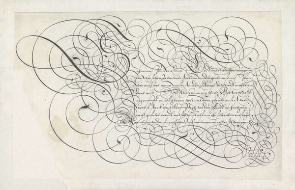
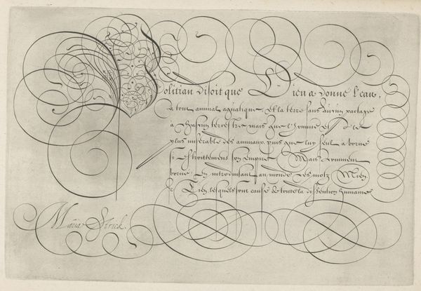
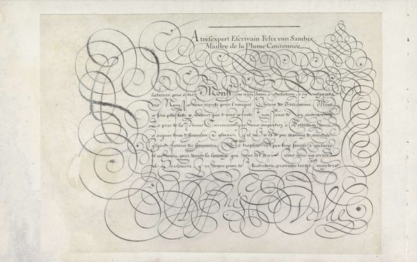
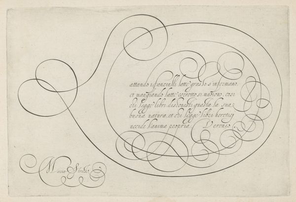
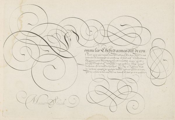
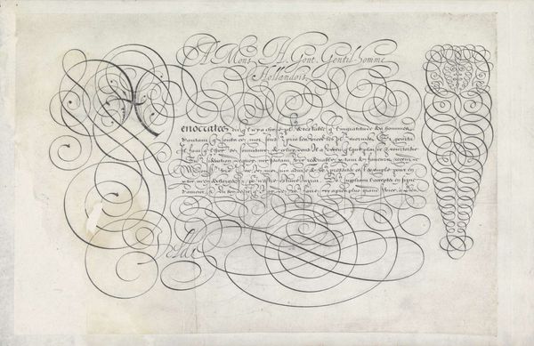
Dimensions: height 198 mm, width 295 mm
Copyright: Rijks Museum: Open Domain
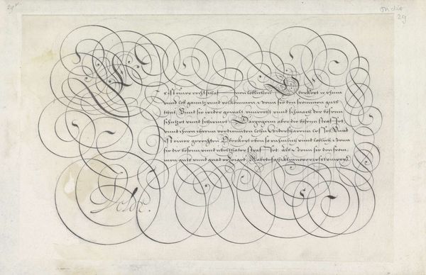
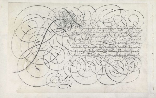
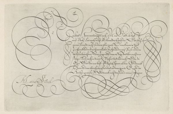
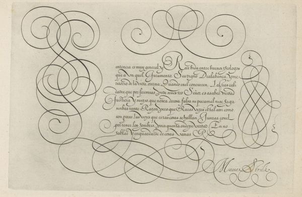
Hans Strick created this writing sample with a capital Q sometime around 1566 using pen and brown ink. Immediately, the eye is drawn to the flourish of calligraphic loops and the controlled lines of text, coexisting in a fascinating tension between ornate design and structured script. Here, the capital 'Q' explodes into a series of spirals, each turn and curve rendered with precise control. Strick’s work exemplifies the Mannerist tendency to destabilize established form, elevating ornamentation to a level that rivals, or even surpasses, the textual content itself. The very act of writing transforms into a visual performance, one that challenges the conventional role of script as mere communication. Consider how the negative space is as crucial as the ink. It's within this interplay that the artwork finds its dynamism, creating a semiotic system where legibility is constantly negotiated with visual spectacle. Ultimately, it invites us to reconsider the boundaries between text and image, challenging fixed notions of language and representation.
Comments
No comments
Be the first to comment and join the conversation on the ultimate creative platform.
More like this