About this artwork
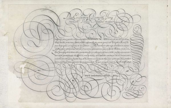
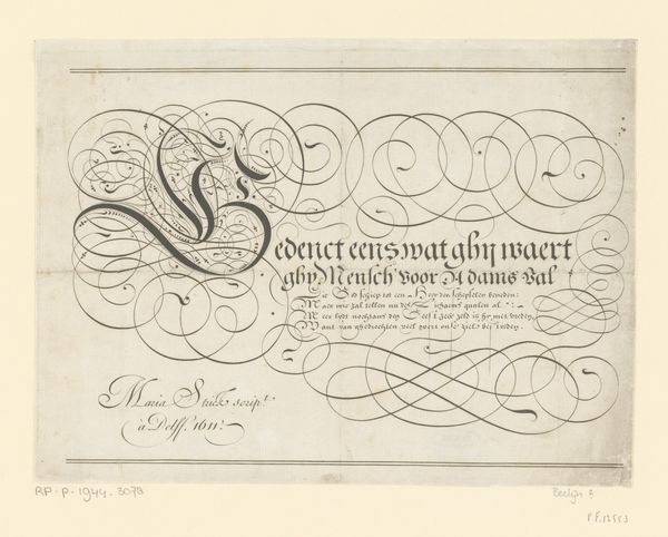
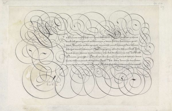
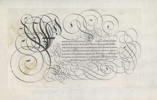
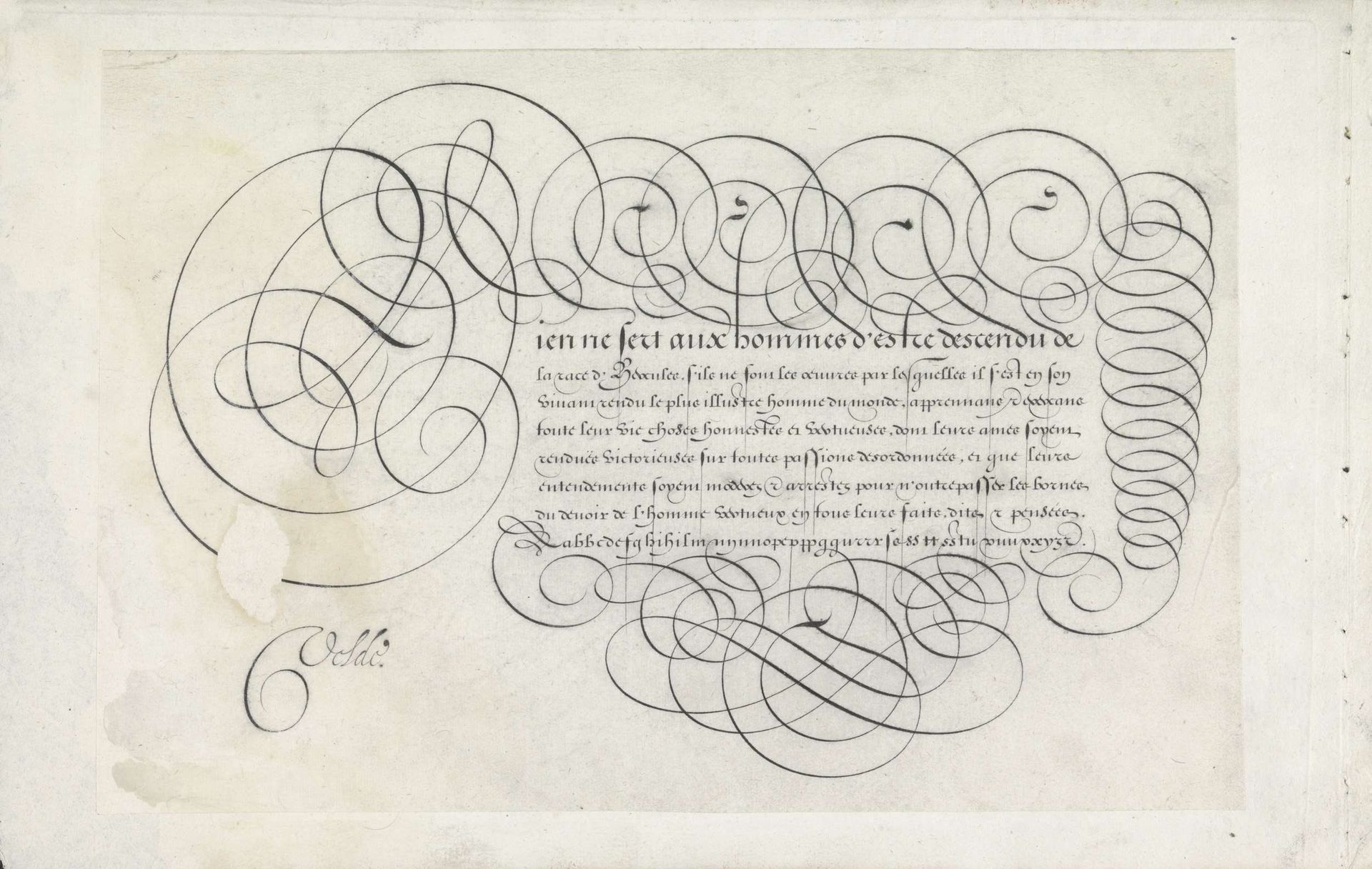
Curator: At the Rijksmuseum, we’re standing before "Ontwerp van een schrijfvoorbeeld: Rien ne sert aux hommes (...)," or Design of a writing sample: Nothing is useful to men..., crafted in 1605 by Jan van de Velde I. It combines etching and ink on paper, a showcase of masterful calligraphy. Editor: It strikes me as incredibly ornate, almost dizzying with its swirls and flourishes. The script cascades down the page, contained—yet seemingly unrestrained—by those looping lines. A certain preciousness, too, in its density. Curator: Exactly. Writing manuals were more than practical guides. Consider the sociopolitical context. Calligraphy was crucial for social mobility and professional advancement in 17th-century Netherlands. Van de Velde wasn't simply demonstrating letterforms; he was displaying societal values, elegance, and refinement accessible only to certain social groups. Editor: It makes you think about who this skill was taught to, and who was excluded. Whose voices weren’t represented because they didn’t have the privilege of such refined literacy? The artistry is undeniable, yet embedded within is the social stratification of the time. And who "prescribes" what qualifies elegance or skill? It appears those who held wealth and sway during the seventeenth century, and were almost exclusively white males. Curator: Precisely. The elaborate loops and tight forms, almost obsessive in their detail, speak volumes. But also the message itself, even if only a writing sample, speaks about hierarchies. Didactics like this contribute to reinforcing a world view, right? A perspective of status through handwriting and the value judgement inherent within it. Editor: Absolutely. It becomes another method of power preservation. The act of producing it, viewing it, understanding the value within this hand drawn letterforms becomes almost ritualistic in its demonstration of both class, status, education, and, perhaps above all, influence. Curator: Ultimately, a seemingly straightforward design for calligraphy reveals intricate layers of meaning. Editor: Revealing, really, how art always speaks within broader power dynamics and structures.
Ontwerp van een schrijfvoorbeeld: Rien ne sert aux hommes (...).
1605
Jan van de Velde I
1568 - 1623Location
RijksmuseumArtwork details
- Medium
- drawing, print, etching, paper, ink
- Dimensions
- height 188 mm, width 281 mm
- Location
- Rijksmuseum
- Copyright
- Rijks Museum: Open Domain
Tags
Comments
Share your thoughts
About this artwork
Curator: At the Rijksmuseum, we’re standing before "Ontwerp van een schrijfvoorbeeld: Rien ne sert aux hommes (...)," or Design of a writing sample: Nothing is useful to men..., crafted in 1605 by Jan van de Velde I. It combines etching and ink on paper, a showcase of masterful calligraphy. Editor: It strikes me as incredibly ornate, almost dizzying with its swirls and flourishes. The script cascades down the page, contained—yet seemingly unrestrained—by those looping lines. A certain preciousness, too, in its density. Curator: Exactly. Writing manuals were more than practical guides. Consider the sociopolitical context. Calligraphy was crucial for social mobility and professional advancement in 17th-century Netherlands. Van de Velde wasn't simply demonstrating letterforms; he was displaying societal values, elegance, and refinement accessible only to certain social groups. Editor: It makes you think about who this skill was taught to, and who was excluded. Whose voices weren’t represented because they didn’t have the privilege of such refined literacy? The artistry is undeniable, yet embedded within is the social stratification of the time. And who "prescribes" what qualifies elegance or skill? It appears those who held wealth and sway during the seventeenth century, and were almost exclusively white males. Curator: Precisely. The elaborate loops and tight forms, almost obsessive in their detail, speak volumes. But also the message itself, even if only a writing sample, speaks about hierarchies. Didactics like this contribute to reinforcing a world view, right? A perspective of status through handwriting and the value judgement inherent within it. Editor: Absolutely. It becomes another method of power preservation. The act of producing it, viewing it, understanding the value within this hand drawn letterforms becomes almost ritualistic in its demonstration of both class, status, education, and, perhaps above all, influence. Curator: Ultimately, a seemingly straightforward design for calligraphy reveals intricate layers of meaning. Editor: Revealing, really, how art always speaks within broader power dynamics and structures.
Comments
Share your thoughts