About this artwork
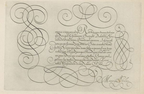
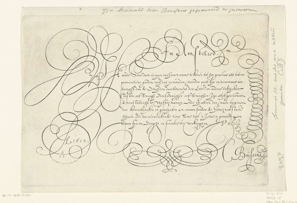
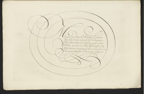
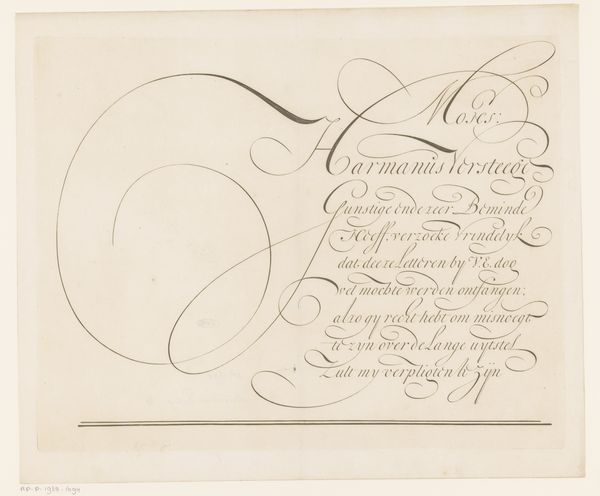
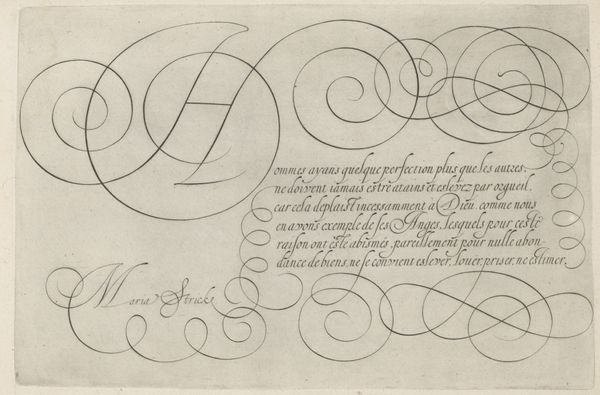
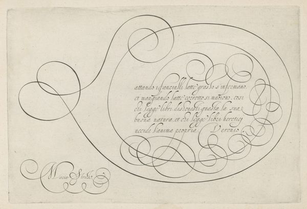
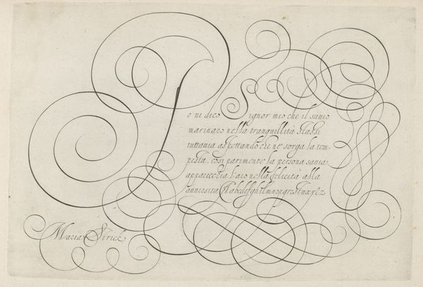
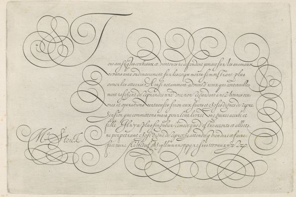
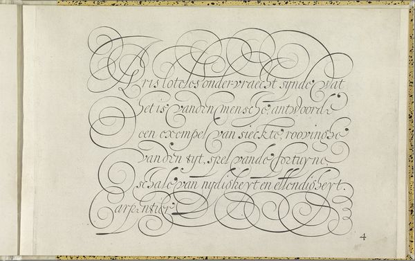
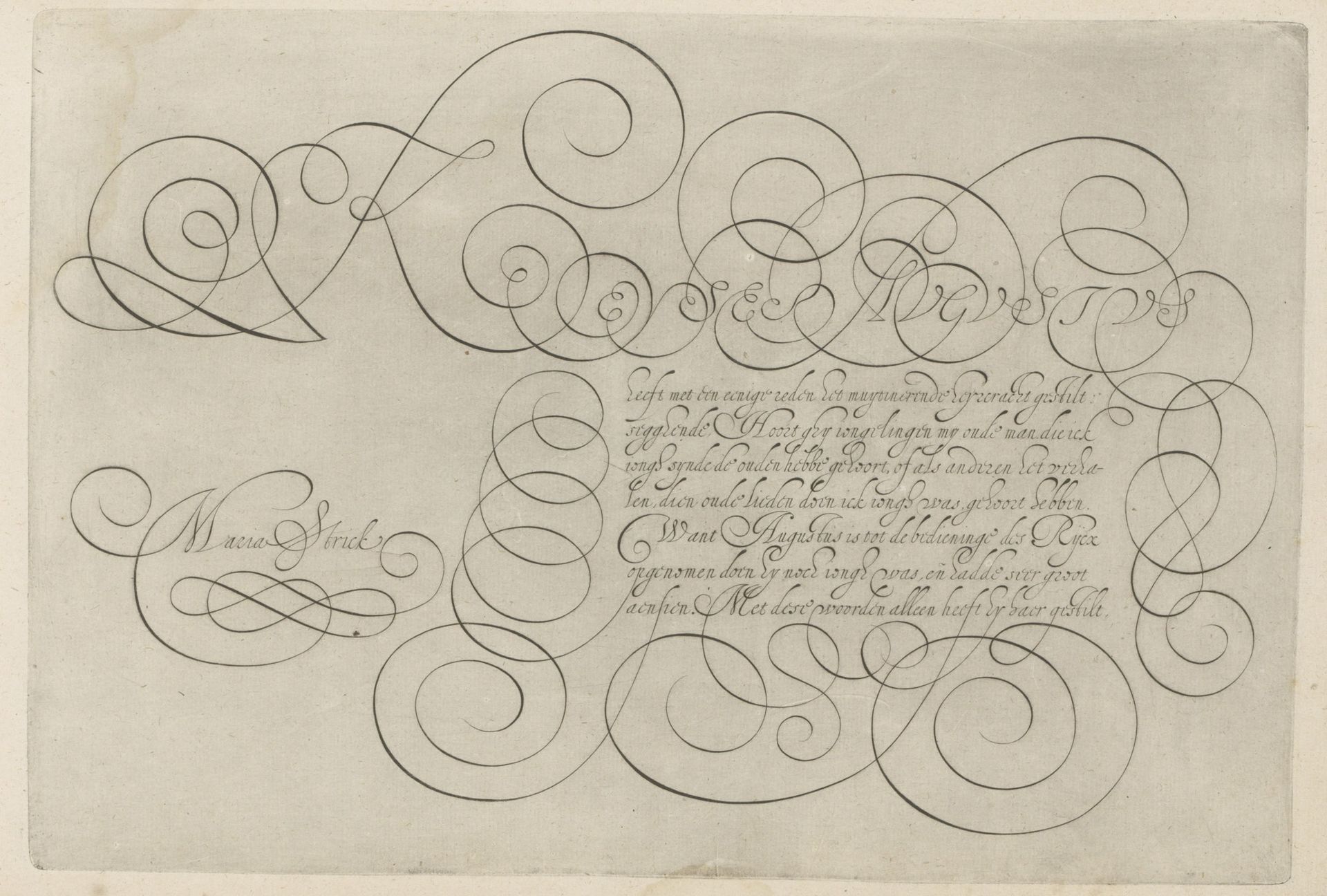
This is a writing sample with a capital K, made by Hans Strick around 1600, using pen and ink. During the late 16th century, calligraphy wasn't just about communication, it was a performance, a visual display of skill and education, closely tied to social status. In a society governed by strict hierarchies, handwriting became a means of asserting identity and belonging to a certain class. The flourishes and the elaborate letterforms weren't just decorative; they were a language in themselves, understood and appreciated by the literate elite. The act of writing was slow and deliberate, imbued with personal expression. The beautifully rendered ‘K’ and the careful script below are a testament to Strick’s mastery, and to the cultural importance of the written word. Consider the hours of practice, the expense of materials, and the cultural value placed on literacy during Strick’s time. This artwork invites us to reflect on the changing nature of communication, and the complex relationship between art, skill, and social identity.
Artwork details
- Medium
- drawing, graphic-art, paper, ink
- Dimensions
- height 202 mm, width 298 mm
- Location
- Rijksmuseum
- Copyright
- Rijks Museum: Open Domain
Tags
Comments
Share your thoughts
About this artwork
This is a writing sample with a capital K, made by Hans Strick around 1600, using pen and ink. During the late 16th century, calligraphy wasn't just about communication, it was a performance, a visual display of skill and education, closely tied to social status. In a society governed by strict hierarchies, handwriting became a means of asserting identity and belonging to a certain class. The flourishes and the elaborate letterforms weren't just decorative; they were a language in themselves, understood and appreciated by the literate elite. The act of writing was slow and deliberate, imbued with personal expression. The beautifully rendered ‘K’ and the careful script below are a testament to Strick’s mastery, and to the cultural importance of the written word. Consider the hours of practice, the expense of materials, and the cultural value placed on literacy during Strick’s time. This artwork invites us to reflect on the changing nature of communication, and the complex relationship between art, skill, and social identity.
Comments
Share your thoughts