About this artwork
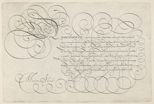
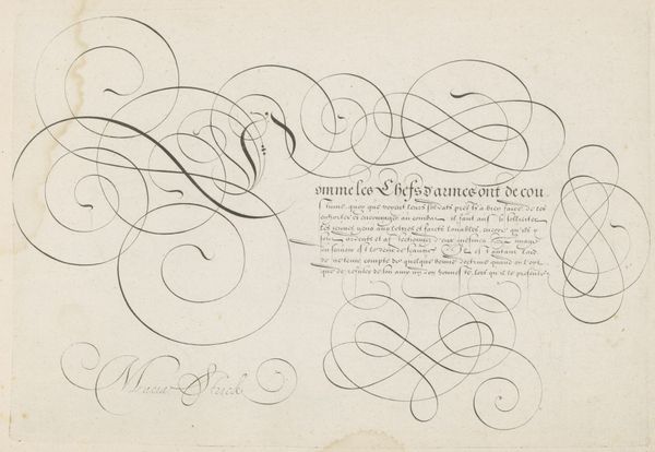
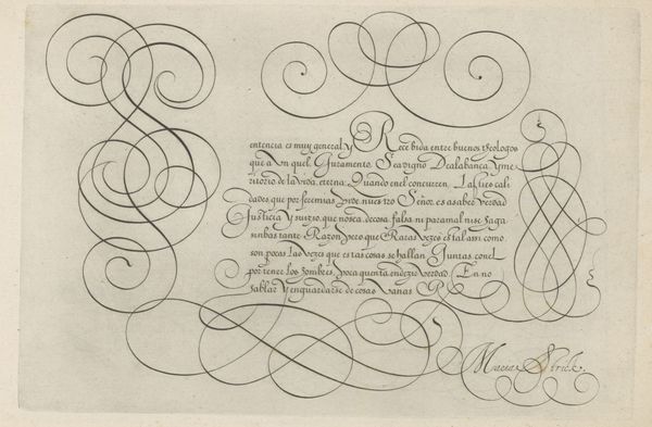
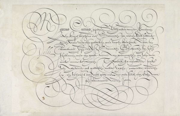
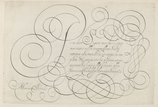
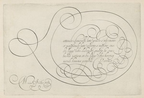
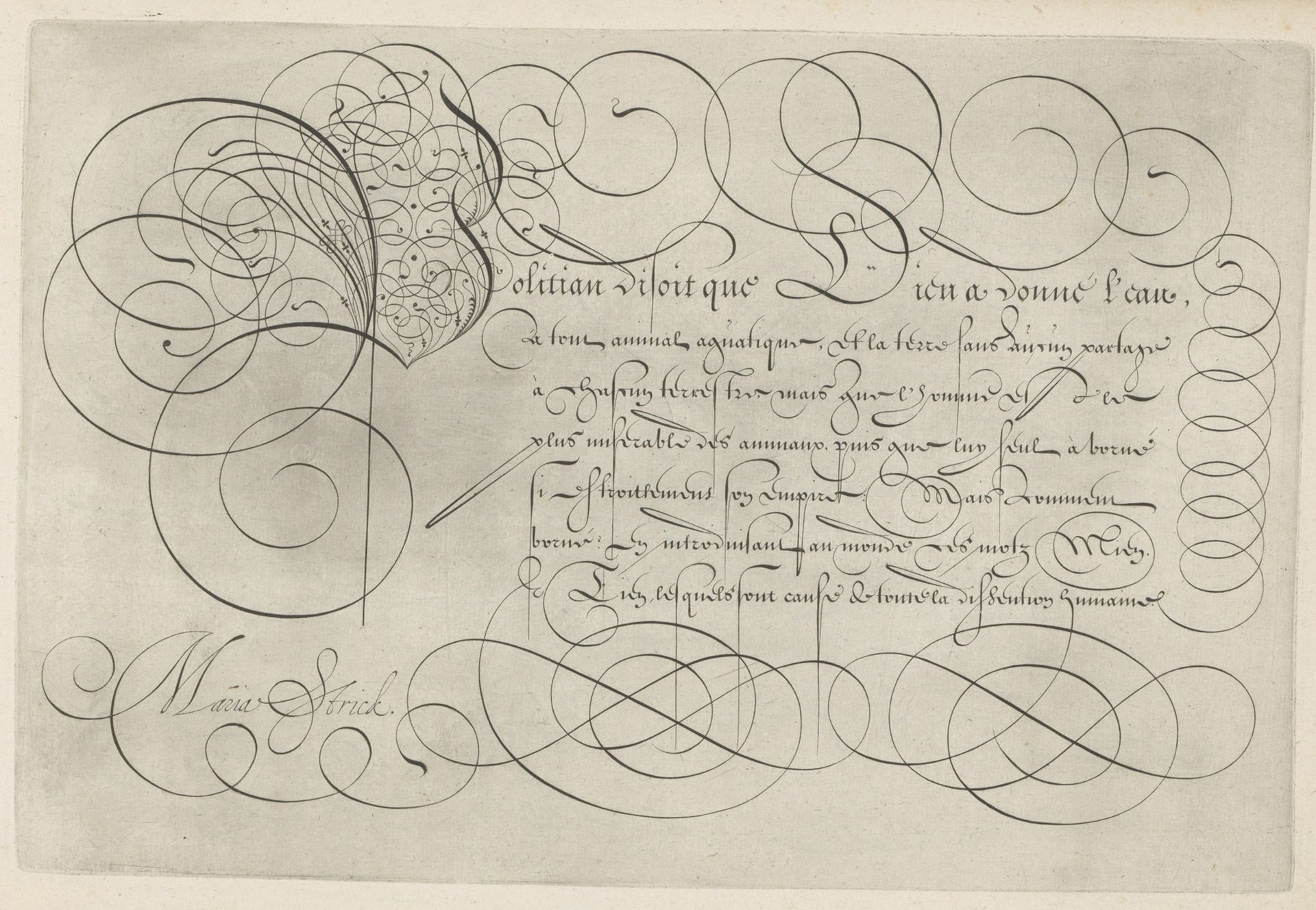
Curator: Here we have a Dutch Golden Age calligraphy, "Schrijfvoorbeeld met kapitaal P," or Writing Sample with a Capital P created in 1618 by Hans Strick. It's an engraving in ink on paper, currently residing here at the Rijksmuseum. Editor: It's visually quite striking. The looping forms remind me of intricate metalwork, something baroque and almost weightless. What's most interesting to you, formally? Curator: Well, consider how Strick uses line, first and foremost. The thickness varies drastically, creating a dynamic interplay between weight and airiness. Semiotically, each flourish conveys elegance and mastery. And how the artist presents the illusion of overlapping curves—the 'P' a structural linchpin. Editor: I find it interesting that he would do such a thing: at the time, calligraphy was essential for legal and political documents. Displaying such artistry implies a social status, and perhaps alludes to a cultural sophistication valued by the Dutch elite. But I must ask, how well does it work as a demonstration of legibility? Curator: Legibility, in the purely utilitarian sense, is secondary here. It transcends mere communication, moving towards pure visual pleasure. Each stroke reflects the ideals of balance and harmony that resonated throughout 17th-century Dutch art. Observe the contrast, too, of the organic letterforms alongside the very calculated execution of curves. Editor: Yet I see that period as one where commerce and governance relied heavily on these skills. How readily would viewers from the Golden Age distinguish a purely artistic expression from a sample meant to display functionality? This makes me ponder what social pressures and influences were upon Strick as he completed the work. Curator: Certainly, those questions inform the historical context. However, as an exercise in formal dexterity, consider the composition—how it guides the eye, encouraging prolonged engagement beyond simple comprehension. The very material qualities--the sheen of ink upon the page and overall craftsmanship elevates a simple writing exercise to something lasting. Editor: Agreed, looking beyond functionality allows us to consider its function: an exercise of virtuosity. A calligraphic caprice if you will. Thank you, that certainly highlights it differently. Curator: A worthwhile perspective indeed. The dialogue between artistic form and its broader cultural role—always enriching!
Artwork details
- Medium
- drawing, print, paper, ink, engraving
- Dimensions
- height 199 mm, width 297 mm
- Location
- Rijksmuseum
- Copyright
- Rijks Museum: Open Domain
Tags
Comments
Share your thoughts
About this artwork
Curator: Here we have a Dutch Golden Age calligraphy, "Schrijfvoorbeeld met kapitaal P," or Writing Sample with a Capital P created in 1618 by Hans Strick. It's an engraving in ink on paper, currently residing here at the Rijksmuseum. Editor: It's visually quite striking. The looping forms remind me of intricate metalwork, something baroque and almost weightless. What's most interesting to you, formally? Curator: Well, consider how Strick uses line, first and foremost. The thickness varies drastically, creating a dynamic interplay between weight and airiness. Semiotically, each flourish conveys elegance and mastery. And how the artist presents the illusion of overlapping curves—the 'P' a structural linchpin. Editor: I find it interesting that he would do such a thing: at the time, calligraphy was essential for legal and political documents. Displaying such artistry implies a social status, and perhaps alludes to a cultural sophistication valued by the Dutch elite. But I must ask, how well does it work as a demonstration of legibility? Curator: Legibility, in the purely utilitarian sense, is secondary here. It transcends mere communication, moving towards pure visual pleasure. Each stroke reflects the ideals of balance and harmony that resonated throughout 17th-century Dutch art. Observe the contrast, too, of the organic letterforms alongside the very calculated execution of curves. Editor: Yet I see that period as one where commerce and governance relied heavily on these skills. How readily would viewers from the Golden Age distinguish a purely artistic expression from a sample meant to display functionality? This makes me ponder what social pressures and influences were upon Strick as he completed the work. Curator: Certainly, those questions inform the historical context. However, as an exercise in formal dexterity, consider the composition—how it guides the eye, encouraging prolonged engagement beyond simple comprehension. The very material qualities--the sheen of ink upon the page and overall craftsmanship elevates a simple writing exercise to something lasting. Editor: Agreed, looking beyond functionality allows us to consider its function: an exercise of virtuosity. A calligraphic caprice if you will. Thank you, that certainly highlights it differently. Curator: A worthwhile perspective indeed. The dialogue between artistic form and its broader cultural role—always enriching!
Comments
Share your thoughts