drawing, ink, engraving
#
drawing
#
ink
#
engraving
#
calligraphy
Dimensions: height 203 mm, width 302 mm
Copyright: Rijks Museum: Open Domain
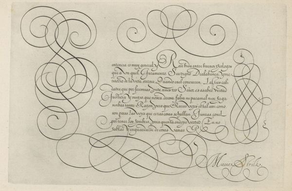
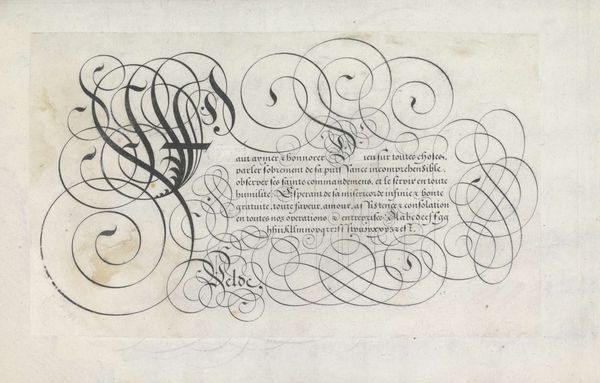
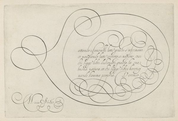
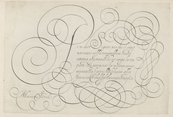
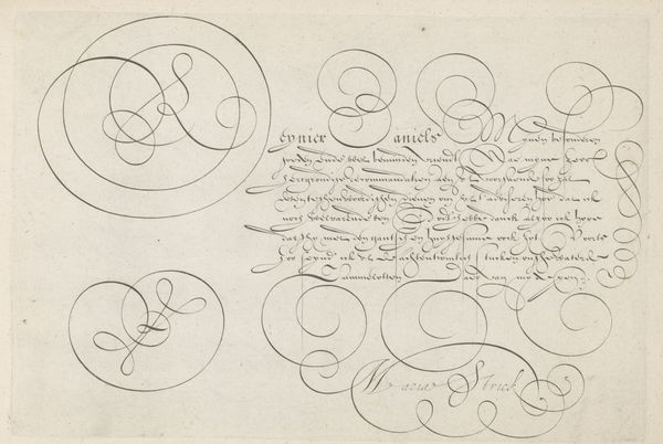
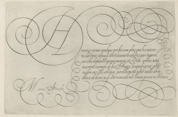
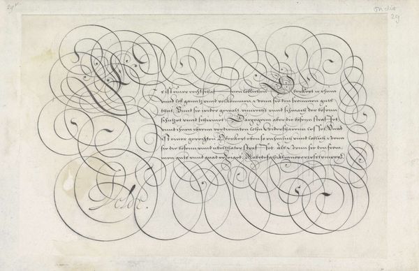
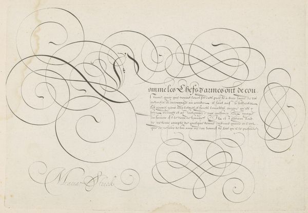
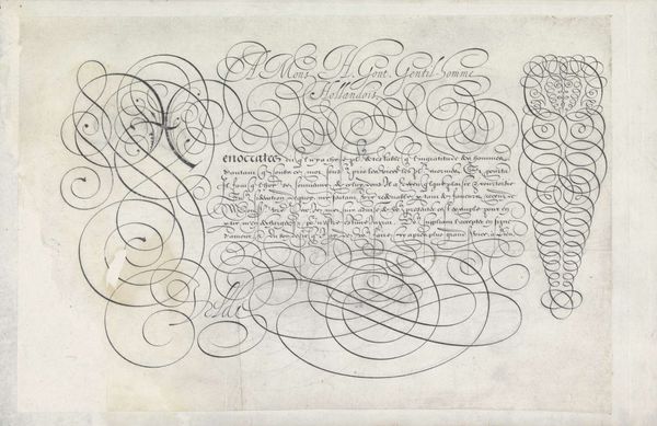
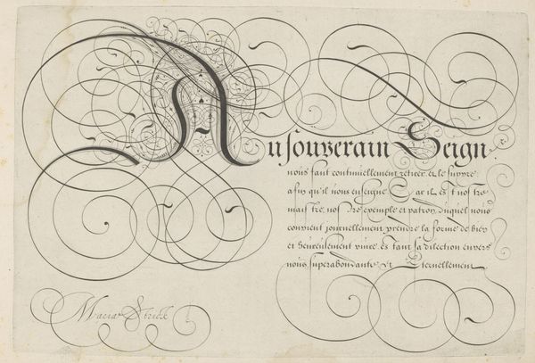
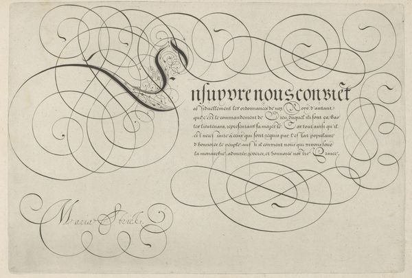
Editor: This drawing, "Schrijfvoorbeeld met kapitaal F," dating back to 1618, is attributed to Hans Strick. It is crafted with ink and engraving. It’s quite striking, a beautiful example of calligraphy. I am particularly curious about how one would read or interpret a work of art such as this. Curator: Ah yes, this piece is a wonderful example of the power imbued in written symbols. Observe how the artist presents a duality; the grand “F” competes with what I can only presume are French phrases for our attention. This capital "F," so boldly presented, becomes a vessel for the symbolic power of language, tradition, and identity. Editor: So it's not just decorative? Curator: Absolutely not! Consider the flourishing lines. They represent far more than mere decoration. They carry the emotional and cultural weight of communication, skill, tradition, societal status and literacy in general. In the early 17th century, ornate script signaled wealth and influence. Editor: I see… so someone seeing this at the time, would have understood it quite differently to someone like me viewing it today? Curator: Precisely! The layers of cultural understanding deepen the symbolic power embedded in the image. The graceful, rhythmic curves, the carefully constructed letterforms...they speak to a cultural memory that continues to resonate, even if unconsciously. Editor: So it’s like, visual poetry, hinting at something more? Curator: Exactly. It reveals connections between intention, skill, language and memory. And these interconnections make it so much more meaningful than pure decoration! Editor: Fascinating! I will be sure to notice more, now.
Comments
No comments
Be the first to comment and join the conversation on the ultimate creative platform.
More like this