print, etching, engraving
#
aged paper
#
toned paper
#
baroque
# print
#
pen sketch
#
etching
#
sketch book
#
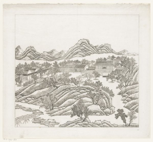
landscape
#
etching
#
personal sketchbook
#
pen-ink sketch
#
pen work
#
sketchbook drawing
#
sketchbook art
#
engraving
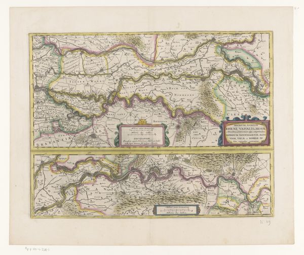
Dimensions: height 1200 mm, width 1520 mm
Copyright: Rijks Museum: Open Domain
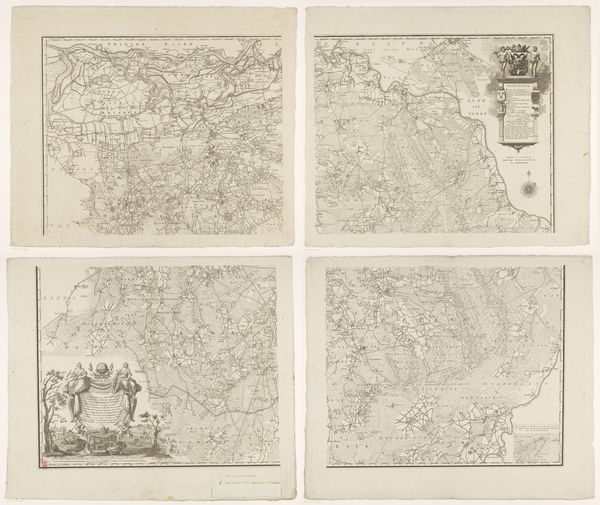
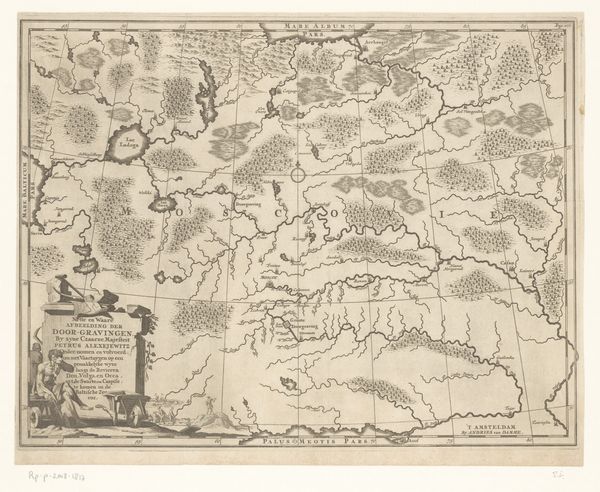
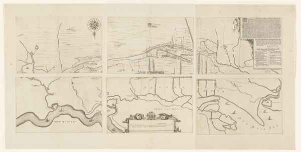
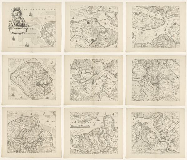
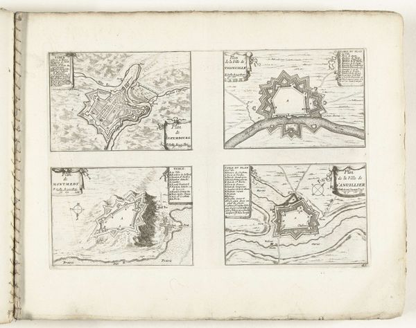
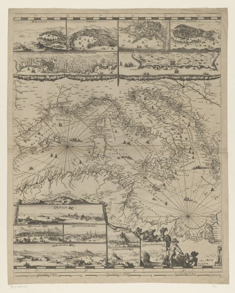
Curator: Immediately striking is the impression of age – the toned paper and the precise lines of this set of four prints gives them an aura of antiquity. What are we looking at? Editor: This is "Vierdelige kaart van Zwitserland," a four-part map of Switzerland created by Emanuel Schalch around 1712. It’s an etching, with pen and ink work evident in the detailing. The paper's age adds a layer of history, doesn’t it? Makes you consider the conditions in which it was created and consumed. Curator: It does. The map appears during the Baroque period. How might this influence our understanding of Swiss identity and power relations in the early 18th century? Maps were, and continue to be, incredibly effective political tools. Editor: Absolutely. Baroque art, with its dramatic flair and emphasis on detail, served as a visual language for expressing authority. Schalch's precise etching certainly emphasizes Swiss control, portraying it with clarity and a level of detail, against external threats. Consider, for instance, how territories and settlements are marked and given hierarchical significance in the way the settlements are depicted. Curator: And the strategic placement of resources and infrastructure would underscore its strategic importance in early modern Europe, both politically and economically. Are those annotations and tiny pictorial scenes I'm seeing as well? What stories are they attempting to communicate? Editor: Yes, the landscapes bordering the central mapped terrain is detailed and illustrative, showing a romantic vision of rurality but one clearly juxtaposed to, if not enabled by, industry in other scenes. The cartouches contain narratives themselves, so they function much more as complex pieces of political propaganda beyond mere geographic orientation. The map seems intended for the rising Swiss mercantile class and elites invested in regional power structures. Curator: Interesting. Given Switzerland's neutrality, the map seems less an instrument of direct aggression, and more an expression of nation building through clear, symbolic boundary-making. Did this contribute to ideas about Swiss distinctiveness from its neighbours? Editor: I'd argue so. It visually establishes what Swiss territory is, what it contains, and what its unique attributes are as understood in the cultural context of the time. I wonder, what kind of reception would this artwork have had in regions bordering Switzerland at this point in time? How would a work such as this complicate relations of Swiss people and their regional neighbors? Curator: I'm now pondering the power and potential violence embedded even in cartography, especially when presented with such careful artistry. Editor: Agreed. Maps always reflect a specific agenda and worldview. Thank you for that brilliant point, I did not quite reflect on the map's engagement within asymmetrical relations with its neighbors. Curator: A privilege to exchange perspectives on this complex representation of power.
Comments
No comments
Be the first to comment and join the conversation on the ultimate creative platform.
More like this