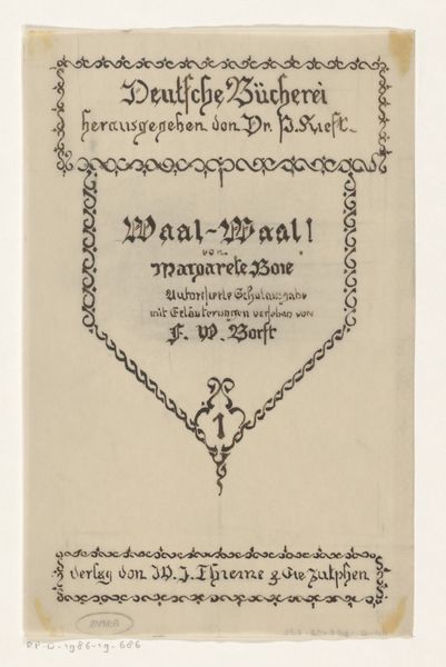
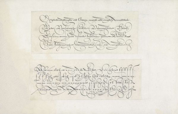
Letterontwerp voor: Margarete Boie, Waal - Waal! Das leben eines Sylter Grönlandfährers, 1942 before 1942
0:00
0:00
drawing, paper, typography, ink
#
drawing
#
aged paper
#
hand-lettering
#
hand drawn type
#
hand lettering
#
paper
#
typography
#
ink
#
hand-drawn typeface
#
fading type
#
thick font
#
handwritten font
#
golden font
#
small lettering
Dimensions: height 60 mm, width 128 mm
Copyright: Rijks Museum: Open Domain
This is a letter design made by Reinier Willem Petrus de Vries, sometime around 1942. It’s for a book by Margarete Boie, and what strikes me is how the artist approaches the lettering, which is so confident and crisp, the kind of graphic design that really pops. There’s a real physical presence to the strokes of ink that make up the lettering – you can imagine the hand moving across the page with such precision. The black ink sits bold against the cream of the paper. It's not just about the words themselves, but the very feel of how they are presented; those sharp lines and angles convey so much energy. Look closely at the ornate ‘W’s, there’s a real drama and personality to them. The German Expressionist woodcuts of the early 20th century come to mind, the way they also used strong, dark lines to make an impact. In the end, art is about communication and making connections, even if it’s just a feeling you get when you look at something.
Comments
No comments
Be the first to comment and join the conversation on the ultimate creative platform.
More like this