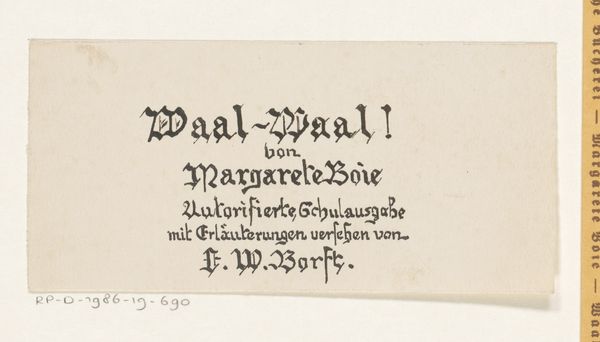
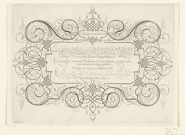
Bandontwerp voor: Margarete Boie, Waal - Waal! Das leben eines Sylter Grönlandfährers, 1942 before 1942
0:00
0:00
drawing, graphic-art, typography, ink, poster
#
drawing
#
graphic-art
#
pen sketch
#
old engraving style
#
hand drawn type
#
personal sketchbook
#
typography
#
ink
#
ink drawing experimentation
#
pen-ink sketch
#
ink colored
#
pen work
#
sketchbook drawing
#
poster
#
sketchbook art
Dimensions: height 197 mm, width 126 mm
Copyright: Rijks Museum: Open Domain
Reinier Willem Petrus de Vries made this book cover design for Margarete Boie's "Waal - Waal!" in 1942, probably using ink on paper. The lettering is quite stylized, almost like it’s been built from lots of little decorative motifs. The title sits inside a frame, and that frame has a kind of hand-made feel, a bit irregular, which gives the whole thing a cool, human touch. Look at that flourish below the number 1, it's almost playful. I love how the dense black ink contrasts with the off-white paper, creating a stark, graphic feel. It's kind of got this old-world vibe mixed with something modern, which I think is super interesting. It reminds me of some of Paul Klee’s more graphic works, that same kind of playful experimentation with form. Art isn’t just about pretty pictures, it’s about ideas, and the conversation between artists across time. And sometimes, it’s just about making something that feels good to look at.
Comments
No comments
Be the first to comment and join the conversation on the ultimate creative platform.
More like this