drawing, paper, ink
#
portrait
#
drawing
#
script typography
#
hand-lettering
#
baroque
#
hand drawn type
#
hand lettering
#
paper
#
ink
#
hand-drawn typeface
#
fading type
#
stylized text
#
thick font
#
typography style
#
calligraphy
#
small lettering
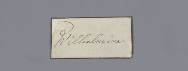
Dimensions: height 2.9 cm, width 8.4 cm
Copyright: Rijks Museum: Open Domain
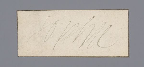
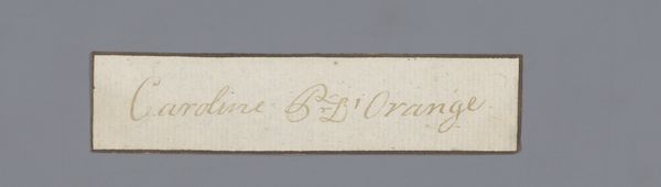
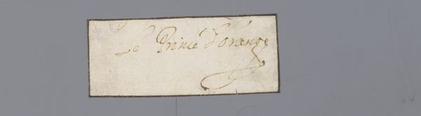
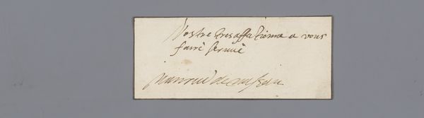
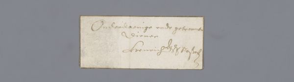
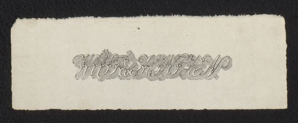
Curator: This artwork, simply titled "Document," dates to the period between 1650 and 1700. It’s a drawing rendered in ink on paper and currently held in the Rijksmuseum’s collection. The name, "Maria Princess of Orange," is rendered in an elegant hand. Editor: There's a certain…fragility to it. The paper looks almost translucent, and the sepia ink creates a sense of delicate antiquity. The lettering itself, despite its flourishes, feels intentionally restrained. Curator: The restraint likely speaks to the subject and the function of the piece. This document features the name of Maria, Princess of Orange, a significant figure in Dutch and later British history. It likely served as an official notation, perhaps attached to a more substantial document. These scripted letterings were a kind of announcement. Editor: I see how the placement of the words balances a top-heavy weight. There's an interesting contrast in the thick strokes versus thinner curves. Curator: The style points towards a fascinating tension of Maria’s position as a woman in power and influence during this baroque era. A kind of Baroque calligraphy that would reflect that in its formality and design. The artwork serves almost as a sign of political theater in the Dutch golden age. Editor: You see, for me the emphasis on "thick" versus "thin" speaks of hierarchy but without grandeur, more emphasis on the actual letter-making craft than say some deep message or hidden context. Curator: Right, it's tempting to see these items merely as signatures in the age before industrialised mass printings, when calligraphy still held importance to official affairs, reflecting someone of nobility and of the highest echelons. It could almost serve as the historical counterpart to what brands signify in this era of social media. Editor: Ultimately, this careful design allows one to truly think of this "document" from centuries ago. It evokes its social station while simultaneously emphasizing craft and purpose in terms of graphic balance. Curator: Precisely, and appreciating its historical context enhances our understanding. We view beyond its immediate aesthetics and more into its meaning. Editor: But close study of technique then allows those insights. What appears simple truly is quite multilayered afterall.
Comments
No comments
Be the first to comment and join the conversation on the ultimate creative platform.
More like this