About this artwork
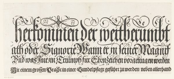
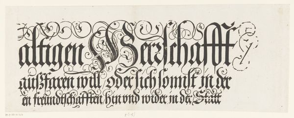
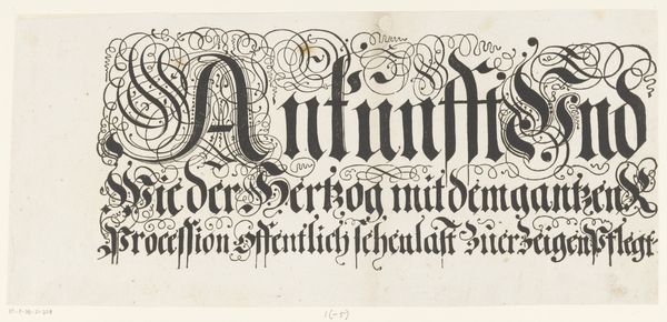
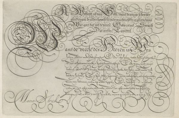
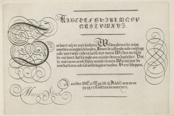
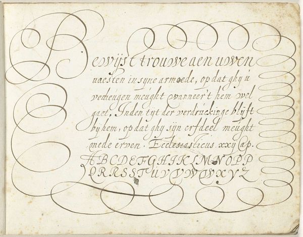
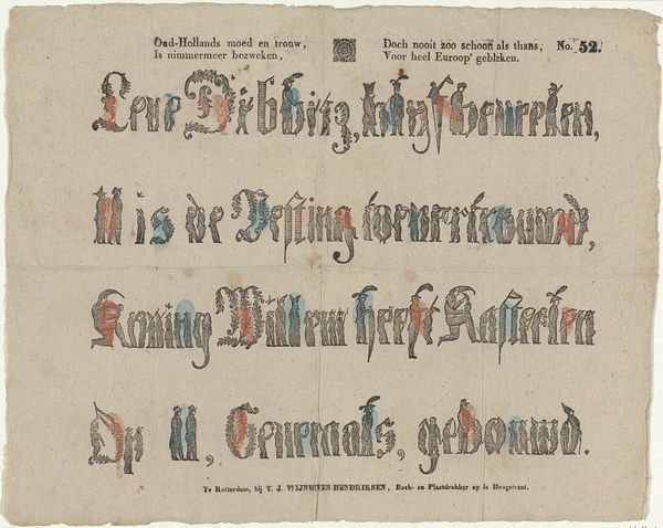
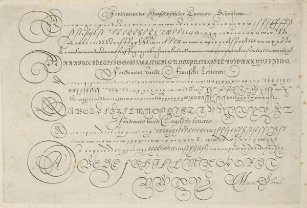
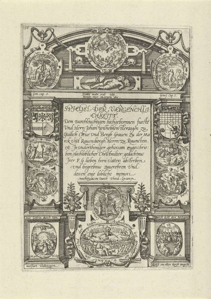
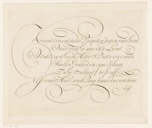
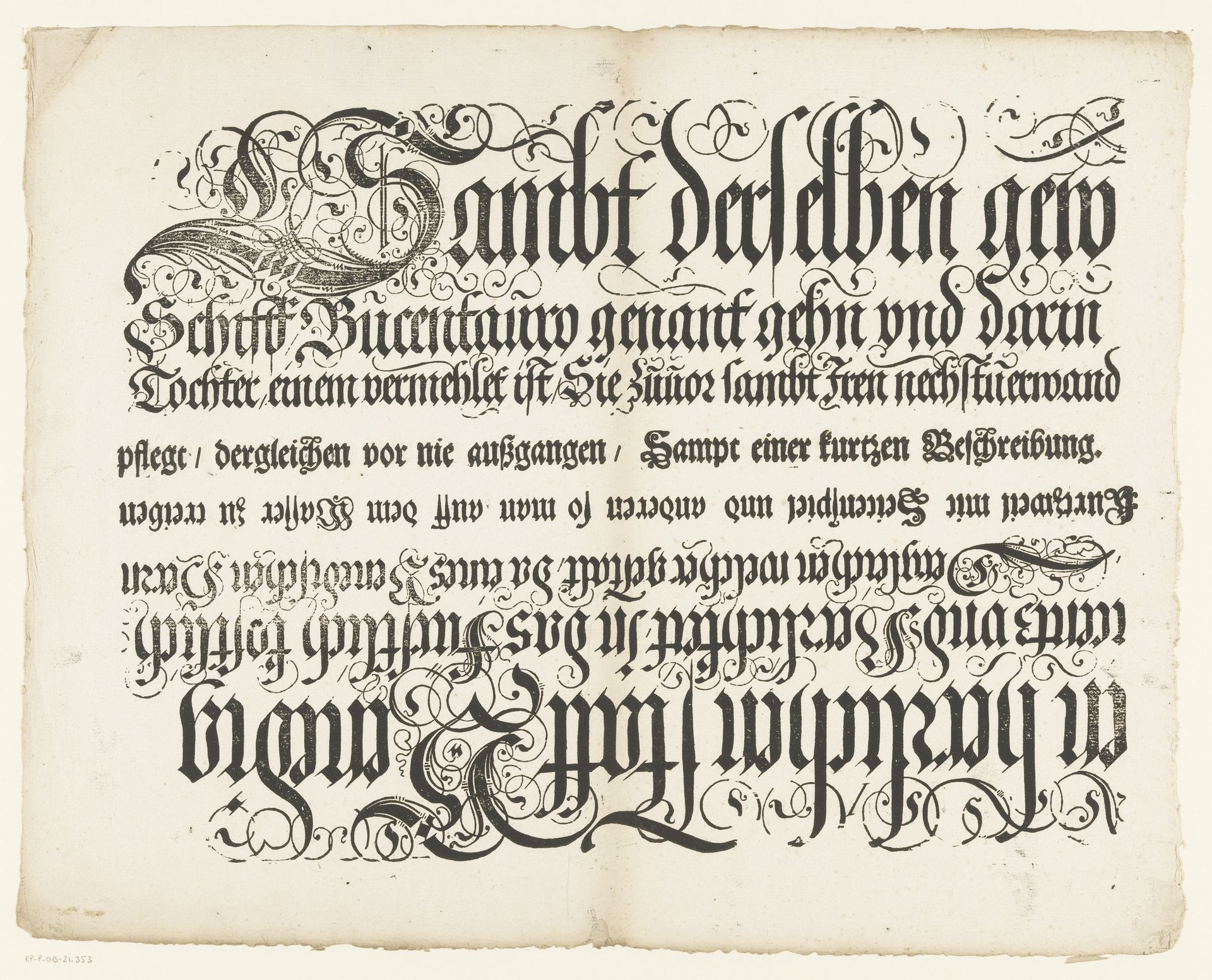
This calligraphic work, *Titel van de Festa della Sensa*, was created by Jost Amman in the late 16th century. The dense black lettering against the off-white paper immediately strikes us with its rhythmic and decorative intensity. The bold, angular letterforms are intertwined with delicate flourishes, creating a visual dance between structure and ornamentation. This piece exemplifies the intersection of form and function. Amman's choice of black ink emphasizes the visual weight of the text, drawing our eyes into the intricate details of each character. The composition follows a structured layout, yet the calligraphic style introduces an element of fluidity and expressiveness. The work functions as both a textual document and a visual artifact, inviting us to contemplate the relationship between language and aesthetics. It destabilizes the notion of fixed meaning by presenting text as a dynamic, evolving form. This challenges the static conventions of typography.
Titel van de Festa della Sensa (derde en vierde gedeelte)
1697
Jost Amman
1539 - 1591Location
RijksmuseumArtwork details
- Medium
- graphic-art, print, engraving
- Dimensions
- height 283 mm, width 375 mm, height 345 mm, width 430 mm
- Location
- Rijksmuseum
- Copyright
- Rijks Museum: Open Domain
Tags
Comments
Share your thoughts
About this artwork
This calligraphic work, *Titel van de Festa della Sensa*, was created by Jost Amman in the late 16th century. The dense black lettering against the off-white paper immediately strikes us with its rhythmic and decorative intensity. The bold, angular letterforms are intertwined with delicate flourishes, creating a visual dance between structure and ornamentation. This piece exemplifies the intersection of form and function. Amman's choice of black ink emphasizes the visual weight of the text, drawing our eyes into the intricate details of each character. The composition follows a structured layout, yet the calligraphic style introduces an element of fluidity and expressiveness. The work functions as both a textual document and a visual artifact, inviting us to contemplate the relationship between language and aesthetics. It destabilizes the notion of fixed meaning by presenting text as a dynamic, evolving form. This challenges the static conventions of typography.
Comments
Share your thoughts