graphic-art, lithograph, print, typography, engraving
#
portrait
#
graphic-art
#
lithograph
# print
#
old engraving style
#
traditional illustration
#
typography
#
pen work
#
sketchbook drawing
#
cityscape
#
decorative-art
#
sketchbook art
#
engraving
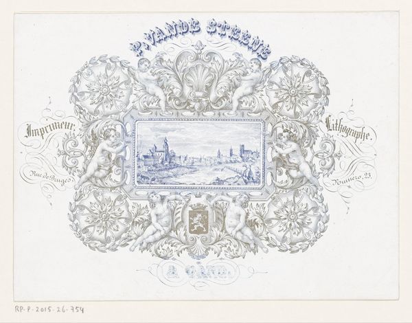
Dimensions: height 137 mm, width 179 mm
Copyright: Rijks Museum: Open Domain
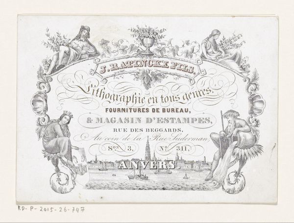
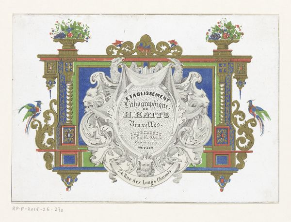
Editor: Here we have "Visitekaartje van drukkerij J. Delfosse te Brussel," a business card print made by J. Delfosse sometime in the mid-19th century using lithography and engraving techniques. The symmetrical design gives it a formal air, like an official document. What strikes you about the piece? Curator: Formally, I observe a meticulous interplay between the micro and macro levels. Consider the cityscape, rendered with remarkable precision. It sits above and almost apart from the primary textual content, yet they both share similar linear elements in the bordering ornamentation. Do you notice how the typography's flourish is echoed in the decorative scrollwork? The eye is encouraged to wander, discovering subtle parallels. Editor: Yes, now that you mention it, there is definitely a calligraphic quality to the ornamentation and text that creates unity. What about the heraldic imagery at the bottom? Curator: Indeed. Its symmetrical placement grounds the entire composition, creating a visual anchor that complements the aerial perspective above. Consider its internal components – the shield, the crown, the suggestion of support. What relationships do these bear to each other, and to the piece as a whole? Editor: The elements within that bottom section appear separate yet carefully balanced...almost mirroring the relationship between the city view and the lettering. It’s fascinating how formal constraints can generate these resonances. Curator: Precisely. By examining the structured elements—typography, illustration, heraldry, arrangement—we can appreciate how this modest business card operates on several visual registers simultaneously. It speaks to the capabilities of the printing house in subtle but effective ways. Editor: I’ve definitely gained a greater appreciation for how all of the individual elements come together as a whole.
Comments
No comments
Be the first to comment and join the conversation on the ultimate creative platform.
More like this