drawing, paper, ink
#
drawing
#
paper
#
11_renaissance
#
ink
#
calligraphy
Dimensions: height 120 mm, width 272 mm, height 227 mm, width 345 mm
Copyright: Rijks Museum: Open Domain
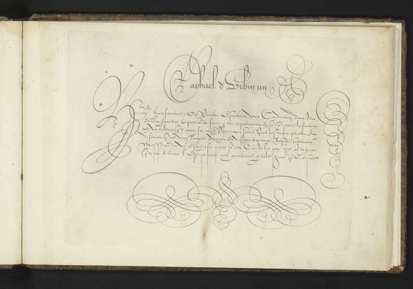
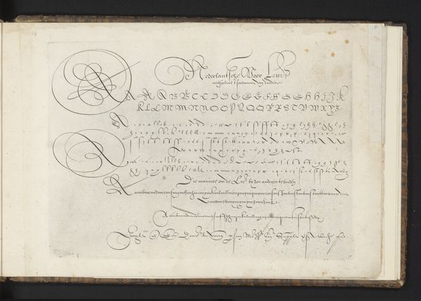
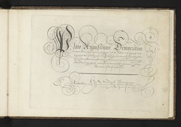
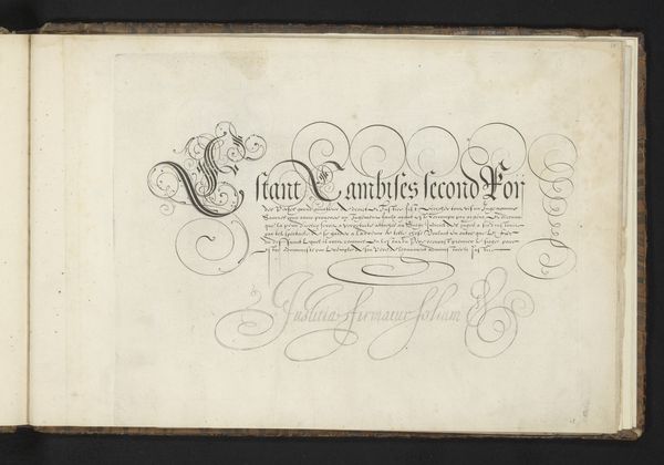
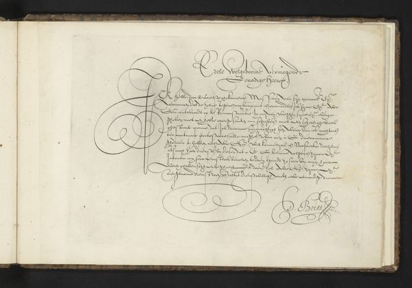
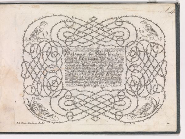
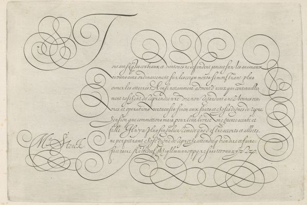
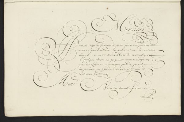
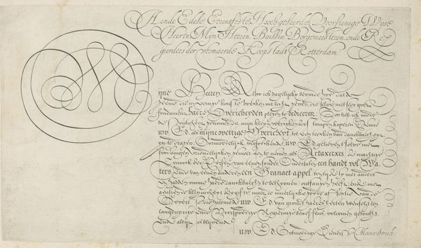
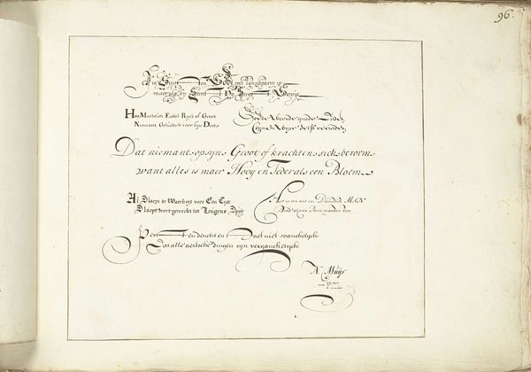
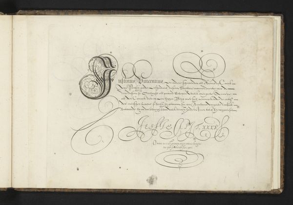
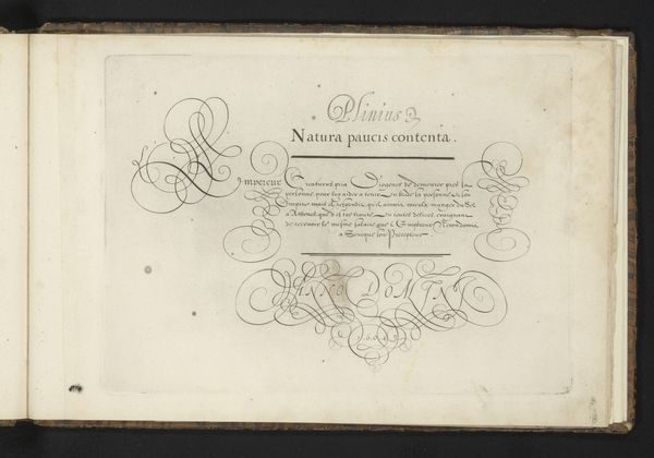
Curator: Here we have “Schrijfvoorbeeld: Nil penna sed usus,” a pen and ink drawing on paper completed in 1605 by Cornelis Dircksz. Boissens. My immediate reaction is to the intricacy of the lettering. Editor: Absolutely, I'm struck by how formalized and deliberate each flourish is. The script dances across the page. There's a rigidity and control alongside beauty that I'm drawn to. Curator: The artist was a writing master in his day, which gives historical context to the precision evident here. These meticulously executed examples served as models, teaching correct letterforms and the art of composition to students in the Netherlands. It served a critical role in civic and mercantile life. Editor: It’s tempting to see a bit of hierarchy embedded here as well, beyond just “instruction.” Writing itself was a political act, even then. Standardized documents and contracts solidify power structures, particularly for merchants and governing bodies. The mastery showcased in the lettering is a direct manifestation of power. The image demands its viewer not just look, but read - engaging with it on both textual and symbolic levels. The calligraphy itself communicates status. Curator: I concur entirely, it mirrors the structured societal frameworks of the time. Consider how printed works became standardized, making handwriting less personal but perhaps more universally comprehensible. This specific piece, in its artistic beauty, transcends functional utility. It exists as a beautiful demonstration of an ideal. Editor: In its aesthetic form, I feel we are led to consider legibility itself as another layer of privilege, no? Who had access to learning how to create or decipher these calligraphic forms? This piece thus engages with broader questions about access to education and its effect on social and economic opportunity in the 17th century. Curator: I think it does indeed give us pause, pushing us to acknowledge those inequalities. Its survival is itself a reflection of those power structures. So we are left contemplating not just craftsmanship but the sociopolitical contexts surrounding even the most beautiful letterform. Editor: Exactly, Cornelis Dircksz. Boissens’ creation goes beyond the aesthetic appeal. For me, it’s an encapsulation of an era—beautiful, powerful, and complicated all at once.
Comments
No comments
Be the first to comment and join the conversation on the ultimate creative platform.
More like this