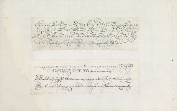
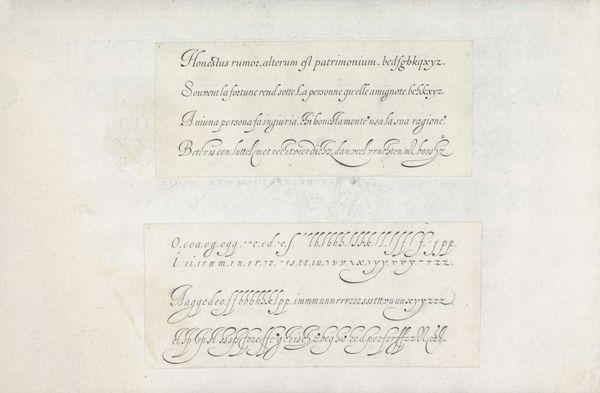
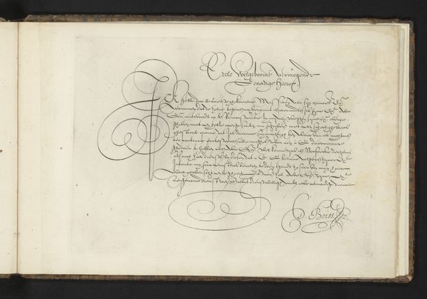
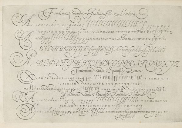
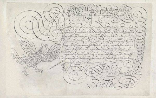
Twee ontwerpen van schrijfvoorbeelden: de bastarde en de Nederlandse lopende letter 1605
0:00
0:00
janvandeveldei
Rijksmuseum
drawing, graphic-art, paper, ink
#
drawing
#
graphic-art
#
paper
#
ink
#
calligraphy
Dimensions: height 79 mm, width 198 mm, height 76 mm, width 209 mm
Copyright: Rijks Museum: Open Domain
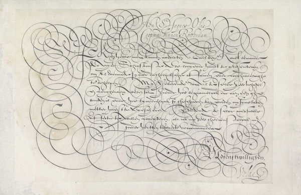
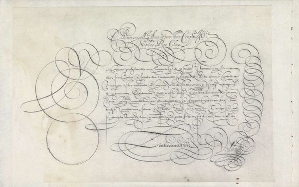
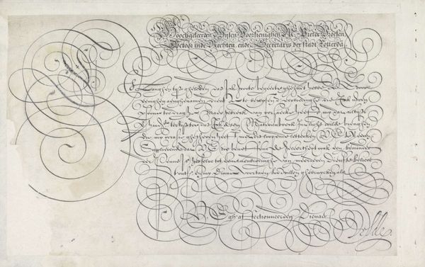
Curator: Here at the Rijksmuseum, we're standing before a drawing by Jan van de Velde I from 1605. It's titled "Twee ontwerpen van schrijfvoorbeelden: de bastarde en de Nederlandse lopende letter"—Two Designs of Writing Examples: the Bastarde and the Dutch Running Script. Executed in ink on paper, it showcases different calligraphic styles. Editor: Wow. It looks like elaborate vines reaching out, almost as if language itself is growing, flourishing on the page. Intricate but disciplined—I sense a kind of controlled energy here, a dance of order and ornamentation. Curator: That's an astute observation. Calligraphy in the 17th century wasn't just about conveying information; it was about projecting status and education. The Bastarde, with its French origins, was favored in diplomatic circles, while the Dutch running script was more commonly used for administrative tasks. So, these are visual tools for distinct social spheres. Editor: Like codes! Each flourish and loop signaling your affiliation, your role in society. You had to literally write your way into a particular club. And looking at the two scripts, they're visually distinct—the top one feels airier, more flamboyant. The second feels a little more grounded. Curator: Precisely. This reflects not just aesthetic choices, but also the functions the writing would serve. It also relates to the politics of imagery. The Dutch Republic was establishing its own identity, and the embrace of a particular script was another way to express their cultural independence. Editor: It makes me wonder how much personal expression was really allowed in this craft. Did calligraphers find ways to sneak in a bit of themselves into these formalized styles? I like to imagine them rebelling with a slightly elongated loop, or an extra flick of the wrist. Curator: A good question. I’m afraid surviving documentation does not reveal such personal details in individual pieces. We do know that mastering these scripts was a rigorous, lengthy process. Scribes took pride in their technical abilities but would, in fact, sign these artworks. The act of signing certainly shows their personal pride in craft. Editor: So, what initially looked like rigid formality has these fascinating social currents beneath the surface. It gives you a whole new perspective to something as seemingly simple as handwriting! I feel like I want to start learning calligraphy now...or at least doodle with a fountain pen. Curator: Well, let’s conclude here. These ‘Writing Examples’ of Jan van de Velde's offers more than a peek into the history of calligraphy and demonstrates how something like handwriting can speak volumes about culture, class and political intentions of 17th century society.
Comments
No comments
Be the first to comment and join the conversation on the ultimate creative platform.
More like this