print, paper, engraving
#
baroque
# print
#
paper
#
engraving
Dimensions: height 511 mm, width 578 mm
Copyright: Rijks Museum: Open Domain
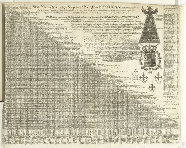
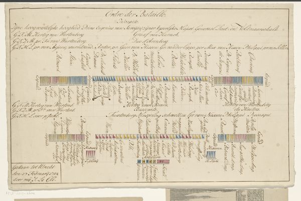
Curator: We’re looking at "Afstandentabel voor Spanje en Portugal", a distance table for Spain and Portugal dating back to between 1685 and 1725, crafted by Abraham Allard. It is currently held at the Rijksmuseum. It’s an engraving printed on paper. Editor: My first impression is… organized chaos! It's fascinating, almost hypnotic. The linear structure fighting against the baroque details creates such dynamic tension. Curator: Exactly! Let's unpack that structure. The grid-like composition dominates, a near-mathematical representation of distances, emphasized by alternating pastel stripes. It’s visually rigid and practical, almost betraying its supposed artistic status. Editor: Yet, consider the upper-right area. The complex, stacked heraldry crowned with the Habsburg double eagle suggests immense imperial power and a layered history, right? It tells me volumes about ambitions, territories claimed, the very air of authority the empire projected. Curator: True, the symbols load this map with significance beyond mere distances. Observe the interplay between the linear precision of the table and the exuberant, almost unruly heraldic design. The composition becomes a dialectic, structure versus symbol, calculation against cultural weight. Editor: I find myself drawn to those crosses at the lower right of the coat of arms—visual anchors with spiritual as well as historical resonance. They conjure the fervor of crusades, and the idea of Christianity at the very core of national identity in Iberia at that moment. It really sets the scene and the emotional context for such calculated expansion of geographical control. Curator: The execution, too, heightens the contrasts: fine lines etching calculated measurements versus the dense crosshatching that gives body to the crest. It exemplifies the engraver's technical skill while enhancing the symbolic language that speaks to power, distance, and religious certainty. Editor: And the choice of pastels—muted pinks and greens, ochre yellows, even—instead of harsher, brighter colors further adds another layer to the mood. There is an almost wistful gentleness about the vision—the image seems almost aged or antique when the political energy behind expansion would have likely felt very stark indeed. Curator: Precisely, this aged aesthetic gives a touch of melancholic beauty. It's interesting how an ostensibly functional object transforms into a rich artistic statement through the details of composition and carefully chosen symbols. Editor: Agreed. Beyond geographical data, we uncover layers of meaning embedded in form, style, and the powerful language of visual motifs.
Comments
No comments
Be the first to comment and join the conversation on the ultimate creative platform.
More like this