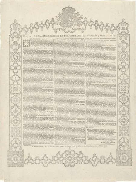
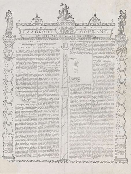
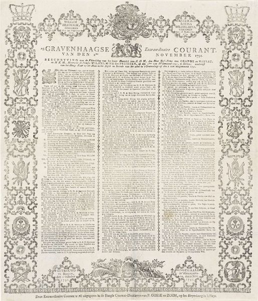
Extra editie van de 's Gravenhaegse Vrijdagse Courant over de lijkstatie van prinses Anna, 1759 Possibly 1759
0:00
0:00
print, typography, engraving
#
baroque
#
dutch-golden-age
# print
#
old engraving style
#
typography
#
pen work
#
history-painting
#
engraving
Dimensions: height 470 mm, width 365 mm
Copyright: Rijks Museum: Open Domain
Curator: This print, believed to be from 1759, presents itself as a special edition of the "Gravenhaegse Vrijdagse Courant," detailing the funeral procession of Princess Anna. Editor: My immediate impression is one of solemnity. The dense typography and the ornate border create a very formal, almost claustrophobic, atmosphere. Curator: Precisely. As a historical document rendered in engraving, the print is fascinating for the layers of cultural symbolism embedded within it. News wasn't just reported, it was performed. Consider how the decorative cartouche and surrounding details elevate a routine broadside to an object for display and perhaps remembrance. Editor: Indeed. The heavy use of baroque-style ornamentation emphasizes the status of the deceased, Princess Anna. And the contrast of black ink against the paper generates dramatic chiaroscuro effects which convey a particular grandeur. Note, too, the rigid grid structure which both contains and conveys information efficiently. Curator: The typography, while dense, is meticulously arranged. Each column of text functions like a distinct chapter, almost a litany in visual form. The language utilized would have held immediate recognition for contemporaries, but may come across quite alien for today’s viewers. Editor: The visual language here reinforces hierarchical structures of power, wouldn’t you say? The composition, even in its minute details, seems concerned with solidifying societal roles and celebrating the elite through formalized, printed pronouncements. Curator: It also served as a powerful reminder of the monarch's mortality, invoking reflections on statecraft and succession. Consider the choice of imagery surrounding the inscription — they visually construct memory. Editor: The level of craftsmanship for something intended for mass consumption is remarkable, though. From a formal perspective, this speaks volumes about the cultural value assigned to graphic communication in 18th-century Dutch society. The overall effect is an intricate web of visual and textual elements, designed not merely to inform but to impress. Curator: A fascinating convergence of statecraft and artistic expression! By considering symbolic visual cues as a mirror reflecting both psychological and cultural attitudes toward governance and the memory of the deceased royal. Editor: Yes, a carefully structured artifact! It not only reveals an event of historical importance, but offers invaluable insight into social and cultural values of its time through its meticulous design and craftsmanship.
Comments
No comments
Be the first to comment and join the conversation on the ultimate creative platform.
More like this