drawing, print, ink, pen
#
drawing
# print
#
pen sketch
#
ink
#
pen
#
academic-art
#
decorative-art
#
calligraphy
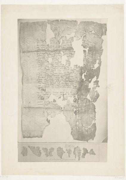
Dimensions: height 547 mm, width 430 mm
Copyright: Rijks Museum: Open Domain
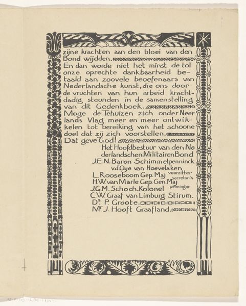
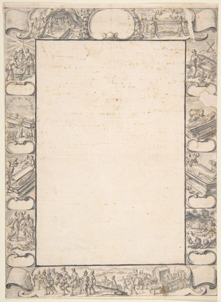
Curator: This print, dating back to 1899, is titled "Address of Homage Sent to the Tsar." Hübner & Van Santen Roeloffzen are credited with its creation using pen, ink, and print techniques. It has strong decorative elements and is academic in its style. What catches your eye? Editor: Honestly? The overwhelming sense of... formality. It’s meticulously ornate, but somehow feels sterile. Like a carefully scripted performance, not a heartfelt declaration. All those flourishes and calligraphic details, it feels like the intention is almost buried beneath the decoration. Curator: The piece offers a window into the intricate political and social landscape of the late 19th century. These formal addresses were not merely ceremonial. They represent a complex negotiation of power and identity. The use of French is indicative of the diplomatic circles, and we might also ask, who are the signatories and what interests do they represent? How does this reflect the Dutch perception of the Tsar and Russia? Editor: True. Seeing those crests and that rendering of what looks like a royal building gives a palpable sense of establishment and class. Almost like the signatures serve the function of validation to cement an idea rather than of an actual person who believes the contents of the document. I can't help but think of who didn't get to sign their name on that thing. Curator: Exactly, and that omission highlights the complex dynamics of inclusion and exclusion within societal structures. It prompts us to examine whose voices are amplified and whose are suppressed in historical narratives. Editor: It’s a gorgeous object, definitely skilled craftsmanship, but its beauty feels like a mask, hiding perhaps something a little colder, a little more calculated underneath. And what of today? Are we that different in our rituals? Do we just express it differently? Curator: Perhaps. Investigating objects like these prompts questions about authority, voice, and historical representation. These beautiful forms frequently encoded exclusive languages, often of domination and exclusion. Editor: Well, I will walk away looking at official things like letters from my bank with a new consideration. The loops and fonts always seemed so innocent before.
Comments
No comments
Be the first to comment and join the conversation on the ultimate creative platform.
More like this