drawing, print, ink, engraving
drawing
baroque
ink
geometric
line
cityscape
history-painting
engraving
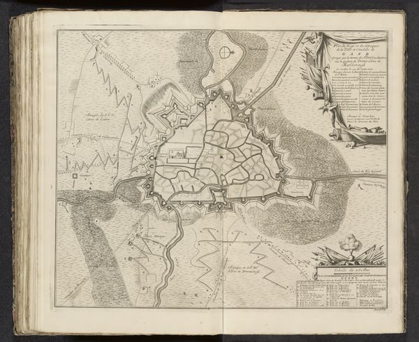
Dimensions: height 257 mm, width 305 mm
Copyright: Rijks Museum: Open Domain
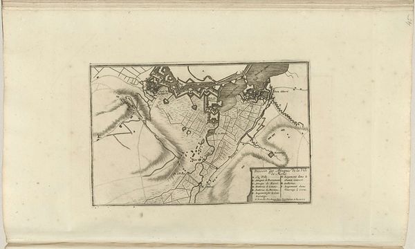
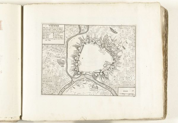
Curator: This print, titled “Kaart met de Geallieerde aanvallen op Douai, 1710,” or “Map of the Allied attacks on Douai, 1710,” comes to us from the skilled hand of Jacobus Harrewijn. It’s currently held in the Rijksmuseum. Editor: It strikes me as so cool, a meticulously rendered spiderweb of strategic intent, even with all its formality. Is that what Baroque maps felt like? The calm before the storm, plotted so precisely with pen and ink. Curator: Indeed. It offers an unusually precise birds-eye-view of the city of Douai under siege, showcasing the allied forces' attack strategy. Notice the stark lines depicting the city's fortifications and the detailed labeling— the "A, B, C's" noting different attack points. Harrewijn primarily worked with drawings, engravings, and ink… Editor: Those zig-zagging lines forming the outworks, remind me a little bit of fortifications in the mind – a person hedging bets against different psychological 'onslaughts'. Curator: It's fascinating that you draw parallels between military defense and psychological protection. I wonder, given the symbolic weight traditionally assigned to cities – embodiments of order, culture, civilization – what does Douai's siege map evoke? Is this map also meant to express Dutch mastery of terrain, even as a representation of conflict? Editor: Absolutely. Look at how the image contrasts between chaos and geometric precision. These lines – those meticulously inscribed trajectories – seem like such deliberate attempt to bring order to destruction and create understanding out of the chaos, don't they? Curator: Definitely! I agree. The detailed inscription describing the Prince of Orange's involvement and so forth… adds a layer of narrative depth. The use of line work reminds me that precision was essential in these representations… there’s a cool story behind the creation of this print too, the city's eventual capture…it carries echoes. Editor: Echoes of victory but also echoes of the human cost, translated through the graphic shorthand. I find myself considering not just the city under attack, but the weight of those decisions represented in each line. A powerful testament to the graphic vocabulary of power.
Comments
No comments
Be the first to comment and join the conversation on the ultimate creative platform.