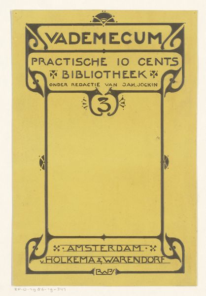
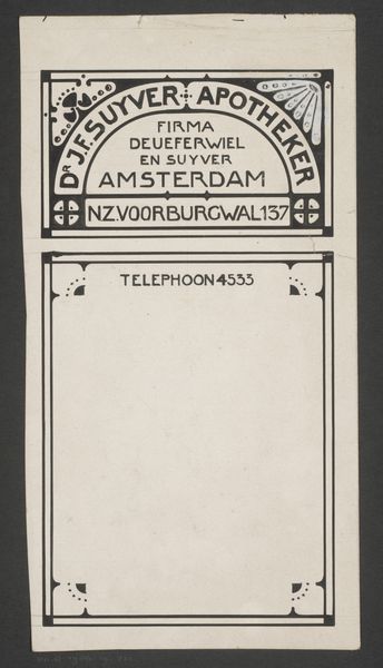
Omslagontwerp voor: Vademecum. Praktische 10 cents bibliotheek, 1903 1903
0:00
0:00
graphic-art, print, paper, typography, poster
#
graphic-art
#
aged paper
#
art-nouveau
# print
#
old engraving style
#
hand drawn type
#
paper
#
personal sketchbook
#
typography
#
fading type
#
thick font
#
golden font
#
poster
#
word imagery
#
historical font
#
columned text
Dimensions: height 327 mm, width 135 mm
Copyright: Rijks Museum: Open Domain
Curator: Let's examine this poster by Reinier Willem Petrus de Vries. Created in 1903, it's a design for the cover of a booklet in the "Practical 10 Cents Library" series. Editor: The aged paper really draws my eye first. It makes me think about how this wasn't some precious object, but cheap ephemera meant to be used and discarded. It has a certain honesty. Curator: Precisely! The low cost was the point; the series aimed to democratize knowledge. This connects to broader social movements, the push for accessible education, and the role of the publishing industry in shaping public opinion. Editor: And look at the typography! It is all meticulously hand-drawn, no doubt reproduced through some affordable printmaking technique, but each letter has incredible texture and weight. It emphasizes labor, both artistic and industrial. How many hands touched this object during production and distribution? Curator: The Art Nouveau style is a deliberate aesthetic choice. Its flowing lines and decorative elements, though often associated with luxury, were being adapted here for mass consumption. De Vries is clearly trying to elevate the everyday. Editor: Yes, the materiality speaks volumes about its intended audience and purpose. This isn't fine art intended for the elite; it’s about making culture available to a broader public. And in this goal it uses a cheap format. Curator: It prompts a wider investigation, doesn't it? What impact did these affordable publications have? How did they shape Dutch cultural identity at the turn of the century? How do images of the past come to bear on the present moment? Editor: Absolutely. I think the raw quality makes this poster really compelling. You understand the constraints of production and the aspiration behind the printed matter which is beautiful. Curator: Thinking about the socio-political context gives a different dimension to the image; thank you for helping me contextualize it with that mindset! Editor: It gives it resonance and feeling!
Comments
No comments
Be the first to comment and join the conversation on the ultimate creative platform.
More like this