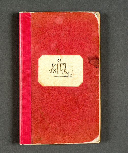
Menu voor de maaltijd in het Carlton Hotel bij de opening van de Nieuwe Sluis te IJmuiden before 1934
0:00
0:00
graphic-art, typography, poster
#
art-deco
#
graphic-art
#
typography
#
geometric
#
poster
#
calligraphy
Dimensions: height 230 mm, width 118 mm, width 236 mm
Copyright: Rijks Museum: Open Domain
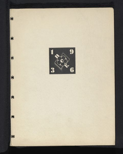
This is a menu for a meal, made in 1930 in the Netherlands, most likely printed using a letterpress. I love that the maker is anonymous – or, more likely, one of many. All those people who collaborate to make an image or object! Anyway, the color palette is so limited: creams, reds, browns. The shapes are blocks and bars. But there’s also this heraldic crest, these lions balancing a shield, where everything is reduced to its most minimal form. I’d love to see these forms translated into a painting, into something less functional. Look at the way the text is stacked, justified, how those thick bars act like punctuation. In a way, this is all about the material aspects of paper, and ink, and the careful placement of images and words. I always think about El Lissitzky when I see things like this – and of course, the whole history of the Bauhaus. But, really, this menu is a reminder that art isn’t just high art. It’s an ongoing conversation, happening everywhere, all the time.
Comments
No comments
Be the first to comment and join the conversation on the ultimate creative platform.
More like this