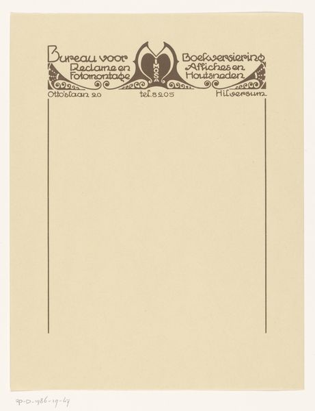
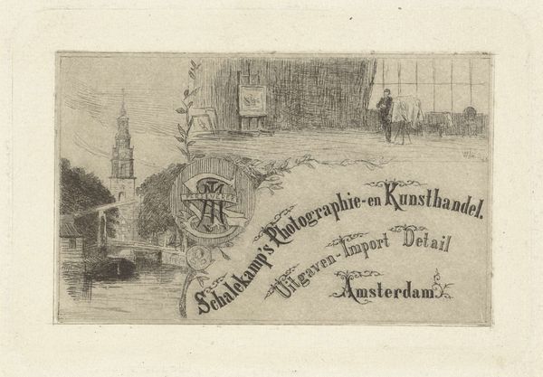
Ontwerp voor een rekeningblaadje van Dr. J.F. Suyver, apotheker te Amsterdam 1884 - 1952
drawing, graphic-art, print, paper, typography, poster
drawing
graphic-art
art-nouveau
paper
typography
poster
Dimensions: height 229 mm, width 120 mm
Copyright: Rijks Museum: Open Domain
Curator: I’m drawn to the clean lines; there’s an almost sterile quality to it, fitting for an apothecary's receipt. Editor: Today, we're looking at “Ontwerp voor een rekeningblaadje van Dr. J.F. Suyver, apotheker te Amsterdam”—or "Design for a billhead for Dr. J.F. Suyver, pharmacist in Amsterdam"—a print and drawing created sometime between 1884 and 1952 by Reinier Willem Petrus de Vries. Curator: The black ink on paper, that stark contrast... It’s functional art. A receipt. You have this highly ornamented typeface, yet the core intention is purely commercial. What statement can we make about commercial art of this kind? What type of paper was commonly used? Editor: Well, consider Art Nouveau's democratizing impulse—it aimed to elevate craft, making aesthetic beauty a part of everyday life, even in commerce. This isn't just about pushing a product; it's about infusing daily transactions with artistry. Think about the context: emerging industrialization and growing consumer culture. Curator: So you are talking about its materiality. The very design suggests that it could be made en masse with relative ease for its time? Editor: Absolutely, look at the efficient, repetitive use of graphic elements. But who was Dr. Suyver? What community did they serve? What can a billhead tell us about the social relations embedded in healthcare at the time? Also, consider its audience. This design signals a certain class, appealing to a desire for refinement and trustworthiness. Curator: It is so striking because everything needed to create this artwork would have to come together so perfectly—artisanal typeface creation and then high-speed manufacturing processes capable of printing in such high quality. It feels almost transitional. Editor: Precisely! A small object revealing major shifts in society, technology, and even aesthetics! We might think about advertising’s growing influence, then, and this attempt to brand healthcare, aligning medicine with sophistication. Curator: Thinking about its method of production alongside this piece has expanded my perspective considerably, making it more than just a design. Editor: Yes, a mundane bill transformed into a small window into a world of shifting values. It goes to show just how rich, complex, and meaningful art can be!
Comments
No comments
Be the first to comment and join the conversation on the ultimate creative platform.