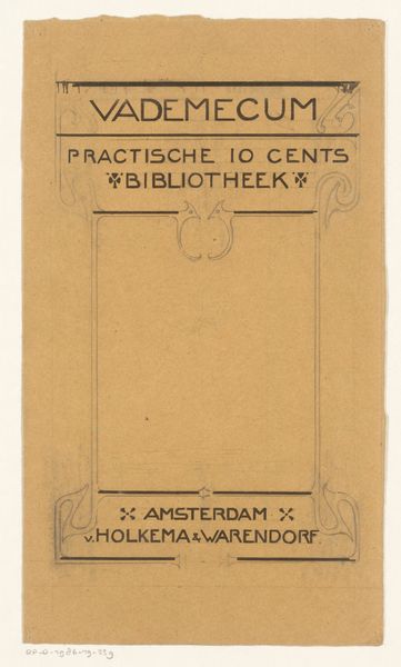
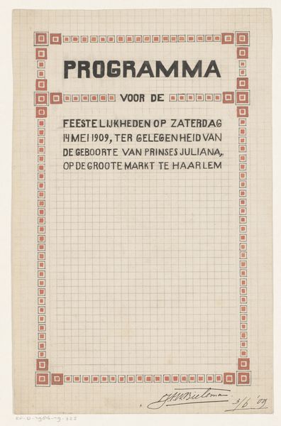
Omslagontwerp voor: Vademecum. Praktische 10 cents bibliotheek, 1903 1903
0:00
0:00
graphic-art, typography, poster
#
graphic-art
#
art-nouveau
#
typography
#
decorative-art
#
poster
Dimensions: height 196 mm, width 133 mm
Copyright: Rijks Museum: Open Domain
Curator: Looking at this design, the first thing that jumps out is how much the black ink pops against that golden yellow background. It almost hums, doesn’t it? Editor: It does. It's very bold, almost brassy. It feels self-assured, like it's got a story to tell, even though it's just a cover. Curator: Absolutely! What we’re observing here is a book cover designed by Reinier Willem Petrus de Vries around 1903 for a publication titled "Vademecum. Praktische 10 cents bibliotheek”. So, a guide of some sort, part of a practical 10-cent library. Editor: Oh, interesting. The Art Nouveau flourishes, very stylized and curvy, around what seems like an empty central field creates a visual tension, almost like the title and borders are straining to contain…nothing. A void, if you will. What was the idea behind leaving the centre field blank, do you think? Curator: That’s a brilliant observation! My thinking here, as this is meant for practical everyday use, the space could be left for the prospective buyer to jot down personal notes or thoughts to enrich the experience provided by "Vademecum", especially with a series on such broad topic like practicality! Editor: I love that interpretation! It transforms the book into an active tool rather than just a passive vessel for information. Did "Vademecum" library focus more on the written material, rather than artistic impressions like the book cover? Curator: Yes. Here, the decorative impulse is entirely invested in the framing elements. And note how the publisher information, Amsterdam, Holkema & Warendorf, is almost an afterthought. It's cleverly tucked in, just the bare minimum, isn't it? Editor: Almost rebellious, which given the artistic license is great! I love it! Curator: Exactly! All elements, the choice of decorative style, typography, overall boldness, add up to a surprisingly evocative package, promising utility without sacrificing visual intrigue, something from the early 1900s that stands well nowadays too! Editor: Absolutely. It definitely piques your interest. After this chat, I'm curious what hidden practical nuggets that "Vademecum" holds in its collection.
Comments
No comments
Be the first to comment and join the conversation on the ultimate creative platform.
More like this