drawing, print, ink, engraving
#
drawing
# print
#
ink
#
geometric
#
history-painting
#
academic-art
#
decorative-art
#
engraving
#
calligraphy
Dimensions: height 177 mm, width 278 mm
Copyright: Rijks Museum: Open Domain
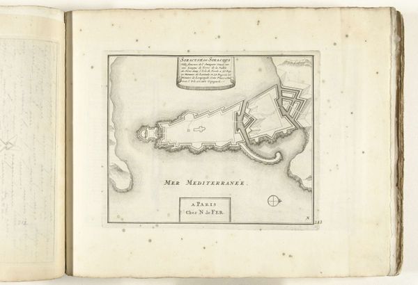
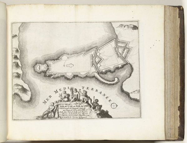
Editor: We are looking at "Kaart van Malta, 1726," an ink drawing, print, and engraving from the Rijksmuseum collection, artist is anonymous. It’s like stepping back in time, with all of its academic and decorative details in precise line work and calligraphy. It’s pretty striking. What stands out to you? Curator: The strength of this work lies in its masterful handling of line and form. Consider the relationship between the positive space, which meticulously renders the topography of Malta, and the negative space of the surrounding sea, labeled "Mer de Barbarie" and "Mer Mediterranee." Editor: What's the significance of those labels and their positions? Curator: They contextualize the map, but also consider how they frame the island. The lettering, the geometric shapes in the island, and the scale marking provide a satisfying interplay. Look at the contrast between the dense concentration of place names and geographical markers within the islands versus the relative emptiness of the surrounding waters. Do you perceive a visual tension there? Editor: Definitely. There is a concentration of linework at the centre of the piece that moves outwards toward simplification on the outskirts of the map, I suppose. How much is that tension an effort to establish structure for navigation? Curator: Precisely! But notice also how the various components—text, island masses, and cartographic symbols—work together to create a visually compelling composition that transcends mere functionality. The careful distribution of these elements across the page produces an aesthetic experience. Editor: I see how analyzing these elements independently emphasizes the artistic quality inherent in a practical historical piece. Thanks for this insight! Curator: My pleasure. By isolating these aspects, we gain a richer appreciation for the work as a designed artifact.
Comments
No comments
Be the first to comment and join the conversation on the ultimate creative platform.
More like this