graphic-art, print, engraving
#
graphic-art
#
dutch-golden-age
# print
#
pen sketch
#
old engraving style
#
landscape
#
geometric
#
line
#
history-painting
#
engraving
Dimensions: height 145 mm, width 220 mm
Copyright: Rijks Museum: Open Domain
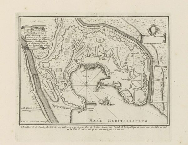
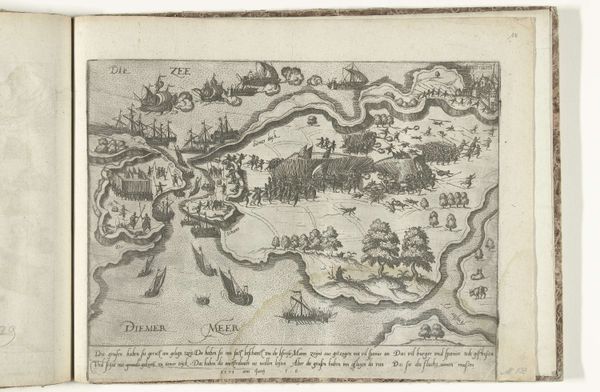
Curator: Here we have a 1646 engraving titled "Kaart van het eiland Java, 1596", which translates to "Map of the island of Java." It’s attributed to an anonymous artist and currently resides in the Rijksmuseum. What strikes you about this piece? Editor: Well, it’s quite intricate. It's fascinating how they mapped Java and the surrounding islands back then with just pen and engraving. There is this tension between the detailed coastlines and place names versus the empty interior. What kind of role did maps play in society during this time? Curator: Maps like these weren't just about geography; they were powerful tools of empire. Consider the context: this was the Dutch Golden Age, a period of intense maritime exploration and colonial expansion. This map of Java served a practical purpose, guiding trade routes and military expeditions. But more than that, it visually asserted Dutch power and presence in the East Indies. Note how the calligraphy used in ‘Java Maior’ dominates the space. How do you read the depiction of the ship in this context? Editor: The ship seems to emphasize movement and connection but maybe also invasion. The presence of a Dutch ship in Indonesian waters, reproduced on a map circulating back in Europe... Curator: Precisely. It signifies the projection of Dutch influence across vast distances. Look closely at the coastal details versus the suggested shapes of the inland. Where does accuracy end and speculation begin? Editor: So the visual elements, like the ship and the stylistic choices, communicated specific political and economic messages, not just geographical information. Curator: Exactly. The map's imagery reinforced the idea of the Netherlands as a dominant global power. Maps were both descriptive and prescriptive, shaping perceptions of the world and justifying colonial endeavors. What do you make of the contrast between ‘Maior’ and ‘Minor’ at the bottom? Editor: It suggests a perceived hierarchy, reinforcing European notions of superiority in geographical and cultural representation. It's quite sobering to view it through that lens. I'll certainly never look at an old map the same way again. Curator: Indeed. By understanding the socio-political context of its creation, we reveal the hidden meanings behind seemingly objective representations. A seemingly simple geographical document turns out to be quite the propaganda piece.
Comments
No comments
Be the first to comment and join the conversation on the ultimate creative platform.
More like this