About this artwork
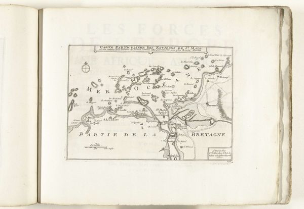
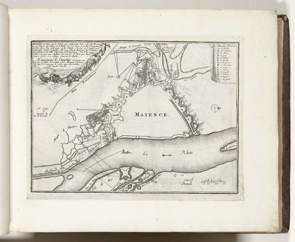
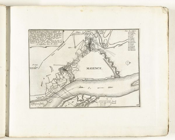
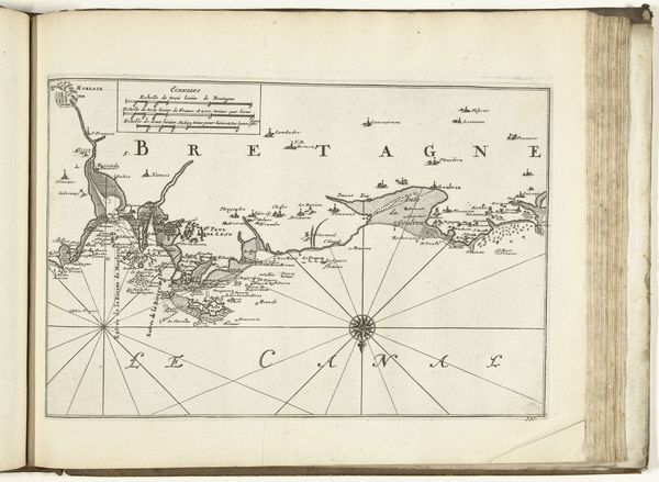
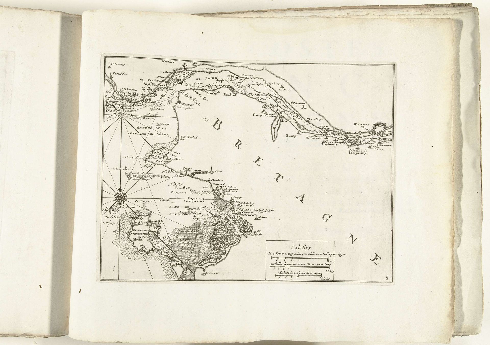
Editor: This is a map titled "Kaart van de zuidkust van Bretagne bij Nantes," created around 1702. It’s an anonymous piece from the Rijksmuseum, done in ink and engraving on paper. The intricacy of the line work is what first struck me; what do you see in the structure of this map that might be particularly meaningful? Curator: I note immediately the emphasis on delineation. Consider how the cartographer has meticulously transcribed coastline, using precise hatching to define landmass versus water. It isn't just about geographical accuracy. The formal relationships between these areas invite an analysis of power dynamics through spatial control. The neat inscription further highlights an intention for order and understanding in a chaotic world. Editor: So, the stark contrast is intentional to establish order and convey control. How does the materiality, the ink on paper, influence this interpretation? Curator: Indeed. The starkness, the indelible nature of ink, suggests permanence, authority. Engraving, in its reproductive capacity, disseminates that authority, effectively distributing a certain viewpoint across a wider audience. What message might be gleaned from its relatively small size and placement within the larger book? Editor: I see... its placement allows for a more intimate engagement. The formal qualities are indeed interconnected, the meticulous details emphasizing the power embedded in the structure. Curator: Precisely. The objective record becomes subjective statement. And a detailed semiotic examination allows us to appreciate how cartography is inherently an artistic act, regardless of perceived objectivity. Editor: Thank you. I definitely look at maps differently now, appreciating their inherent artistic statement rather than simple documents of a location.
Kaart van de zuidkust van Bretagne bij Nantes, ca. 1702
1702 - 1703
Anonymous
@anonymousLocation
RijksmuseumArtwork details
- Medium
- drawing, paper, ink, engraving
- Dimensions
- height 226 mm, width 298 mm
- Location
- Rijksmuseum
- Copyright
- Rijks Museum: Open Domain
Tags
Comments
Share your thoughts
About this artwork
Editor: This is a map titled "Kaart van de zuidkust van Bretagne bij Nantes," created around 1702. It’s an anonymous piece from the Rijksmuseum, done in ink and engraving on paper. The intricacy of the line work is what first struck me; what do you see in the structure of this map that might be particularly meaningful? Curator: I note immediately the emphasis on delineation. Consider how the cartographer has meticulously transcribed coastline, using precise hatching to define landmass versus water. It isn't just about geographical accuracy. The formal relationships between these areas invite an analysis of power dynamics through spatial control. The neat inscription further highlights an intention for order and understanding in a chaotic world. Editor: So, the stark contrast is intentional to establish order and convey control. How does the materiality, the ink on paper, influence this interpretation? Curator: Indeed. The starkness, the indelible nature of ink, suggests permanence, authority. Engraving, in its reproductive capacity, disseminates that authority, effectively distributing a certain viewpoint across a wider audience. What message might be gleaned from its relatively small size and placement within the larger book? Editor: I see... its placement allows for a more intimate engagement. The formal qualities are indeed interconnected, the meticulous details emphasizing the power embedded in the structure. Curator: Precisely. The objective record becomes subjective statement. And a detailed semiotic examination allows us to appreciate how cartography is inherently an artistic act, regardless of perceived objectivity. Editor: Thank you. I definitely look at maps differently now, appreciating their inherent artistic statement rather than simple documents of a location.
Comments
Share your thoughts