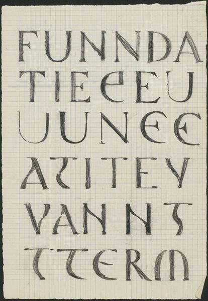
Ontwerp voor de omslag van de folder Catalogus der n.v. Theosofische Ver. Uitgevers Mij. Amsterdam 1874 - 1932
0:00
0:00
drawing, graphic-art, print, paper, typography
#
drawing
#
graphic-art
#
art-nouveau
#
script typography
#
hand-lettering
# print
#
lettering
#
book
#
hand drawn type
#
hand lettering
#
paper
#
typography
#
hand-drawn typeface
#
fading type
#
stylized text
#
thick font
#
small lettering
Dimensions: height 216 mm, width 143 mm
Copyright: Rijks Museum: Open Domain
Curator: At first glance, the typography seems like an architectural blueprint for a utopian city. Editor: Fitting, then, that this drawing, created sometime between 1874 and 1932, is titled "Ontwerp voor de omslag van de folder Catalogus der n.v. Theosofische Ver. Uitgevers Mij. Amsterdam" — or, "Design for the cover of the catalog of the Theosophical Society Publishing Company, Amsterdam" – by Mathieu Lauweriks. It’s rendered in graphic art on paper. Curator: Exactly! Theosophy sought to unify diverse spiritual and philosophical traditions. The almost blocky, monumental lettering, hints at stability, tradition and the notion of foundational knowledge. This visual language certainly resonates with the Theosophical Society’s aims. Editor: I'm intrigued by the visible grid underneath the text. It betrays the hand-made quality, but it doesn’t break the rigid visual impact—it adds another layer of process. The grid itself is a symbol of imposed order, challenged and humanized by Lauweriks' style. Curator: It highlights the interesting tension here between individual expression and structural systems, a kind of negotiation between freedom and control so critical to discussions around theosophy itself as an organizational system attempting to manage human belief and connection to a spiritual domain. Editor: Plus, there's the slightly fading type near the bottom of the composition… It mirrors the idea that even seemingly solid structures can be ephemeral. Everything transforms. Curator: Absolutely. That notion of transformation connects us to ongoing debates surrounding identity, the destabilizing effect of modernity on long held certainties. As a draft design, the piece really gets me thinking about the provisionality of all systems, even those, like Theosophy, promising absolute knowledge. Editor: For me, it's like stumbling upon a beautiful ruin—a fragment of a grand, unfulfilled ambition. A testament to the human need to organize… well, everything! Even the unorganizable. It's really thought-provoking on that level.
Comments
No comments
Be the first to comment and join the conversation on the ultimate creative platform.
More like this