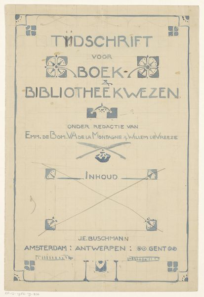
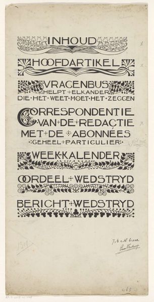
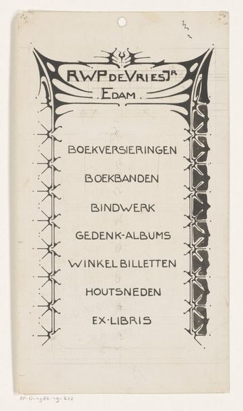
Omslagontwerp voor: Tijdschrift voor boek- en bibliotheekwezen, 1903 1903
0:00
0:00
graphic-art, print, typography, poster
#
graphic-art
#
natural stone pattern
#
naturalistic pattern
#
art-nouveau
# print
#
pattern background
#
pattern design
#
typography
#
organic pattern
#
limited pattern
#
pattern repetition
#
golden font
#
decorative-art
#
imprinted textile
#
layered pattern
#
poster
Dimensions: height 280 mm, width 189 mm
Copyright: Rijks Museum: Open Domain
This is Reinier Willem Petrus de Vries's cover design for "Tijdschrift voor boek- en bibliotheekwezen," created in 1903. Look at the way the red ink sits on the graph paper, like it's a blueprint, something still in formation. It's a process unfolding right before our eyes! Notice how the red lines, a single colour, have an almost tangible quality. You can almost feel the scratch of the pen, the pressure of the hand that guided it. The lines are bold, declarative, and yet they dance with a certain lightness and grace. Take the bird symbol in the centre. Is it an owl? Is it a strange heraldic device? For me it's an emblem of possibility, of open-endedness, where meaning is never fixed, but rather emerges through the act of looking, of feeling, of connecting. It reminds me of Hilma af Klint, another artist who explored the symbolic potential of simple shapes and forms. Like her, de Vries invites us to enter into a space of contemplation.
Comments
No comments
Be the first to comment and join the conversation on the ultimate creative platform.
More like this