drawing, typography, graphite
#
drawing
#
type repetition
#
art-nouveau
#
hand-lettering
#
typeface
#
hand drawn type
#
typography
#
hand lettering
#
typography
#
hand-drawn typeface
#
geometric
#
stylized text
#
thick font
#
typography style
#
graphite
Dimensions: height 175 mm, width 120 mm
Copyright: Rijks Museum: Open Domain
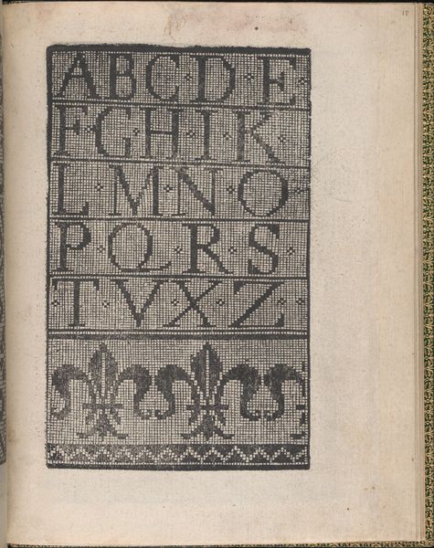
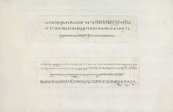
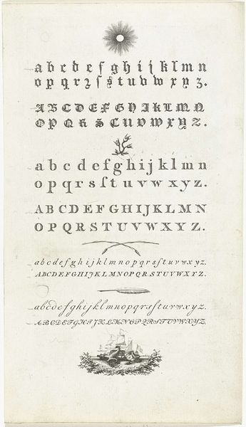
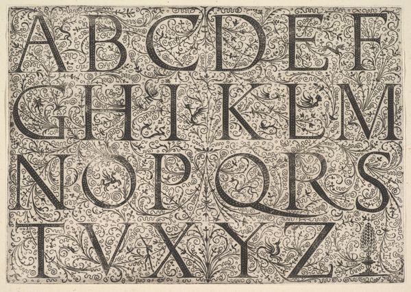
Gerrit Willem Dijsselhof made this drawing, ‘Letters,’ with a pencil on graph paper. Looking at the way the pencil lines vary in thickness, and how some of the letters appear multiple times with subtle differences, it's clear that Dijsselhof was working through something, figuring things out as he went. The grid of the graph paper is visible beneath the carefully drawn letters. The texture is smooth, almost cool to the touch. Notice the density of the graphite, how it catches the light differently across the page. Look at the 'A' in the fourth row. The angle of the lines, the way they connect – it’s a study in balance, an exploration of form. I’m reminded of Hilma af Klint’s drawings, not in style, but in the sense of using the act of drawing as a tool for thinking. Like many drawings, this piece feels less like a declaration and more like a question.
Comments
No comments
Be the first to comment and join the conversation on the ultimate creative platform.
