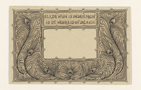
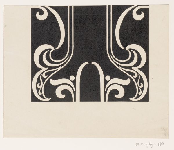
Omslagontwerp voor: Catalogus voor de tentoonstelling van de werkstukken der leerlingen van de Vakschool voor de Typografie 1910
graphic-art, typography, poster
graphic-art
type repetition
aged paper
art-nouveau
reduced colour palette
retro 'vintage design
typography
poster
Dimensions: height 158 mm, width 221 mm
Copyright: Rijks Museum: Open Domain
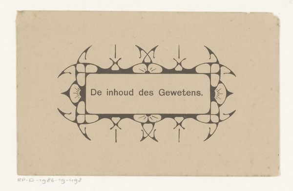
Curator: Standing before us is the "Omslagontwerp voor: Catalogus voor de tentoonstelling van de werkstukken der leerlingen van de Vakschool voor de Typografie," or "Cover design for the exhibition catalog of the students of the School of Typography," dating back to 1910. It's an intriguing example of early 20th-century graphic design. Editor: My initial feeling is a strange kind of peace. A serene formality. It’s minimalist, almost stern with its simple colour palette, yet somehow comforting in its old-world charm. I immediately want to see what designs inspired the young typographers of the day. Curator: Absolutely! It's definitely evoking a bygone era. The design has elements of Art Nouveau but it is more restrained, a sign of the changing times in graphic design. This was made to promote the works of typography students. It's all about clean lines, isn't it? Editor: Yes, there's an undeniable push towards the practical. The symmetrical grid, those regimented lines, speaks volumes about the principles being instilled: order, precision, readability. It has that 'no nonsense' early modernist vibe which I appreciate because it allows our eye to appreciate negative space as much as the lettering. Curator: Consider the socio-political implications. At the time, a school exhibition was a significant public event, demonstrating commitment to arts education but also showcasing the industrial capabilities of the time. Typography wasn't just art; it was about communicating messages, constructing public identity, and supporting emerging forms of communication. Editor: It's a subtle, very Dutch assertion of quality, like a whisper that suggests strength and craft. You can really sense the care given to presentation and how seriously that community of artisans approached typography. I imagine the exhibit must have generated conversation and influenced trends of advertising art! Curator: This piece tells a wider tale. It captures the values of an era—a drive for education, industry, a celebration of students’ work, and the rise of typography. The design captures a cultural commitment to clarity. Editor: For me, it resonates deeply. It inspires questions on how past art shapes what we see now and how those first experiments continue to have so much creative expression embedded within a simple color selection!
Comments
No comments
Be the first to comment and join the conversation on the ultimate creative platform.
More like this