About this artwork
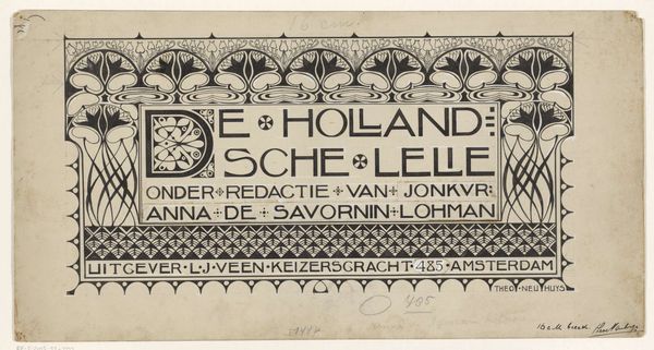
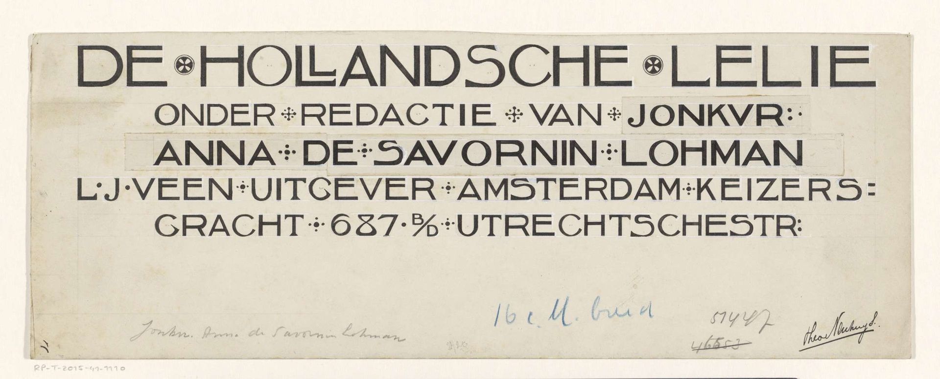
Curator: Before us we have Theo Neuhuys’s “Ontwerp voor: De Hollandsche Lelie, Weekblad voor jonge dames,” which roughly translates to “Design for: The Dutch Lily, a weekly magazine for young ladies,” dating from about 1901 to 1915. Editor: It strikes me as surprisingly bold. The graphic weight and simplified forms telegraph modernity even now. Curator: Absolutely. Let’s start with the overall structure. Notice how the text is arranged in distinct horizontal bands. This creates a clear hierarchy, with "DE HOLLANDSCHE LELIE" in a larger, more prominent typeface at the top, acting as the primary anchor. The typeface itself… observe its almost geometric simplicity, the clean lines, the deliberate use of thick and thin strokes, and how the letterforms integrate decorative crosses. Editor: Those crosses jump out at me. They break up the monotony and suggest something about the magazine’s moral tone. Lilies, of course, are strongly linked with purity and the Virgin Mary, resonating deeply within the cultural symbolism surrounding idealized womanhood. Curator: Precisely. And if you study the subsequent lines of text, particularly "ONDER REDACTIE VAN JONKVR: ANNA DE SAVORNIN LOHMAN," meaning "Under the editorship of Lady Anna de Savornin Lohman," we see a slightly different application. The spacing is tighter, the font size smaller, a visual signal that this is secondary information. Editor: The hand-lettered quality makes it feel intimate and personal, even progressive. The name “Lohman” would have meant something to readers, perhaps promising certain values or viewpoints. “Keizersgracht” anchors the journal geographically within Amsterdam, grounding it in a specific cultural space. Curator: Indeed. Neuhuys effectively merges form and content, employing font and spatial organization to convey layers of information and cultural cues within a visually arresting and easily legible framework. Editor: It is more than just pretty typography, it is cultural coding for a specific audience. This little magazine design is now a fascinating document in design history.
Ontwerp voor: De Hollandsche Lelie, Weekblad voor jonge dames, c. 1901-1915
c. 1901 - 1915
Artwork details
- Medium
- graphic-art, typography, poster
- Dimensions
- height 131 mm, width 352 mm
- Copyright
- Rijks Museum: Open Domain
Tags
Comments
Share your thoughts
About this artwork
Curator: Before us we have Theo Neuhuys’s “Ontwerp voor: De Hollandsche Lelie, Weekblad voor jonge dames,” which roughly translates to “Design for: The Dutch Lily, a weekly magazine for young ladies,” dating from about 1901 to 1915. Editor: It strikes me as surprisingly bold. The graphic weight and simplified forms telegraph modernity even now. Curator: Absolutely. Let’s start with the overall structure. Notice how the text is arranged in distinct horizontal bands. This creates a clear hierarchy, with "DE HOLLANDSCHE LELIE" in a larger, more prominent typeface at the top, acting as the primary anchor. The typeface itself… observe its almost geometric simplicity, the clean lines, the deliberate use of thick and thin strokes, and how the letterforms integrate decorative crosses. Editor: Those crosses jump out at me. They break up the monotony and suggest something about the magazine’s moral tone. Lilies, of course, are strongly linked with purity and the Virgin Mary, resonating deeply within the cultural symbolism surrounding idealized womanhood. Curator: Precisely. And if you study the subsequent lines of text, particularly "ONDER REDACTIE VAN JONKVR: ANNA DE SAVORNIN LOHMAN," meaning "Under the editorship of Lady Anna de Savornin Lohman," we see a slightly different application. The spacing is tighter, the font size smaller, a visual signal that this is secondary information. Editor: The hand-lettered quality makes it feel intimate and personal, even progressive. The name “Lohman” would have meant something to readers, perhaps promising certain values or viewpoints. “Keizersgracht” anchors the journal geographically within Amsterdam, grounding it in a specific cultural space. Curator: Indeed. Neuhuys effectively merges form and content, employing font and spatial organization to convey layers of information and cultural cues within a visually arresting and easily legible framework. Editor: It is more than just pretty typography, it is cultural coding for a specific audience. This little magazine design is now a fascinating document in design history.
Comments
Share your thoughts