graphic-art, print, typography
#
graphic-art
#
sand serif
#
script typography
#
hand-lettering
# print
#
hand drawn type
#
hand lettering
#
typography
#
hand-drawn typeface
#
fading type
#
thick font
#
handwritten font
#
golden font
Copyright: Rijks Museum: Open Domain
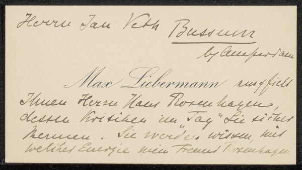
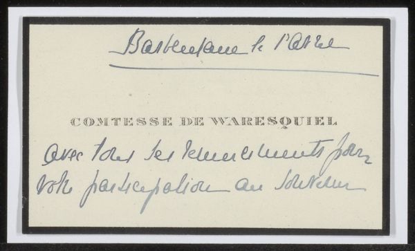
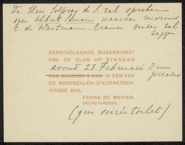
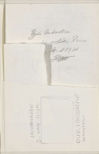
Curator: Alright, let’s turn our attention to “Uitnodiging aan Philip Zilcken,” a print dating roughly from 1884 to 1930. Editor: My immediate impression is that this invitation is incredibly unassuming, almost secretive in its simplicity. The golden and fading handwriting adds an intimate touch. Curator: Exactly! This work employs hand-lettering, featuring a unique blend of sand-serif and script typography. The combination creates a personal feel; imagine the act of handwriting each invite! It highlights a specific event: Philip Zilcken presenting "lithos by Bauer" at Pulchri Studio. Editor: The faded type almost makes it feel like a recovered artifact, doesn't it? Handwriting always carries so much more emotion than printed text, which creates an immediate and more significant connection to the past. Why do you think they used these particular letter forms? Curator: I'd wager that there's an aspiration to merge accessibility with artistry. The sand serif makes sure the key information can be read, while flourishes from the handwritten portion imbue sophistication. Editor: It speaks volumes about the value placed on this club and the art within it, I think. Not just anyone gets this invitation, but clearly folks "in the know" that the sender thought valued them enough to have a beautiful handmade invitation created. It reveals this little slice of cultural memory for us. Curator: The choice of gold-colored text hints towards the precious nature of both art and intellectual gatherings, don’t you think? What a statement for something small and seemingly practical! Editor: Definitely. And the term 'secretaresse' at the bottom, referring to Fenna de Meyier, reinforces that this communication isn't mass-produced corporate jargon but rather someone’s labor of love, and attention to the receiver. Curator: That's right, these thoughtful touches underscore not just its function as a mere notification but also as an art piece in itself. Editor: I like that thought—transforming what might seem quotidian into something quite profound. A lot can be said in even the humblest objects.
Comments
No comments
Be the first to comment and join the conversation on the ultimate creative platform.
More like this