graphic-art, print, paper, typography
#
graphic-art
# print
#
paper
#
typography
#
geometric
#
monochrome
Dimensions: height 137 mm, width 215 mm
Copyright: Rijks Museum: Open Domain
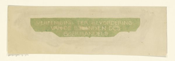
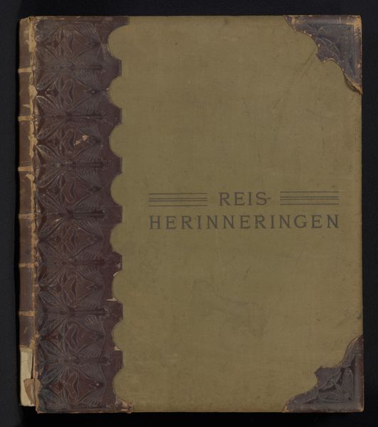
This print, 'Titelkader' by Reinier Willem Petrus de Vries, uses simple black lettering on a warm, off-white background, kind of like a really nice label. The process feels very direct, like something made by hand, where each mark has its own weight. Looking closely at the word 'REIS' you can see the texture of the ink, it's not perfectly smooth. And the way the letters are slightly irregular makes it feel really human. This reminds me that art is about embracing imperfection. The materiality of the piece, the slight imperfections in the print, all contribute to its charm. I'm reminded of Sister Corita Kent, who also used typography and bold graphics to create powerful, accessible art. Like her work, this piece invites us to slow down and appreciate the beauty in the everyday, the things we experience and remember.
Comments
No comments
Be the first to comment and join the conversation on the ultimate creative platform.
More like this