drawing, print
drawing
art-nouveau
parchment
old engraving style
landscape
bird
botanical illustration
figuration
line
golden font
Dimensions: height 124 mm, width 169 mm
Copyright: Rijks Museum: Open Domain
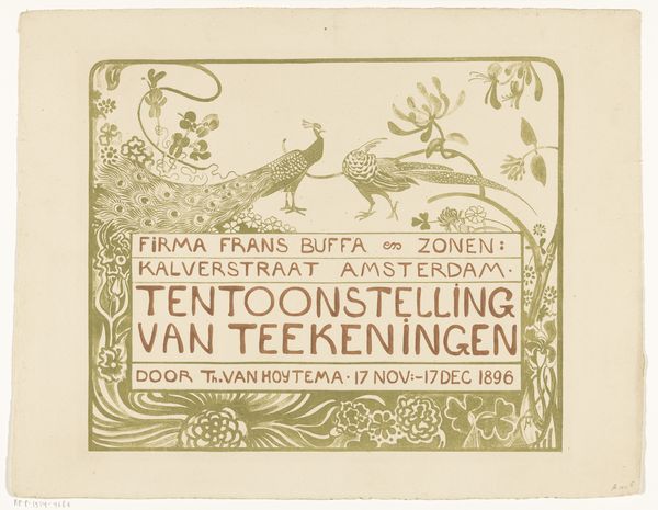
Editor: This is a fascinating print! "Bestelkaart voor 'Hoe de vogels aan een koning kwamen'" by Theo van Hoytema, from 1892. It looks like a book order form. What stands out to me is how the decorative line work contrasts with the central, plainer area that lists details for ordering. What do you see in this piece? Curator: Formally, the organization of the page arrests my attention. Observe how the framing device operates through the motif of birds and a stylized landscape. The sun at the top is visually counterbalanced by the townscape at the bottom, anchoring the composition. What effect does this symmetry produce? Editor: It makes it feel balanced, stable. The golden colour of the font really draws the eye. I'd never really considered symmetry as a visual strategy on such a small scale like this. Curator: Indeed. Van Hoytema seems concerned with balancing surface embellishment and negative space. The function of text shifts in the composition – from an informative, essential component, to one acting in conversation with the more illustrative passages around it. Would you say the relationship between line and shape carries additional resonance here? Editor: The line quality in the birds – those tiny details suggesting feathers and flight – is so refined, while the text in the middle, despite being so clearly laid out, looks rougher in comparison. Perhaps it reflects some hierarchy, emphasizing the book itself above its purchasing. I'm starting to see it differently now. Curator: Precisely. Through line, form, and their very placement, this print subtly elevates artistic expression, even on a mere order card, showcasing that there is art inherent in the print, line, and organization. Editor: This was very informative; I hadn't quite noticed the dialogue happening between the contrasting elements on the page.
Comments
No comments
Be the first to comment and join the conversation on the ultimate creative platform.