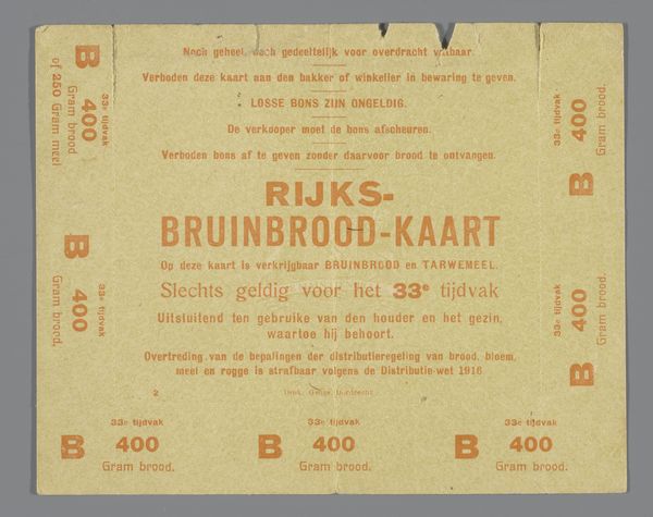
graphic-art, print, poster
graphic-art
art-nouveau
poster
Dimensions: height 10.1 cm, width 8.5 cm
Copyright: Rijks Museum: Open Domain
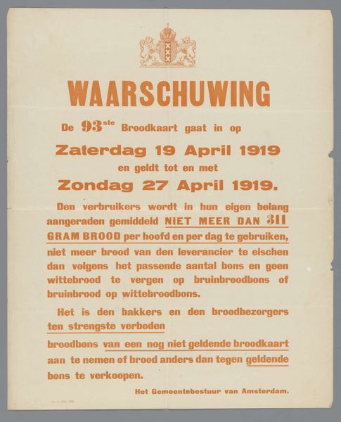
Editor: This is "Rijks-Aanvullings-Broodkaart," a poster print from around 1918 by Geuze & Co. It seems to be some kind of ration card, with its simple design and stern warnings. What strikes you about this piece? Curator: Oh, a humble artifact with stories etched into its very fibers. Look at that subdued color palette, whispering of scarcity and constraint. The stark typography is almost brutally efficient. This wasn't designed to delight, was it? This was designed to control, to instruct. Can you sense the underlying tension of wartime rationing pressing in on this little card? It makes you think of the silent struggles people had during war time, and how a piece of paper controlled a part of one's life. What strikes you about the language itself? Editor: The emphasis on "STRIKT PERSOONLIJK" is interesting. They really didn't want people sharing these! Was there a black market for bread even back then? Curator: I imagine so! The desire to provide, to circumvent hardship... it's deeply human. This poster becomes a window into that quiet resistance. And "uitsluitend Bruinbrood" – only brown bread – speaks volumes. I bet there was someone who dreamed of white bread. Editor: It's amazing how much history and feeling can be packed into something so seemingly simple. I’d never really thought about rationing posters as having artistic merit, but I totally see it now! Curator: Exactly. It teaches us how even ordinary objects have a deeper meaning. Each line, each phrase tells a story, if you take time to stop and listen. Now I want to go bake some brown bread… maybe not strictly rationed though!
Comments
No comments
Be the first to comment and join the conversation on the ultimate creative platform.