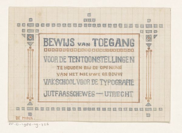
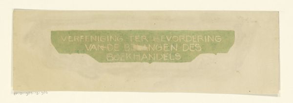
Toegangsbewijs voor de tentoonstellingen van de Vakschool voor de Typografie 1910
0:00
0:00
graphic-art, print, typography, poster
#
graphic-art
#
art-nouveau
# print
#
typography
#
poster
Dimensions: height 120 mm, width 182 mm
Copyright: Rijks Museum: Open Domain
Editor: Here we have "Toegangsbewijs voor de tentoonstellingen van de Vakschool voor de Typografie," or "Admission Ticket for the Exhibitions of the School of Typography," created around 1910. It’s a poster, seemingly a print. What stands out to me is how decorative it is, considering its very practical purpose. What can you tell me about this piece? Curator: It's fascinating to consider this from a materialist perspective. Think about the production process: someone designed the layout, chose the typefaces, prepared the printing plates, and then actually printed these tickets. The act of creating something visually appealing, almost luxurious, for what is essentially a piece of functional ephemera raises interesting questions about the value placed on craft and design. It shows that care was taken, that even everyday objects were viewed through the lens of artistry, how does this connection between artistry and function make you reflect on it? Editor: I guess I hadn't really thought about the labour involved in making what appears to be a very simple ticket. Seeing it as an example of Art Nouveau design, I considered the overall image, the aesthetic and assumed its purpose to simply signal the coming exhibition. Curator: Exactly. The Art Nouveau elements point towards specific workshop practices and material concerns within graphic design at the time. The choice of colour, the patterns used - these weren't simply aesthetic choices. The design incorporates materials available to them. This relates back to larger questions around the separation of fine art and design, doesn't it? Editor: It really does. It makes me question if functional pieces such as this are separate from a design, artistic expression. Curator: Consider how printing impacted accessibility. This wasn’t necessarily about individual skill; instead, it was dependent on wider trends around industrialization. It makes us reconsider how ideas circulated at the time. Editor: That’s such a great point, looking at the distribution of materials, what were people using and why. I feel that viewing this piece now allows me a closer examination into the labour behind production than I ever really had before. Thank you.
Comments
No comments
Be the first to comment and join the conversation on the ultimate creative platform.
More like this