About this artwork
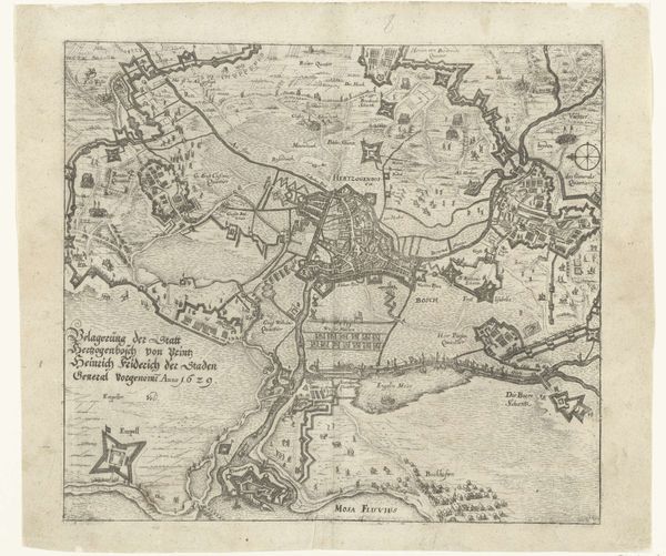
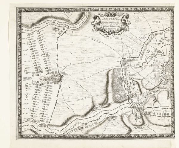
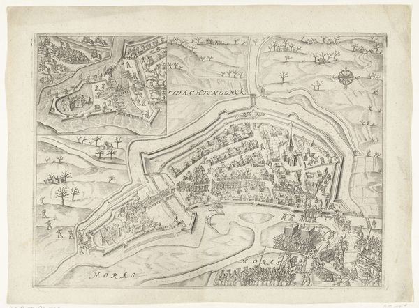
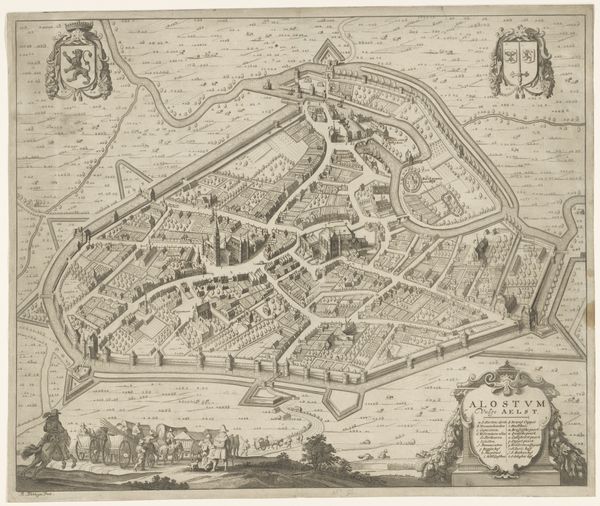
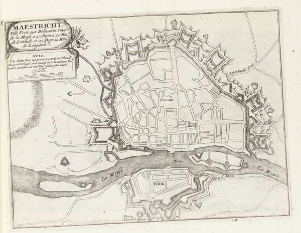
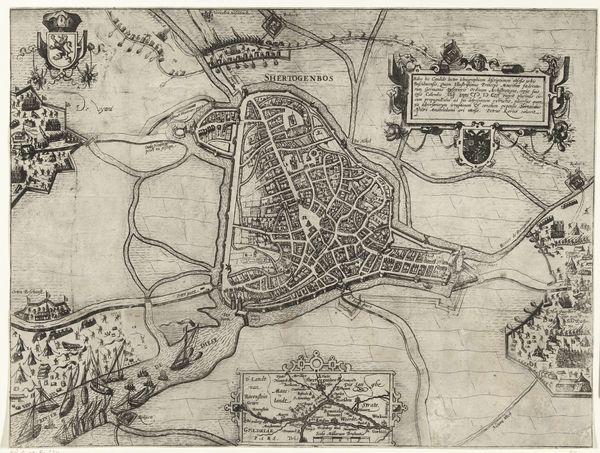
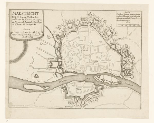
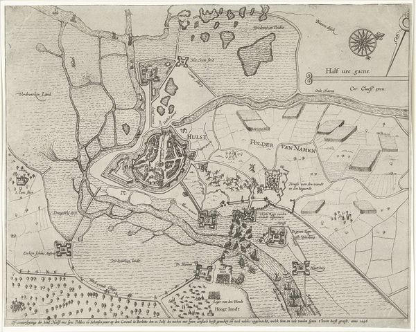
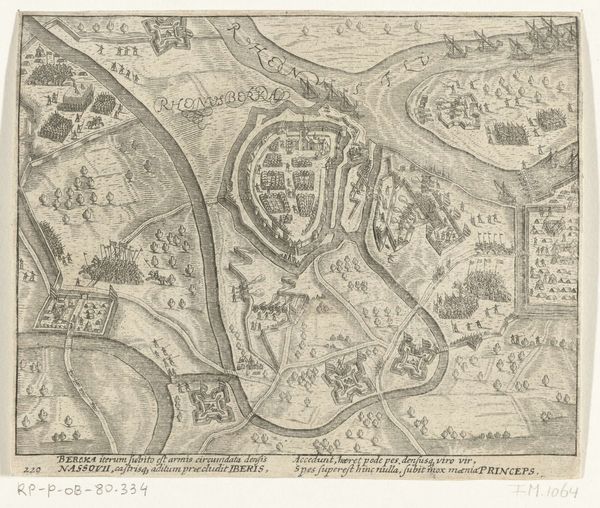
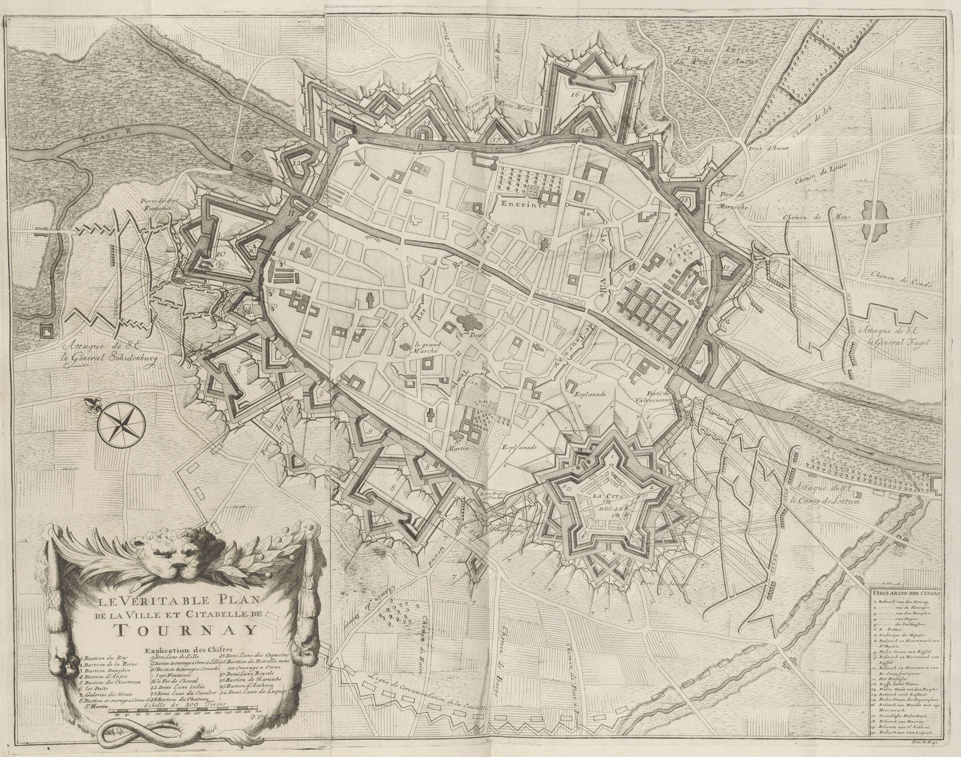
Curator: This remarkably detailed print offers a plan of the siege of Tournai, dating from 1709 to 1729 and crafted by Pieter van Call the Younger. Note the intricacy of the linework. Editor: Intricate indeed, it is stunning. At first glance, its delicate nature belies its intended use of brutal war. Curator: Absolutely, it's a prime example of baroque artistry. Consider the cartouches framing the title and legend. A grand lion presides over floral flourishes. The detailed geometry indicates an attempt at precise representation. Editor: Geometry that serves military strategy. This map highlights the societal emphasis on order and reason of the early 18th century, even amidst warfare. The defensive star forts are presented as rational, almost beautiful, shapes imposed on the land. It’s quite a chilling aesthetic statement when viewed this way. Curator: I'm intrigued by how line itself communicates structure. Note how van Call varies the weight and density to differentiate between built environment and natural features. A testament to engravings’ versatility in mark making. Editor: The density visually conveys the weight of political ambitions. Tournai's capture was crucial to the Allied advances, shifting balances in the War of the Spanish Succession. The map wasn’t just informational. It became an emblem of conquest. These prints aided the victors’ self-aggrandizement. Curator: A tool for power manifested in design, quite so. The strategic depth communicated through these linear arrangements certainly transcends mere cartography. Editor: To delve into prints from a historical viewpoint, such as this rendering, unveils not only artistry, but exposes social and military intentions. Curator: Agreed, such elegant articulations in graphic-art unveil structures of thinking embedded in early eighteenth century visualizations of war.
Plan van het beleg van Tournai, 1709 1709 - 1729
Pieter van (II) Call
1688 - 1737Location
RijksmuseumArtwork details
- Medium
- graphic-art, print, ink, engraving
- Dimensions
- height 603 mm, width 760 mm
- Location
- Rijksmuseum
- Copyright
- Rijks Museum: Open Domain
Tags
graphic-art
baroque
pen sketch
ink
geometric
line
cityscape
engraving
Comments
No comments
About this artwork
Curator: This remarkably detailed print offers a plan of the siege of Tournai, dating from 1709 to 1729 and crafted by Pieter van Call the Younger. Note the intricacy of the linework. Editor: Intricate indeed, it is stunning. At first glance, its delicate nature belies its intended use of brutal war. Curator: Absolutely, it's a prime example of baroque artistry. Consider the cartouches framing the title and legend. A grand lion presides over floral flourishes. The detailed geometry indicates an attempt at precise representation. Editor: Geometry that serves military strategy. This map highlights the societal emphasis on order and reason of the early 18th century, even amidst warfare. The defensive star forts are presented as rational, almost beautiful, shapes imposed on the land. It’s quite a chilling aesthetic statement when viewed this way. Curator: I'm intrigued by how line itself communicates structure. Note how van Call varies the weight and density to differentiate between built environment and natural features. A testament to engravings’ versatility in mark making. Editor: The density visually conveys the weight of political ambitions. Tournai's capture was crucial to the Allied advances, shifting balances in the War of the Spanish Succession. The map wasn’t just informational. It became an emblem of conquest. These prints aided the victors’ self-aggrandizement. Curator: A tool for power manifested in design, quite so. The strategic depth communicated through these linear arrangements certainly transcends mere cartography. Editor: To delve into prints from a historical viewpoint, such as this rendering, unveils not only artistry, but exposes social and military intentions. Curator: Agreed, such elegant articulations in graphic-art unveil structures of thinking embedded in early eighteenth century visualizations of war.
Comments
No comments