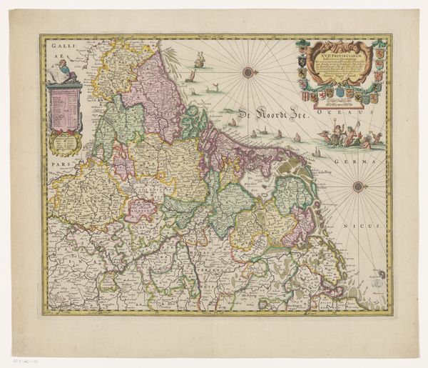
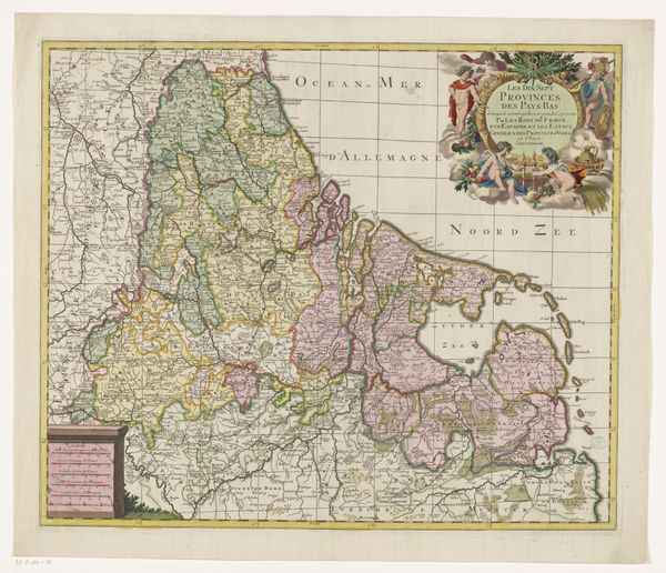
print, engraving
dutch-golden-age
landscape
geometric
engraving
Dimensions: height 403 mm, width 505 mm
Copyright: Rijks Museum: Open Domain
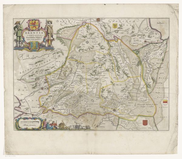
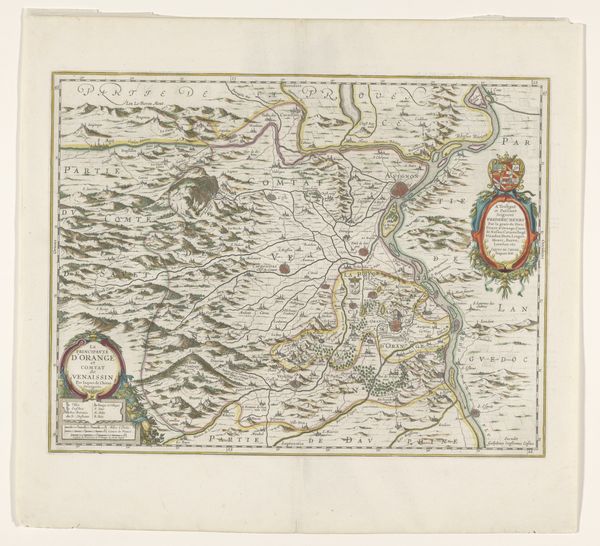
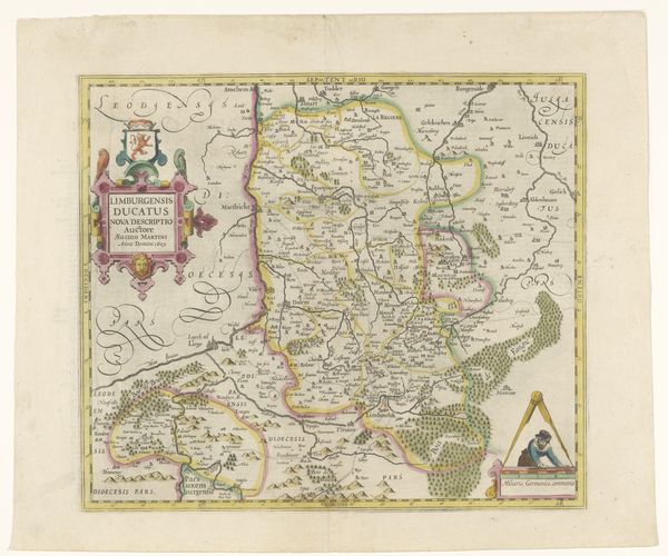
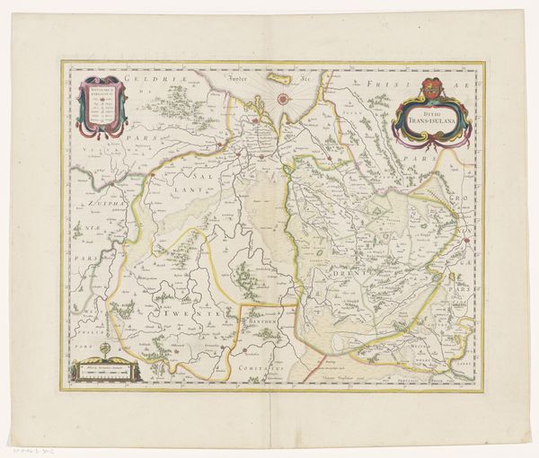
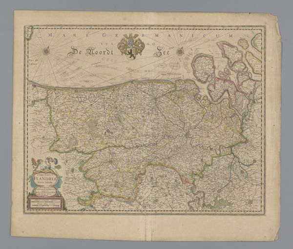
Editor: Here we have Henricus Hondius' "Kaart van de Nederlanden, 1631", a print at the Rijksmuseum. The intricate detailing is remarkable; the cartography so precise and adorned. How would you interpret this piece based on its formal elements? Curator: Initially, note the organizational principle: a clear bounding rectangle within which all representational elements are confined. Further, the map itself demonstrates a fascinating interplay of line and color. Hondius employs line to delineate borders, bodies of water, and topological features. Editor: And the colors? They seem somewhat muted, yet purposefully applied. Curator: Precisely. The selective coloration—greens, yellows, and muted reds—serves to differentiate territories and emphasizes a constructed, aestheticized geography, rather than a strictly representational one. This careful consideration of color acts to flatten the image, inviting the viewer to engage with it as a surface first. Editor: I hadn’t thought of it that way. What about the text and symbols, those little ships for instance? Curator: The textual elements and the representational icons like the ships and decorative cartouches should be regarded as integral components of the work’s formal structure. Their strategic placement balances the composition and adds layers of visual complexity. Observe the heraldic device— its own miniature composition of color, shape, and line. These elements converge to enhance the surface's depth. Do you see how it all works in harmony? Editor: I think I am beginning to see how you read the image by breaking it down into form and structure and seeing those relationships. So, by focusing on line, color, and symbolic integration, we reveal an emphasis on aesthetic experience rather than merely the conveyance of geographic data? Curator: Exactly. In this paradigm, the 'Kaart van de Nederlanden' stands as a sophisticated exercise in visual organization.
Comments
No comments
Be the first to comment and join the conversation on the ultimate creative platform.