graphic-art, print, typography
art-deco
graphic-art
type repetition
aged paper
homemade paper
hand-lettering
hand drawn type
typography
stylized text
thick font
golden font
historical font
columned text
Dimensions: height 30.2 cm, width 22.5 cm
Copyright: Rijks Museum: Open Domain
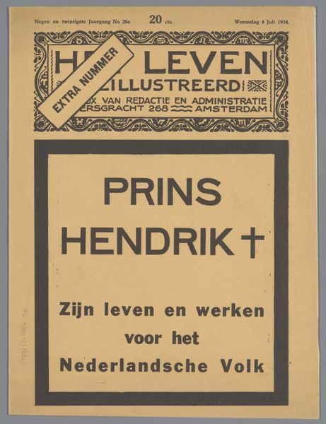
This cover for “Het Leven” extra edition, made in 1936, probably used some kind of printmaking technique. The image has this awesome directness; you can feel the hand of the artist in every mark. I’m immediately drawn to the black lettering of the title, it's bold, almost cartoonish. Notice how the image’s flat, matte surface emphasizes the contrast between light and shadow. There’s a tension between the graphic quality of the image and the softness of the underlying paper. Look at the frame around the text; it has this slightly wobbly quality. It’s not perfect, and that’s what makes it so human. It's a bit like someone telling you a story. That imperfection reminds me of Martin Kippenberger, in the way he embraced the handmade. Like him, the artist isn't afraid to show the process. It's this sense of openness that makes the work so compelling, inviting us to see the world with fresh eyes.
Comments
No comments
Be the first to comment and join the conversation on the ultimate creative platform.