print, typography, poster
#
art-deco
# print
#
typography
#
poster
Copyright: Rijks Museum: Open Domain
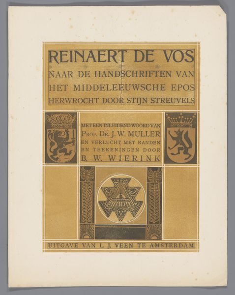
Curator: Let's discuss this folder from the archive of Philip Zilcken, a promotional print likely from 1931, created by W.P. van Stockum & Zoon. What are your initial impressions? Editor: Stark! And ordered. The tight borders, the regimented blocks of text… there’s a kind of formal austerity to it. It feels very… purposeful, very much of its time, actually. Curator: Indeed. This typographic poster, showcasing Van Stockum's "Mededeelingen," reflects the clean lines and geometric sensibilities of the Art Deco movement, even in something as seemingly mundane as a publisher's announcement. Editor: Precisely. One can easily see how its streamlined aesthetic would function within the context of visual communication in the early 1930s. What's intriguing is how this piece served to legitimize and brand W.P. Van Stockum as a modern and reliable publishing house. The poster itself acts as a cultural artifact. Curator: Consider also the calculated use of limited colors, a key aspect of print aesthetics that draws our attention to textual hierarchies. Editor: Agreed, and I wonder how recipients in that era would have viewed it. Was it eye-catching? Or too restrained? I can imagine this piece as an indicator of economic shifts during the depression era, and a deliberate choice of economical design decisions as the times demanded. Curator: An insightful suggestion. Notice how even the stylized emblem, containing the year “1833," contributes to the company’s cultivated image of heritage and steadfastness during uncertain times. It subtly reinforces their legacy. Editor: This exploration definitely expands our perception of posters beyond simple ads, offering valuable context about how socio-economic landscapes impact design. Curator: Exactly. By exploring elements of style and historical backdrop, we can unveil compelling narratives through this single printed leaflet.
Comments
No comments
Be the first to comment and join the conversation on the ultimate creative platform.
More like this