graphic-art, print, typography, poster
#
graphic-art
#
type repetition
#
aged paper
#
script typography
#
hand-lettering
#
branded good
# print
#
hand drawn type
#
typography
#
embossed
#
thick font
#
golden font
#
decorative-art
#
poster
#
word imagery
Dimensions: height 126 mm, width 45 mm
Copyright: Rijks Museum: Open Domain
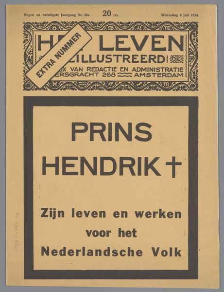
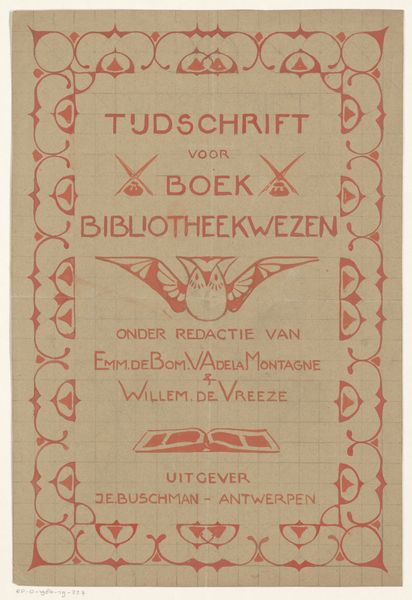
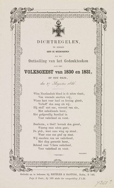
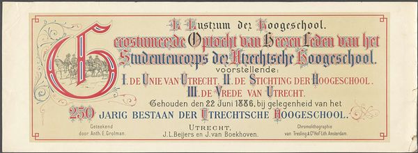
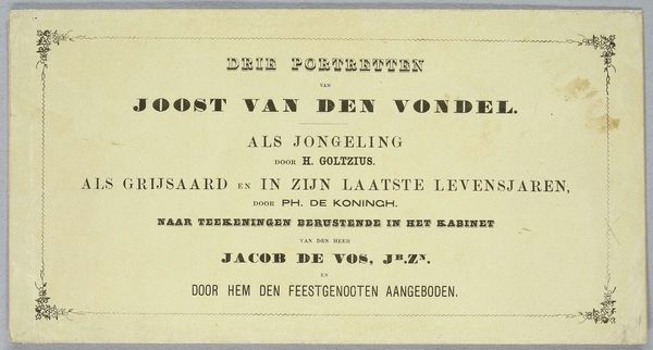
This small label for cod liver oil was printed anonymously, sometime in the past. Look at the typography! See how the letters are bold but softened with rounded edges, and how the flourishes add a touch of whimsy to something so, well, medicinal? I love that this was made with such care. The ink isn't applied perfectly, there are slight variations in tone and the pressure of the printing, which gives the label an intimate, handmade feel. It's these imperfections that really draw me in. Think about the person who designed this; they were communicating trust, expertise, and a touch of care, all in this little rectangle. In the same way that Ed Ruscha elevated the mundane with his deadpan depictions of gas stations, the maker of this label took a functional object and transformed it into something quietly beautiful. We’re left with a testament to the power of design, and its ability to elevate everyday life.
Comments
No comments
Be the first to comment and join the conversation on the ultimate creative platform.
