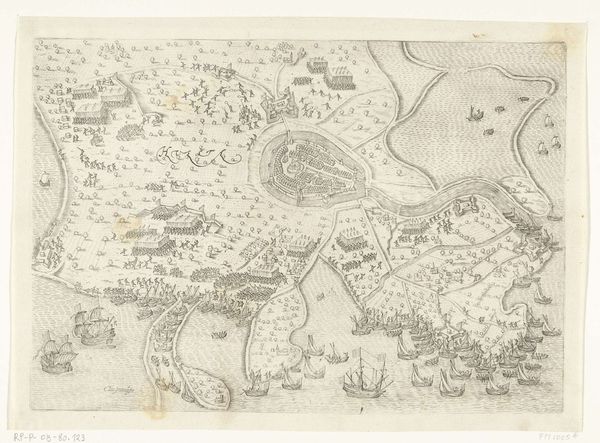
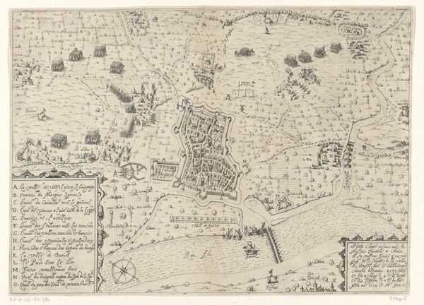
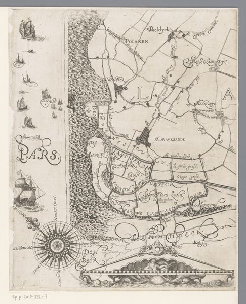
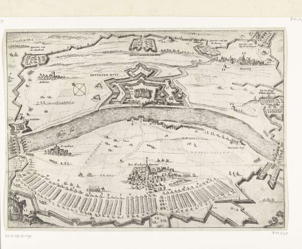
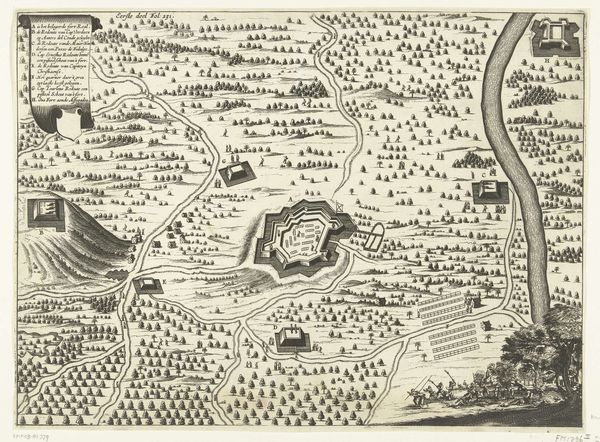
drawing, print, ink, engraving
#
drawing
#
baroque
#
dutch-golden-age
# print
#
landscape
#
ink
#
geometric
#
engraving
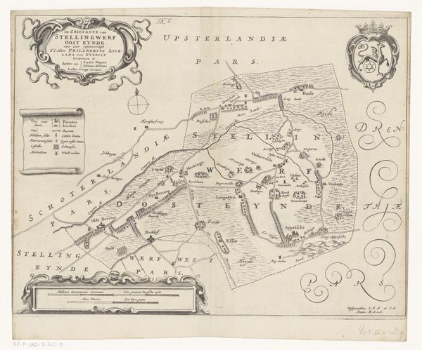
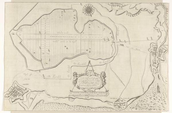
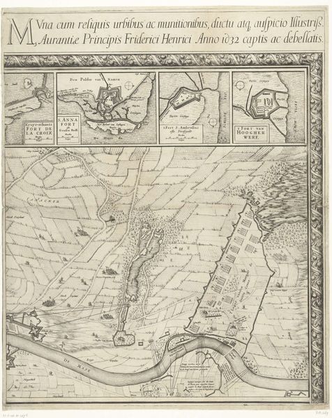
Dimensions: height 760 mm, width 491 mm
Copyright: Rijks Museum: Open Domain
Editor: So, this is "Kaart van de Slaperdijk (vierde deel)," a drawing made with ink and engraving by Caspar Specht in 1705. It looks like a section of a much larger map. I find the density of the lines and geometric shapes oddly compelling. How do you approach interpreting a piece like this? Curator: Initially, I look at the composition. Observe the division of space; note the hierarchy created through scale and placement. How does the artist use line—the crispness of the engraved lines versus the freer, more gestural ink work, perhaps indicating different functions, like established boundaries versus less defined areas? Editor: That’s interesting, I hadn’t thought about the contrast in the line work so much. Are you suggesting that it might show areas more or less controlled? Curator: It invites the question. Also, note the repetition of motifs – the coats of arms, the stylized trees, the compass rose. These recurring visual elements establish a rhythm, a structural framework within the image. What sort of system or program could these devices suggest for the viewer? Editor: Perhaps it's suggesting power, through repeated emblems? A constant visual reminder? It's more than just a map; it's a statement. Curator: Precisely. The aesthetic choices always serve a function. The relationship between form and content in a work like this is really sophisticated. How do you see this piece differently now? Editor: Now I'm seeing beyond just the representation, noticing how the arrangement and visual language itself contribute to the meaning. Thanks for that formalist perspective.
Comments
No comments
Be the first to comment and join the conversation on the ultimate creative platform.
More like this