drawing, print, paper, ink, engraving
#
drawing
#
neoclacissism
#
blue ink drawing
#
dutch-golden-age
# print
#
landscape
#
paper
#
ink
#
geometric
#
history-painting
#
engraving
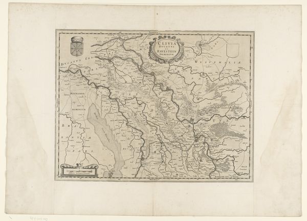
Dimensions: height 168 mm, width 116 mm
Copyright: Rijks Museum: Open Domain
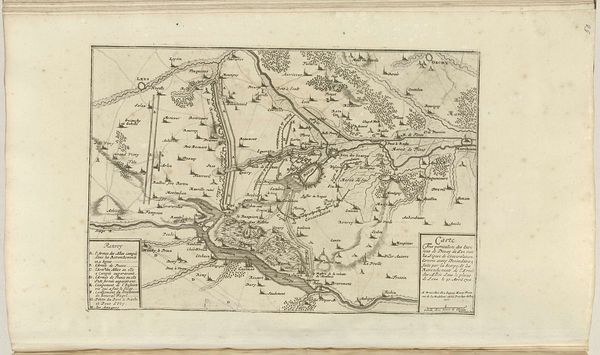
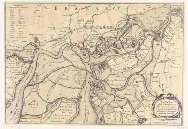
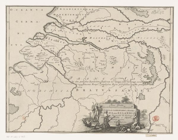
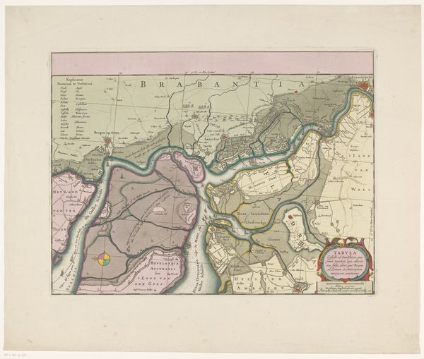
Curator: This is an anonymous print from around 1830, titled "Kaart van het gebied rond Bergen op Zoom," a map of the area. It's ink on paper. Editor: It has such a detailed, almost architectural quality in how it delineates space. The lines and forms create a kind of ordered landscape, a geometric representation. How would you interpret the visual language of this map? Curator: Observe the precision in the rendering. The lines are clean, and the shapes, while representing organic landforms, are stylized. The balance between representation and abstraction intrigues me. Editor: So, it's not just about showing what's there but creating a structured composition? Curator: Precisely. It invites contemplation on the mapmaker's method. The artist has transformed terrain into line, shape, and even color, directing how the eye moves. It’s semiotics – symbols acting as a form of text. What effect does the limited colour palette have for you? Editor: It gives it a very particular, antique quality and seems to focus the viewers attention on the linear aspect. Do you think that's part of its design? Curator: Absolutely. Color affects form. Consider how each hue works together. Blue defining waterways gives structure to the composition while simultaneously guiding visual consumption. Editor: This way of looking at it helps reveal it's an intentionally constructed object of beauty as much as something utilitarian. I appreciate learning more about this lens. Curator: Indeed. A successful study reveals a complex series of deliberate artistic decisions.
Comments
No comments
Be the first to comment and join the conversation on the ultimate creative platform.
More like this