drawing, ink, pen
#
drawing
#
baroque
#
ink
#
calligraphic
#
pen
#
calligraphy
Dimensions: height 198 mm, width 297 mm
Copyright: Rijks Museum: Open Domain
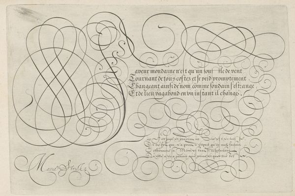
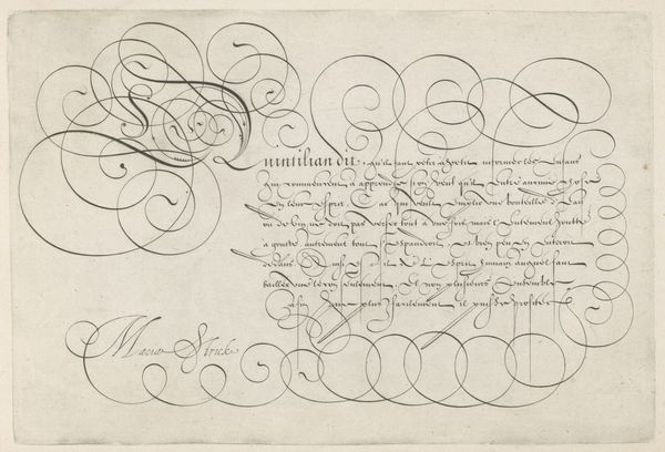
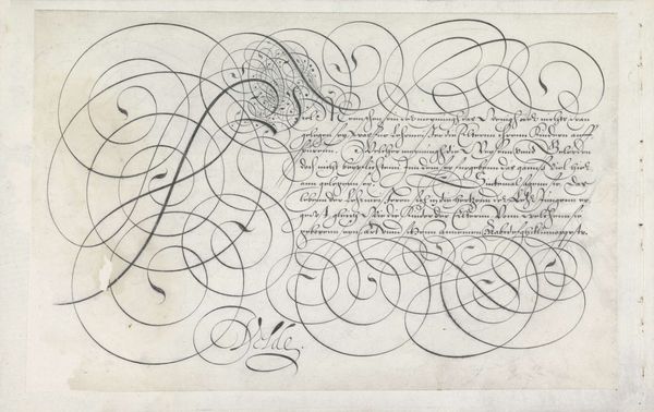
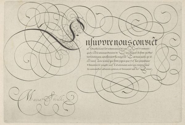
Curator: Here we have a drawing from 1618 entitled "Schrijfvoorbeeld met kapitaal R", or "Writing Sample with a Capital R", by Hans Strick, currently housed at the Rijksmuseum. Editor: It’s elegant. The line work gives it a certain weightlessness, even though it’s so controlled and precise. It almost looks like a dance across the page. Curator: Strick's command of ink and pen is indeed remarkable. Notice how the flourishes become both text and ornamentation. The elaborate capital R is not just a letter, but a complex design. Editor: Right, and that level of artistry was certainly intentional, wasn't it? Consider the social context of literacy in the 17th century. These elaborate scripts would have been the domain of a privileged few, reflecting a hierarchy of knowledge. Curator: Precisely. One could explore the principles of calligraphy: the line weights, the curves, the balance between the script and the blank space. It is the formal composition that elevates the writing to art. Editor: But that formal beauty serves a specific function, right? Calligraphy was more than beautiful penmanship; it signified education, status, access to power structures. Even the choice to showcase a capital "R" can be dissected. Why that letter in particular? Curator: Perhaps for 'Rijk'—realm or empire? Or maybe simply for the artistic challenge of its form. The baroque period delighted in complexity and virtuosity. The artist likely viewed this piece as both a practical writing example and a display of artistic skill. Editor: Or perhaps both at once; those things aren't mutually exclusive. Understanding the intersection of form and function within the society informs our appreciation for the aesthetic qualities on display. Curator: True enough. It reveals a depth to what appears to be simply a decorative exercise. Editor: Absolutely. An intricate expression and articulation, one of literacy and the historical era, literally embodied through layered aesthetic, semiotic, and historical value.
Comments
No comments
Be the first to comment and join the conversation on the ultimate creative platform.
More like this