drawing, print, ink, engraving
#
drawing
#
baroque
#
mechanical pen drawing
# print
#
pen illustration
#
pen sketch
#
personal sketchbook
#
ink
#
ink drawing experimentation
#
pen-ink sketch
#
pen work
#
sketchbook drawing
#
cityscape
#
storyboard and sketchbook work
#
sketchbook art
#
engraving
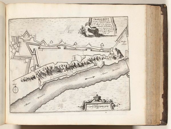
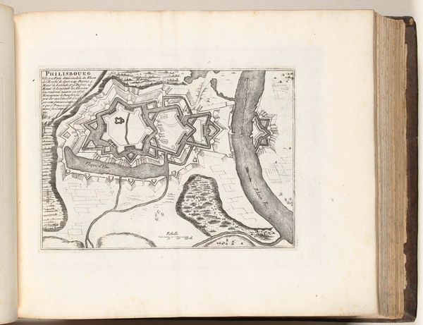
Dimensions: height 216 mm, width 296 mm
Copyright: Rijks Museum: Open Domain
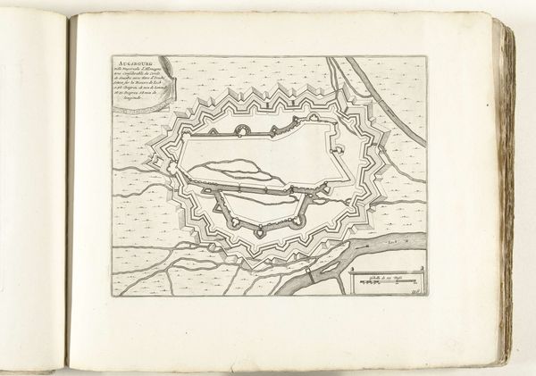
Curator: Plattegrond van het fort Charlemont, a print from 1696 by an anonymous artist, strikes me with its stark lines. The meticulous rendering of this fortress is fascinating. What stands out to you? Editor: It's incredibly precise. The intricate details of the fortifications, the sharp angles, the controlled ink lines--it's more technical than expressive. I'm curious about its formal qualities. What do you see in the relationship between its components? Curator: Indeed, the strength of this work lies precisely in its composition and its adherence to the visual vocabulary of cartography. The stark contrast between the black ink and the white paper emphasizes the geometric shapes, especially in the fortifications and the river's sharp bends. Have you considered the interplay of positive and negative space? Editor: Yes! How the ink defines form but also implies the land beyond. It isn't trying to deceive with illusory space. Can the composition tell us more about the intentions of the cartographer? Curator: Notice how the lines that constitute the river and landforms offer less consistent application. The engraving method lends a uniformity and precision that speak to an Enlightenment ideal of clarity and control. Consider this not as a literal landscape, but as an exercise in graphical reduction. Editor: So, the visual organization serves the clarity of information, rather than artistic expression. The stark style helps with communicating facts in an unambiguous way, even today! Curator: Precisely! Form and function coalesce here to create a visually arresting and informative image. This cartographic representation becomes, in its own way, an aesthetic statement. Editor: I never thought I could find aesthetics in a map before. This made me see it completely differently!
Comments
No comments
Be the first to comment and join the conversation on the ultimate creative platform.
More like this