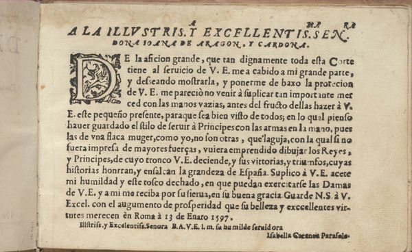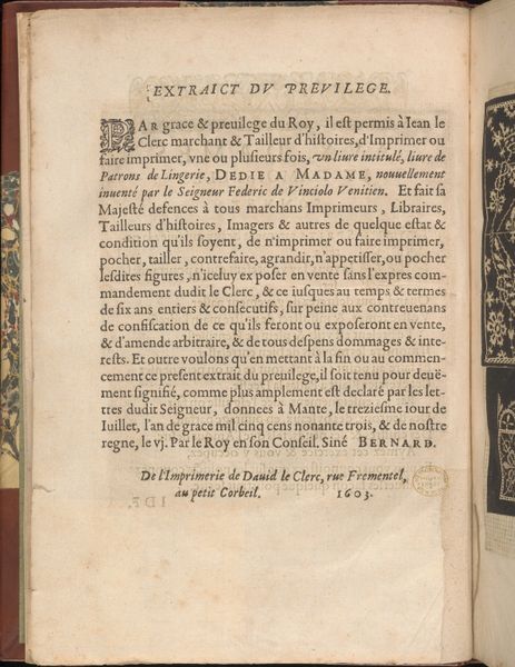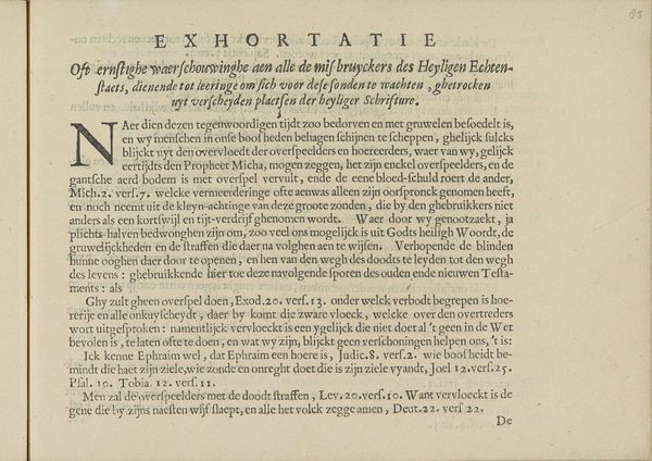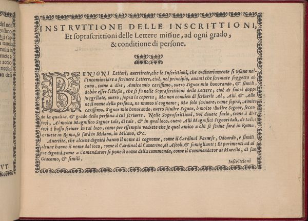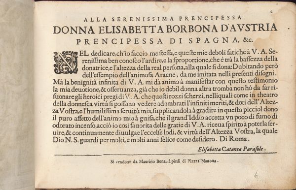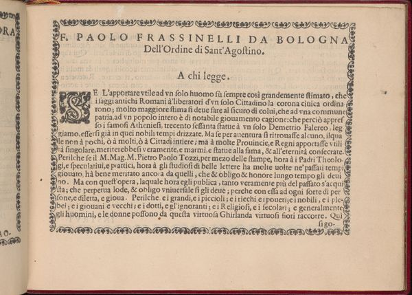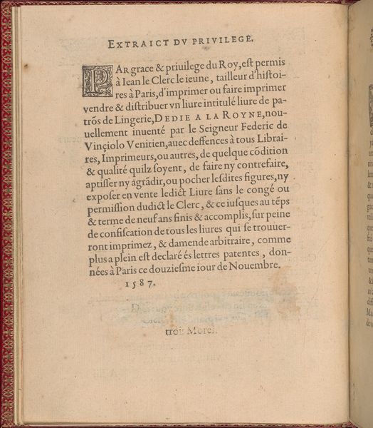
Studio delle virtuose Dame, page 3 (recto) 1597
0:00
0:00
drawing, print, paper, typography
#
drawing
# print
#
book
#
paper
#
typography
#
italian-renaissance
Dimensions: Overall: 5 1/2 x 8 1/16 in. (14 x 20.5 cm)
Copyright: Public Domain
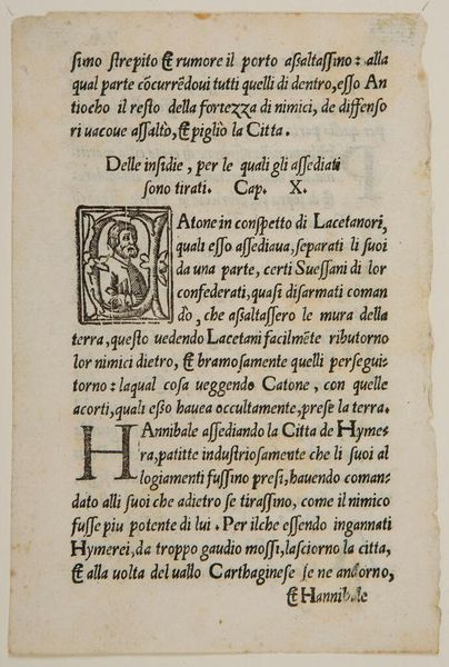
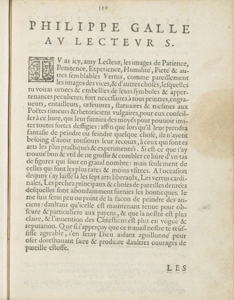
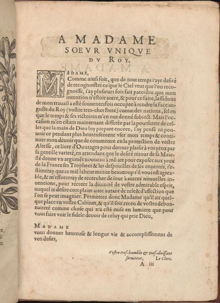
Editor: This is a page from "Studio delle virtuose Dame" by Isabella Catanea Parasole, dating back to 1597. It looks to be a drawing reproduced as a print. There's so much tightly packed typography. It feels very formal. How do you interpret this page? Curator: From a formalist perspective, consider the use of black ink against the stark white paper. The rigid geometry of the text block creates a sense of order, contrasted with the ornate initial 'D', where vegetal forms and figurative elements intertwine. This contrast invites consideration of the dialectical interplay between constraint and embellishment. Editor: I see what you mean, there's a real tension between the severe, straight text and that decorated 'D.' Curator: Precisely. Moreover, the absence of color forces us to attend to the nuances of line, texture, and the spatial relationships created by the arrangement of typographic elements. Observe the minute details in the initial "D"; how might we deconstruct this ornamental figure into its component shapes and patterns? Editor: That's interesting; focusing just on those elements isolates it for study, removed from the meaning of the text around it. Do you think the layout itself has an intrinsic meaning? Curator: The intentional layout generates visual interest, manipulating space to achieve an aesthetic effect. While text conveys a message, it’s also a visual structure – the serifs, the leading, the margins all contribute to a visual harmony, and potentially, dissonance, worthy of scrutiny. The framing creates an enclosed universe of communication that is purely artistic. Editor: I never thought about typography in that way before. I was too focused on just reading the words. Curator: It’s in these very details, in the deployment of lines and shapes, that we see the essence of artistic intention manifested on the page.
Comments
No comments
Be the first to comment and join the conversation on the ultimate creative platform.
